A Composable Journey: Creating a Unique UI using Jetpack Compose

Alejandro Zurcher
Posted on June 28, 2023
Intro
From time to time, our team’s designer comes up with a brilliant idea for the mobile app we’re working on. But then, horror strikes: it’s not based on a native component that we can easily find in the Material Design Guidelines or the iOS Human Interface Design Guidelines. It’s fresh, it’s new, it’s custom.
As a developer, this is the exact moment when you start scratching your head or, at best, suggesting a native alternative. But what if you could implement it as it is, in a reusable way? And not only that, what if you could also incorporate some animations into it?
Today, we will explore how to utilize Compose to effortlessly implement a highly customized UI, bringing a designer’s wildest dream to life and creating an astonishing visual experience.
Design
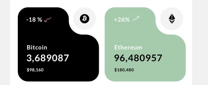
The design we’ll be working with in this exercise is a captivating element from a Crypto Wallet App, skillfully crafted by Roman Lieliushkin. You can check out his incredible mobile design work here: https://www.behance.net/ozmoweb
More specifically, we will be focusing on implementing square cards in the center of the screen. These cards will display the value of a cryptocurrency coin along with some additional details.
The Base
The first step we take when dealing with a custom UI like this is to search for its closest native counterpart that can serve as a foundation. This approach helps us minimize the amount of work required. Fortunately, in this case, it’s relatively straightforward. We can utilize a native Card, which provides us with the fundamental structure of rounded corners for our component.
val cardSize = 150.dp
Card(
    modifier = Modifier.size(cardSize).clip(RoundedCornerShape(15.dp)),
    colors = CardDefaults.cardColors(containerColor = Color.Black)
) { ... }
Now, let’s head to the drawing board and contemplate how we can fashion this unique shape by utilizing other shapes.
Collaborating closely with the designer would be incredibly beneficial at this point. They can provide valuable insights into the creation of the custom element, making it easier for us to translate and incorporate it into our own custom piece.
The plan now is to utilize different shapes to “cover” or “cut” the original card in order to achieve the desired custom shape. We’ll begin by creating squares that will be filled with the background color of our UI, giving the illusion of being cut.
Canvas Time
Within our Card, we’ll utilize the Canvas Composable, which plays a crucial role in our plan to develop a new custom component.
The Canvas enables us to position shapes or lines of any size and color at any x, y coordinate pair. Our initial step is to add rectangular white boxes to remove unnecessary portions of the original Card, accomplished through the use of drawRect()
val cardSize = 150.dp
Card(
    modifier = Modifier.size(cardSize).clip(RoundedCornerShape(15.dp)),
    colors = CardDefaults.cardColors(containerColor = Color.Black)
) {
    Canvas(modifier = Modifier.size(cardSize), onDraw = {
        drawRect(
            color = backgroundColor,
            topLeft = Offset(x = size.width - radius + (radius * 0.2f), y = 12f),
            size = size / 2f,
        )

//...
val cardSize = 150.dp
Card(
    modifier = Modifier.size(cardSize).clip(RoundedCornerShape(15.dp)),
    colors = CardDefaults.cardColors(containerColor = Color.Black)
) {
    Canvas(modifier = Modifier.size(cardSize), onDraw = {
        drawRect(
            color = backgroundColor,
            topLeft = Offset(x = size.width - radius + (radius * 0.2f), y = 12f),
            size = size / 2f,
        )

        drawRect(
            color = backgroundColor,
            topLeft = Offset(x = cardSize.value * 1.3f, y = cardSize.value * -1f),
            size = size / 2f,
        )

//...
To create the curvy shape cutout at the top, I used three circles strategically positioned around the corner. By partially blending the background color (white) with the card color (black), it successfully achieves the curvy shape for the top left section of the card. Luckily, there’s an easy way to draw circles in the Canvas using drawCircle()
    drawCircle(
        color = Color.Red,
        radius = cardSize.value / 1.5f,
        center = Offset(
            x = size.width - radius + (radius * 0.2f),
            y = radius - (radius * 0.2f)
        )
    )

    drawCircle(
        color = Color.Green,
        radius = radius * 0.8f,
        center = Offset(
            x = size.width / 2.14f,
            y = radius - (radius * 0.2f)
        )
    )

    drawCircle(
        color = Color.Green,
        radius = radius * 0.8f,
        center = Offset(
            x = size.width - radius + (radius * 0.2f),
            y = radius + (radius * 1.93f)
        )
    )
I’m highlighting them here so Its easier to see but the idea Is that the Green ones will be turned into the Card color and the Red one will be coloured as the background Is.
Finally, let’s add the Circle background the original design had in place to display the Crypto Coin Icon. To do so, we add one more circle.
      drawCircle(
          color = bubbleColor,
          radius = radius * 0.8f,
          center = Offset(
              x = size.width - radius + (radius * 0.2f),
              y = radius - (radius * 0.2f)
          )
      )
The full background Canvas:
Canvas(modifier = Modifier.size(cardSize), onDraw = {
      drawRect(
          color = backgroundColor,
          topLeft = Offset(x = size.width - radius + (radius * 0.2f), y = 12f),
          size = size / 2f,
      )

      drawRect(
          color = backgroundColor,
          topLeft = Offset(x = cardSize.value * 1.3f, y = cardSize.value * -1f),
          size = size / 2f,
      )

      drawCircle(
          color = backgroundColor,
          radius = cardSize.value / 1.5f,
          center = Offset(
              x = size.width - radius + (radius * 0.2f),
              y = radius - (radius * 0.2f)
          )
      )

      drawCircle(
          color = cardBackground,
          radius = radius * 0.8f,
          center = Offset(
              x = size.width / 2.14f,
              y = radius - (radius * 0.2f)
          )
      )

      drawCircle(
          color = cardBackground,
          radius = radius * 0.8f,
          center = Offset(
              x = size.width - radius + (radius * 0.2f),
              y = radius + (radius * 1.93f)
          )
      )

      drawCircle(
          color = bubbleColor,
          radius = radius * 0.8f,
          center = Offset(
              x = size.width - radius + (radius * 0.2f),
              y = radius - (radius * 0.2f)
          )
      )

  })
When displaying this Composable over a White surface, remnants of the Card we covered can be slightly seen on the top right corner.
To fix it, we can wrap the entire Card into a Box and add a second Canvas as the last element, which covers that area with another drawRect and brings the gray circle on top of it.
Canvas(modifier = Modifier.size(cardSize), onDraw = {
    drawRect(
        color = backgroundColor,
        topLeft = Offset(x = size.width - (cardSize.value / 2f) - 7.5f, y = 0f),
        size = size / 5f
    )

    drawCircle(
        color = bubbleColor,
        radius = radius * 0.8f,
        center = Offset(
            x = size.width - radius + (radius * 0.2f),
            y = radius - (radius * 0.2f)
        )
    )
})
//...
Box {
        Card(
//...
And let’s also make our Composable customizable so that the background and the gray bubble can be easily adjusted to fit different styles and themes.
@Composable
fun CryptoCardBackground(
    cardBackground: Color = Color.Black,
    bubbleColor: Color = Color(0xFFf3f3f3),
    backgroundColor: Color = Color.White,
    cardSize: Dp = 150.dp,
) {

  ...

}
Coffee Break
Let’s take a moment to catch our breath and reflect on our progress. We’ve managed to handcraft our own custom UI by incorporating circles and rectangles, building upon the foundation of the Card component. The result is fantastic! Now, it’s time to introduce the final piece: the data.
To bring In the data we’ll use our handcrafted background an lay on top of It some Rows and Columns with Text.
To visually represent our Data I’ve created a data class that will serve as input for our Composable and has all the required fields It needs:
data class CryptoCardData(
    val name: String,
    val value: Float,
    val valueChange: Int,
    val currentTotal: Long,
    val icon: Int
)
Since our final Composable need to be able to support different background colors we need to introduce a style property that will be used across the composable to define text color, card fill and background.
enum class CryptoCardStyle {
    Dark, Light
}
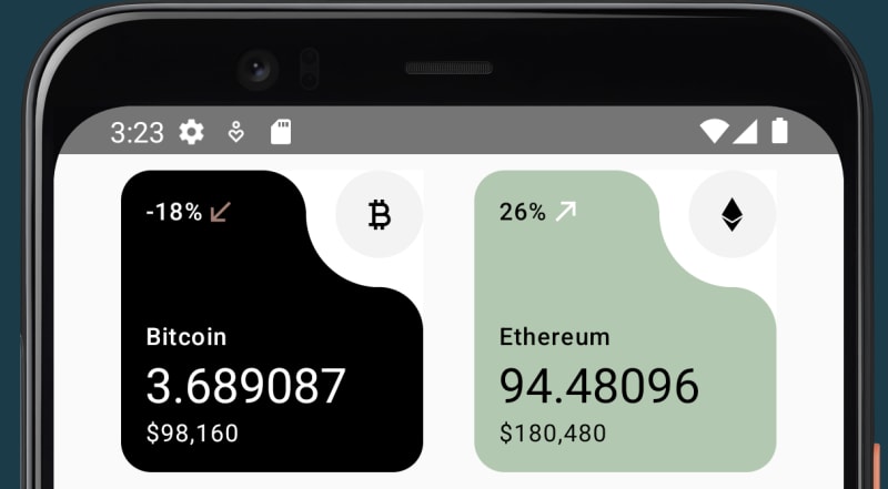
Finally, right next to the change value (-18% in this image), there’s a small icon that highlights if the value is positive or negative. So, we need to introduce a small Composable that will handle this for us.
@Composable
private fun ChangeIcon(valueChange: Int = -18) {
    var iconModifier: Modifier = Modifier
    val tint: Color
    val contentDescription: String

    if (valueChange > 0) {
        tint = Color(0xFFFFFFFF)
        iconModifier = Modifier.rotate(180f)
        contentDescription = "Arrow Up"
    } else {
        tint = Color(0xFFa97d72)
        contentDescription = "Arrow Down"
    }

    Icon(
        modifier = iconModifier.size(17.dp),
        painter = painterResource(id = R.drawable.ic_arrow_bottom_left),
        contentDescription = contentDescription,
        tint = tint
    )
}
And after putting all these pieces together, here it is, our fully customized CryptoCard in action, running in an Android emulator.
If interested in the full implementation you may find It here: CryptoCard.kt
In an upcoming post, we’ll explore how we can easily update this to support a small animation when loading the data and also how to accurately bring any custom font into Compose.
I hope you learned something new today, and thank you for reading this far!

Posted on June 28, 2023
Join Our Newsletter. No Spam, Only the good stuff.
Sign up to receive the latest update from our blog.


