Rebuilding our front-end tech stack for the new teleloisirs.fr

Yoriiis
Posted on October 3, 2020
Getting started
Introduction
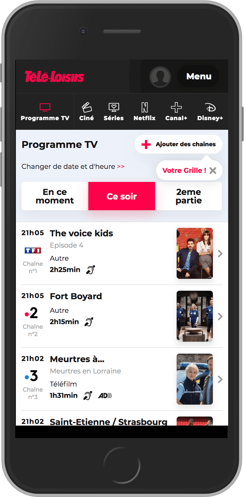
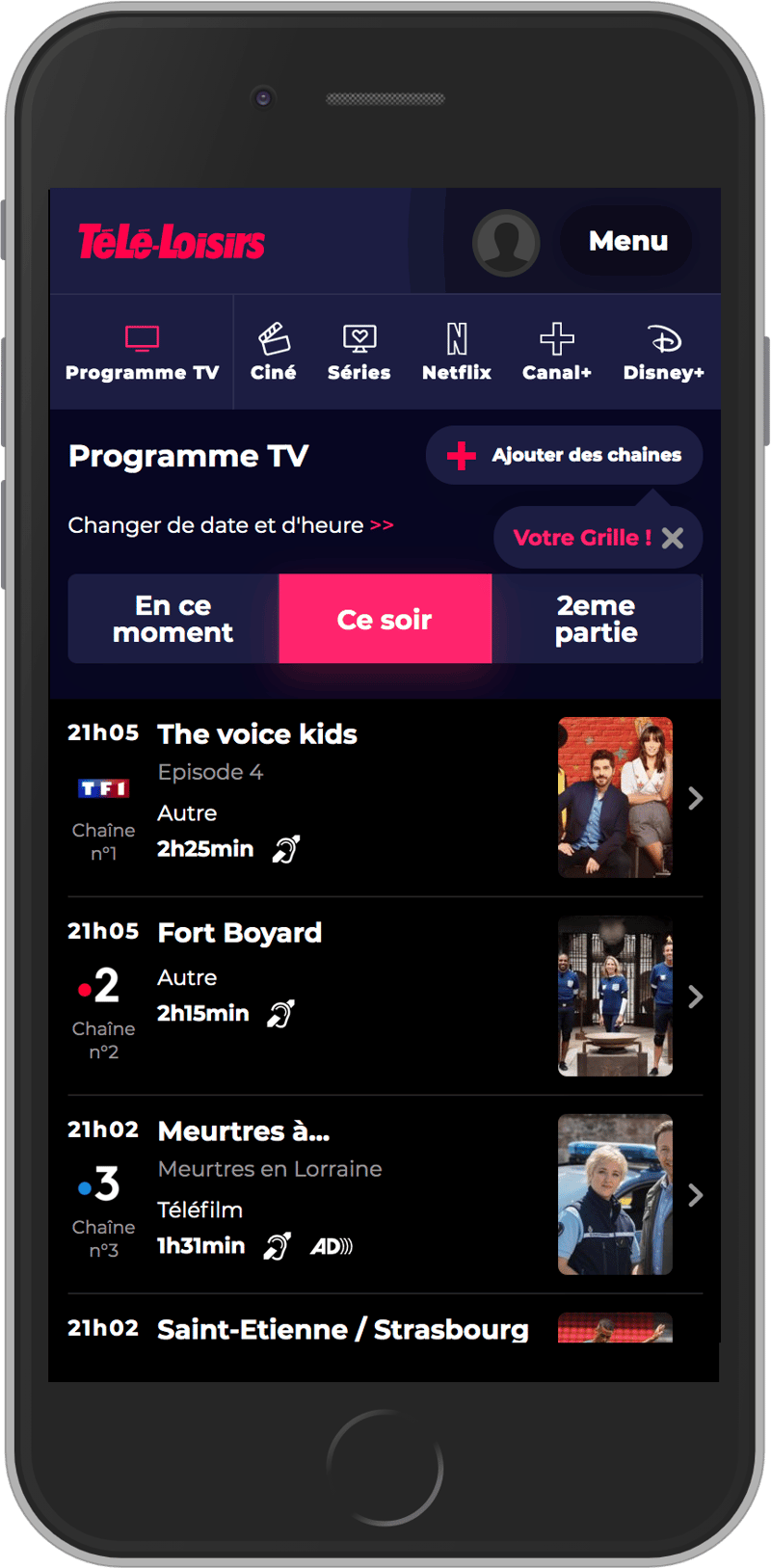
Télé-Loisirs is a french TV programs' website with a server-rendered in PHP Symfony. As a front-end engineer, this article covers how we did a progressive rebuild of the website with a new User Interface (UI) and a complete rewrite of the front-end stack. The main goals were to improve page load performances and to facilitate the development of new features with reusable components.
The progressive rebuild
For the UI development, we started with the home page. This page is the main target for our customers and we couldn't change everything in one shot without the risk of losing users. The solution was to rebuild progressively the first page, beginning from the bottom to the top of the page.
This strategy is softer for users, but incredibly more difficult to implement. Indeed, the legacy code needs to cohabit with the new code.
Once all the homepage's components were rebuilt, the clean steps were very important in order to remove all the legacy code and to reorganize the files.
Thinking in components
To build our Design System, all the teams worked together, the UX designers and the front-end and back-end developers. The common goal was to create reusable components all over the site. Throughout the process, we anchored our work around three technical mantras to avoid multiplication of new components:
- Does the component already exist?
- Can an existing component require only small updates to fit the needs?
- Can the design be harmonized?
If any of these questions couldn't be answered positively, we created a new component. It is strict, but was necessary to visually harmonize all our components for our users.
Organize the components
At the beginning we reviewed the mockups of the whole website to identify all the components used by each page. Then we got a list of the components to develop and use-cases.
Components can be specific to a page, shared between a group of pages or shared between all pages. On our site, the groups of pages are related to the sections: program, people, news, amongst others. Each group contains multiple child pages that are free to use either global or group shared components. We added this intermediate level to avoid moving a group shared component to the global level if it wasn't required. The following tree represents our components' structure organization:
# The single page
PAGE_NAME
    # The components of the single page
    COMPONENTS
        COMPONENT_NAME
PAGE_GROUP
    # The child page of the group
    PAGE_NAME
        # The components of the child page
        COMPONENTS
            COMPONENT_NAME
    SHARED
        # The shared components of the group
        COMPONENT_NAME
SHARED
    # The global shared components
    COMPONENT_NAME
This tree structure allows us to organize all components based on where they are used on the website. It makes it easier to manage and use all components either across a page, a group of pages or even the entire website.
Naming the components
For a better understanding of the different components across all teams, we decided to name all of them using a short, simple and descriptive name.
Here are some of the names we use:
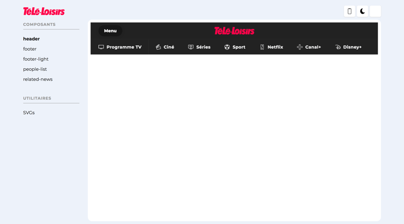
navigationrelated-newstime-navigationpush-custom-griddouble-broadcast-card
Creating the design variables
We created a file for the global CSS variables. It stores all our graphical charter elements, like:
- Colors
- Gradients
- Shadows
- Transition durations
- Borders
- Fonts
- Media Queries
That file is our reference for all the UI and is edited only sparingly to keep the UX harmonized. All the CSS files must use those variables in priority to avoid new additions.
Here is an extract from our global variables file:
:root {
    --containerMaxWidth: 1000px;

    /* Main colors */
    --realBlack: #000;
    --black: #141414;
    --lightBlack: #212121;
    --darkBlue: #696f79;
    --blue: #d5d9e0;
    --grey: #e5e5e5;
    --lightGrey: #f9f9f9;
    --red: #ff004b;
    --white: #fff;
    --placeholderAds: #e3e9f2;

    /* Dark mode */
    --darkmodeRed: #ff236d;
    --darkmodeDarkBlue: #070720;
    --darkmodeBlue: #1c1d42;
    --darkmodeRedGradient: linear-gradient(135deg, #ff236d 0%, #ee5b35 100%);
    --darkmodePlaceholderAds: #151515;

    /* RGBa colors */
    --blackTransparent30: rgba(0, 0, 0, 0.3);
    --blackTransparent80: rgba(0, 0, 0, 0.8);

    /* Gradients */
    --redGradient: linear-gradient(135deg, #ff004b 0%, #ee5b35 100%);
    --purpleGradient: linear-gradient(135deg, #895de4 0%, #cb7995 100%);
    --blackGradient: linear-gradient(180deg, #44474d 0%, #161717 100%);

    /* Shadows */
    --purpleShadow: 0 10px 30px 0 rgba(167, 106, 191, 0.4);
    --greyShadow: 0 10px 30px 0 rgba(229, 229, 229, 0.4);

    /* Transitions */
    --transition300msEase: 0.3s ease;

    /* Border-radius */
    --mainBorderRadius: 15px;

    /* Fonts */
    --font-montserrat: "Montserrat", sans-serif;
}

/* Media queries */
@custom-media --media-mobile only screen and (max-width: 749px);
@custom-media --media-tablet only screen and (min-width: 750px);
@custom-media --media-desktop only screen and (min-width: 1024px);
Static and dynamic component libraries
In collaboration with the design team, we created two component libraries, one static and one dynamic.
The static component library brings together all the components on Sketch, our design software. There, the components are static and not interactive. It allows us to easily create new pages based on the existing components. New components are automatically added to that library. It is mainly used by the design team and provides a good overview of all the currently available and designed components.
The dynamic component library is created from the static library and brings together all the components in their developed version. It's a tool for the UI development, inspired from StoryBook. In it, components are dynamic, interactive and use the same markup as the ones available on the website: nothing is duplicated. Static data is provided to every component so they can function independently. This library is use by all teams and provides an interactive overview of all the components available on the project.
Optimizing Cumulative Layout Shift
"I was about to click on that! Why did it move? 😭"
Cumulative Layout Shifts can be disturbing for users. It happens when visible elements moves on the page because another element was added, removed or resized in that very same page. We identified the main causes of this behavior on our website:
- Images without dimensions
- Advertising spaces
- Custom web fonts
Placeholders for images
During page load, images are often unavailable and the layout appears differently. Suddenly, elements jump from there to there because images are downloaded and displayed on the page. This is a normal behavior for a web page. In responsive web design, we can't fix the size of the images with the attributes width and height. The solution is to reserve the image area even if it is not yet loaded using the CSS ratio trick.
Imagine the following image inside a container:
<div class="picture">
    <img src="image.jpg" alt="I won't move the page, I promise" />
</div>
Without dimensions, the content below the image will move during the page loads. Because we know the image ratio (calculated by: (height / width) * 100 = ratio), we figured we could prevent that behavior. For example, for a landscape image (16/9), the calculation is: (1080/1920) * 100 = 56.25. The container's height is calculated with the padding ratio, which is responsive (excellent to handle responsive videos by the way). The image is in absolute position, outside of the page flow and fills its container. Thus, having responsive images without layout shifts is possible with this simple technique.
.picture {
    position: relative;
    overflow: hidden;
    height: 0;
    padding-bottom: 56.25%;
}

.picture img {
    position: absolute;
    top: 0;
    left: 0;
    width: 100%;
    height: 100%;
}
Placeholders for advertising
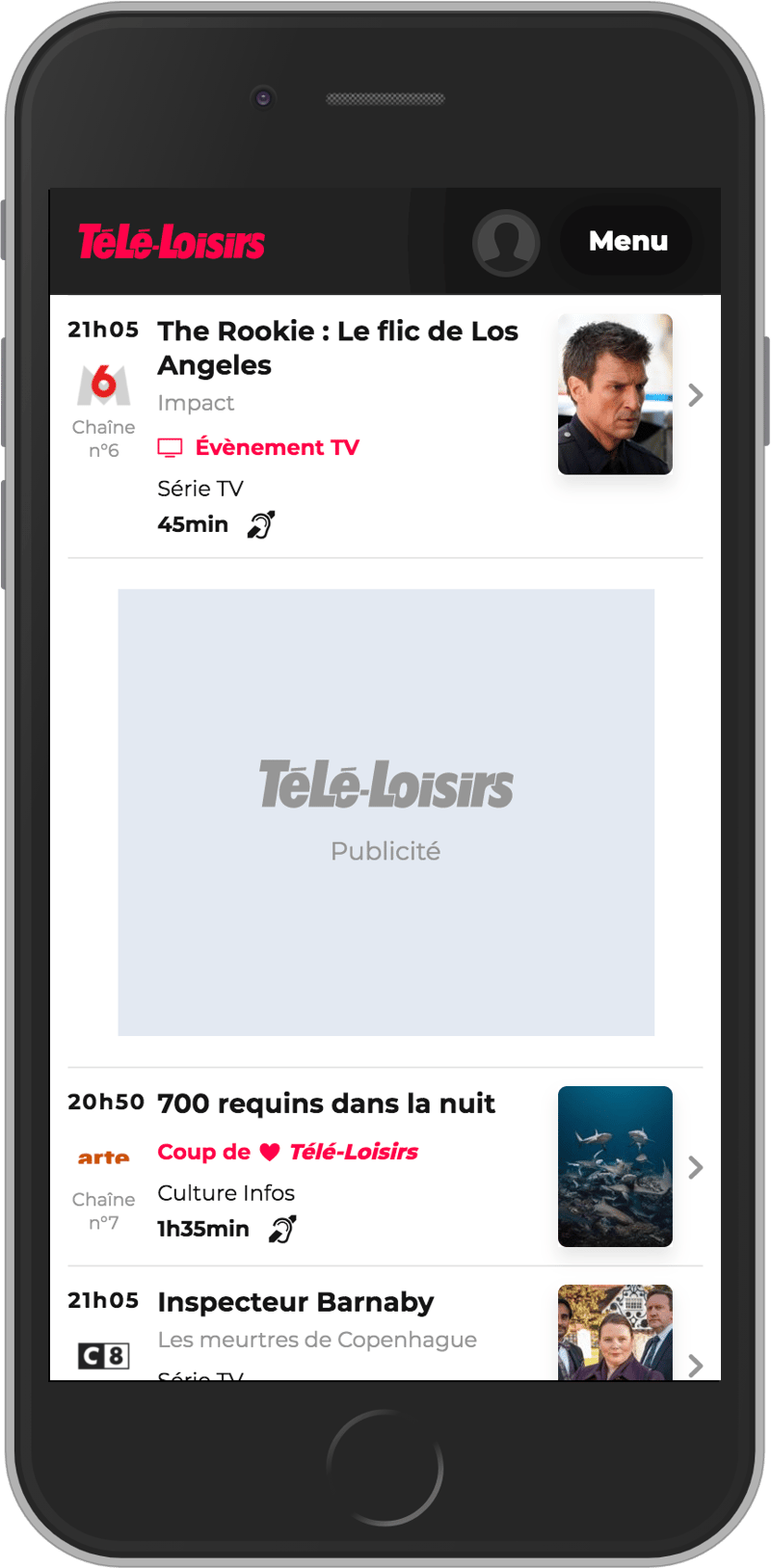
We use several formats for advertising which can often result in multiple layout changes on the site. In order to keep fixed advertising areas, we use the previously detailed solution which results in displaying placeholders to reserve areas on the page for the advertising elements. This result in an improved UX. Indeed, textual content and small iconographies can be added to help users easily identify advertising spaces.
Custom web font loading
When a browser requests a font asset from a web server, any elements with styles invoking that font is hidden until the font asset has downloaded. This is known as the “Flash of Invisible Text,” or FOIT.
To avoid these flashes, we use the font-display CSS property. The swap value allows to use the next available system typeface in the font stack for text rendering until the custom font loads. Multiple values are available for different needs.
More information about font-display on CSS Tricks.
Improving web performances
Lighten dependencies
Like most websites, we had a lot of JavaScript dependencies, but now, with all the new ECMAScript features, the game has changed. Native JavaScript is powerful and can easily replace libraries like jQuery.
It's not about reinventing the wheel, but use Javascript native the most possible.
Javascript APIs are used in priority when they are natively supported by the browser. For older browsers, newer features are supported thanks to Polyfill.io.
Loading scripts
Scripts can have a negative impact on the loading time of a page. The location of script tags is important. We used native script tags in the <head> of the document with the defer attribute. That way, scripts will be fetched as soon as possible, but the browser will wait for the DOM tree to be complete before executing them.
More information about scripts loading in the article Efficiently load JavaScript with defer and async.
Content hash
To reduce the number of downloaded files by the browser on each page load, we use the webpack [contenthash] option. Webpack adds a unique hash based on the content of the asset. When the asset's content changes, the [contenthash] changes as well. Files compiled by webpack can remain cached until their content changes. We configured a cache of 1 year for images, JavaScript and CSS files. That way, no matter if another build is deployed to production, the hashes will remain the same for unchanged files and be updated only for edited files. In other words, the first time a user loads the page, all assets will be downloaded and cached by the browser. On the second page load, all unmodified assets will come from the browser's cache even if a new deployment occurred in between both page loads and all modified assets will be downloaded again.
Code-splitting and JavaScript modules
Code size is one of the biggest concerns for an application. Websites often combine all of their JavaScript into a single bundle. When JavaScript is served that way, the page load takes more time because it loads code that is not necessary for the current page. To serve the minimum JavaScript and CSS to the client, we split common JavaScript and CSS code.
In addition, to reduce code size for modern browsers, we introduced Javascript modules using the following approach:
- Serve JavaScript modules with ES2015+ syntax for modern browsers (without Babel transpilation).
- Serve JavaScript with ES5 syntax for older browsers (with Babel transpilation).
We've detailled a complete codelab on a dedicated article, Granular chunks and JavaScript modules for faster page loads.
Delivering only what the user needs, when he needs it
Today, websites have rich interfaces and display a lot of content. But users still don't see content outside the first screen. So, why would they need to load content they don't see yet? Lazy-loading scripts and contents on scroll can be highly beneficial for performance. We load Javascript bundles that contains only what the user needs and ideally, only what he can see on his screen.
We use the Web API IntersectionObserver to watch when a user is near a target element. For example, all the content below the first screen, which has Javascript dependencies, can be instanciated later. The rootMargin parameter allows us to specify when exactly to trigger elements, according to the user's need. We use a margin of 1 dynamic screen height to trigger the lazy-load like the following example:
const callback = (entries, observer) => {
    console.log('Function is triggered');
};
const options = {
    rootMargin: `0px 0px ${window.innerHeight}px 0px`
};
const observer = new IntersectionObserver(callback, options);

observer.observe(document.querySelector('#footer'));
When the observer detects the target element, a dynamic import is triggered, all assets are loaded and the related JavaScript code is executed.
For browser support, we use the Polyfill.io IntersectionObserver
An open-source version of our observer module is available: lazy-observer on Github
SVG sprites
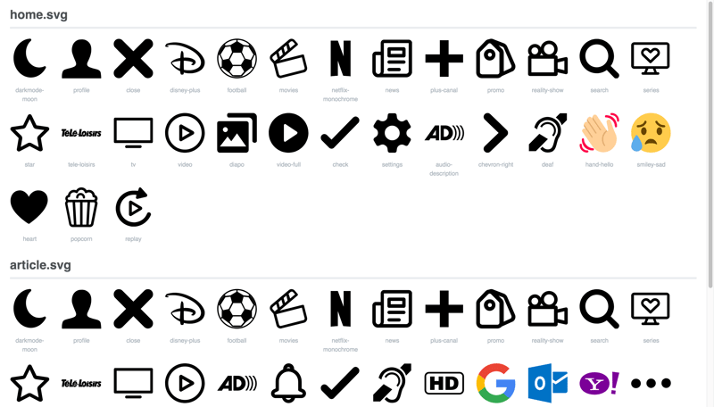
We use SVG files for icons to avoid HTTP requests and for their flexibility. Additionally, these icons are perfectly displayed no matter the pixel ratio; and animations can be done using CSS. To prevent icons from flickering during the page load, we use SVG sprites. Their content are inlined directly into the HTML. We are using the svg-chunk-webpack-plugin to automate the process of generating each sprites. Each page only imports its own svg sprite which has previously been optimized using svgo.
Responsive images
Users' screens are all different by sizes (watches, phones, tablets, laptops, desktops) and by pixel density (1x, 2x, 3x). Pictures made for a 1x pixel density can appear pixelated on devices with higher pixel density. Nomad devices generally have a slower connection. To provide the most suitable image format for any user, we need responsive images.
For images with the same ratio for all different breakpoints, the <img> tag, along with the srcset and size attributes are enough. For more complex use cases, the <picture> tag can be used, but it has the disadvantage of increasing the DOM size.
The following example displays an image that is compatible with different screen sizes, all formats (mobile, tablet and desktop), plus, the 1x and 2x pixel density.
<img src="image-64x90.jpg"
     sizes="(max-width: 750px) 64px, (max-width: 1023px) 64px, (min-width: 1024px) 64px"
     srcset="image-64x90.jpg 64w, image-128x180.jpg 128w"
     alt="My responsive image" />
Better accessibility
Accessibility is essential on websites. It provides a better experience for all users. We use tools like Google Lighthouse to generate analysis reports, they contain useful information to improve it.
Some rules can greatly improve the score:
- Use a minimum size for all links and buttons, along the
paddingproperty - Use
<h1|2|3|4|5|6>for titles - Use
<ul>or<ol>for lists - Use the
<a>for link and the<button>for elements with Javascript action - Add the
altattribute on images - Add the
titleattribute on links - Add the
aria-labelattribute on<button|a>without text - Adjust the contrast for the color of the design
- Respect HTML descendants (
ul>li)
Monitoring
To monitor performance, we use two different tools:
SpeedCurve to analyze daily several of our main pages. This allows us to detect different types of issues:
- Page load duration
- Page size
- Assets size
- Number of requests
- Lighthouse score
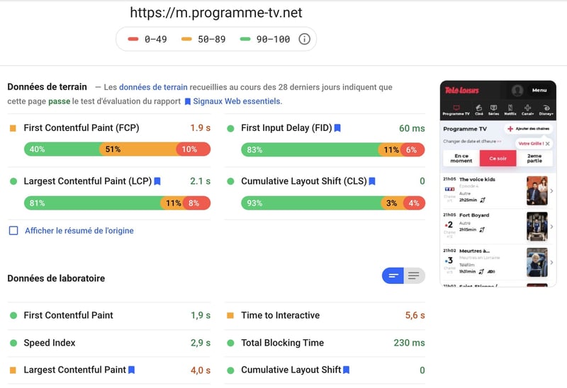
Google Page Speed Insights for occasional reports.
Rethinking CSS
CSS naming conventions
To improve maintainability and performance, we use a CSS naming convention: the flat hierarchy of selectors, inspired from BEM (Block Element Modifier) and FUN. CSS selectors are unique and shorter, which leads to smaller CSS files. To avoid class names that become too long quickly, we keep modifier classes independent from the block class name. In addition, the block class name and the element class name use the camelCase syntax with an hyphen as separator.
.blockName-elementName .modifier {}
CSS variables for theming (dark mode)
The dark mode applies a custom theme to the website. It works by adding a class name to the <html> element. Our first approach was to override existing styles with rules that had higher specificities. We quickly noticed that this approach had issues. One of them being a considerable increase of the size of CSS files.
We've switched to native CSS variables for theming. That way the size of our CSS files remains lighter even if they contain both light and dark mode styles. Below, an example of the background color of an header element being overridden by another color when the dark mode is enabled.
.darkMode .header {
    --backgroundColor: #1c1d42;
}

.header {
    --backgroundColor: #212121;
    background-color: var(--backgroundColor);
}
Support for IE11 had to be dropped to use native CSS variables and keep small CSS files. Otherwise the generated file would have duplicated all the CSS rules.
Code review
Team work are important part of our development processes. Code reviews helps improving the maintainability of a project, team spirit and allow everyone to increase theirs skills. To make the code review easier, merge requests needs to be small and their context needs to be respected. Merge requests are kept small which leads to a more efficient review.
Some of the rules we follow are listed in an article (in French) by @Julien Hatzig:
- Promote asynchronous reviews.
- Avoid making the review synchronous by asking for validation, but rather ask for a review of your work. This will put the reviewer in a better position which will leads to constructive feedback.
- Add a context with a description in the header of the merge request. The reviewer doesn't know the topic you worked on.
- Take the time to review other people's code.
- Be benevolent in exchanges, favor the conditional in sentences, suggest solutions, describe problems.
- Avoid sniper reviews.
- Comments are not negative for the developer, they stimulate discussion and lead to improvements. Discuss more when necessary to find the most suitable solution.
Additional reading

Posted on October 3, 2020
Join Our Newsletter. No Spam, Only the good stuff.
Sign up to receive the latest update from our blog.
