Setting up Dark Mode for Nuxt and Storybook via Tailwind CSS

Camillo Visini
Posted on December 29, 2020

This article reviews configuring dark mode via Tailwind CSS for Nuxt and Storybook. The following resources are used:
- Nuxt and Vue
- Color Mode module for Nuxt
- Storybook via Storybook module for Nuxt
- Dark Mode addon for Storybook
- Tailwind CSS via Tailwind CSS module for Nuxt
- Dark Mode Plugin for Tailwind CSS
The companion repository includes the complete configuration of all moving parts, demonstrated via the example of a simple Button component:
https://github.com/visini/nuxt-tailwind-storybook-dark-mode
Nuxt Color Mode – Enabling Dark Mode
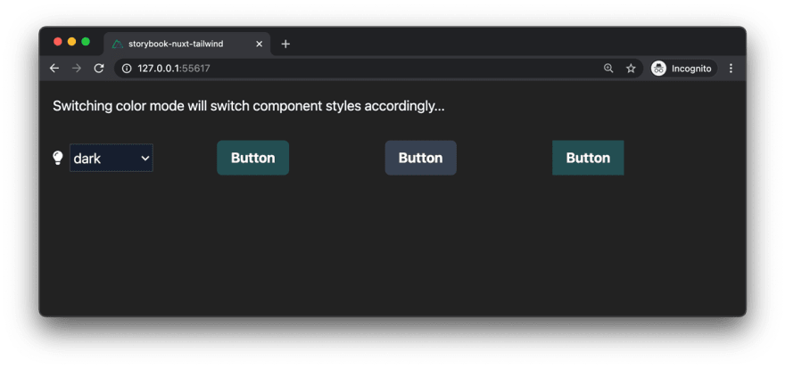
Color Mode module adds boilerplate-free and effortless color mode switching – including auto detection based on the system's color-mode preferences – to any Nuxt app. See this excellent walkthrough for a more thorough introduction.
Different color modes require different styling. Thus, every component needs to be configured with conditional styling for all supported color modes, which will be applied based on the user's selection.
In order to define global styles for dark mode, add the respective CSS declarations. For instance, specify white text on dark background for when dark mode is activated by the user:
@import "tailwindcss/base";
@import "tailwindcss/components";
@import "tailwindcss/utilities";

.dark {
  @apply bg-dark;
  @apply text-white;
}
Tailwind CSS utility classes based on props such as the component's variant can be dynamically computed within buttonClass() – for both light and dark mode. A base class provides fundamental styling scoped to the button component via @apply.
<template>
  <button class="base" :class="buttonClass">
    <slot name="text">{{ text }}</slot>
  </button>
</template>

<script>
export default {
  props: {
    variant: {
      type: String,
      default: "primary",
    },
    square: {
      type: Boolean,
      default: false,
    },
    text: {
      type: String,
      default: "Button",
    },
  },
  computed: {
    buttonClass() {
      const c = []
      // Square
      if (!this.square) {
        c.push("rounded-md")
      }
      // Variant
      if (this.variant === "primary") {
        c.push("bg-primary-500 hover:bg-primary-600")
        c.push("dark:bg-primary-900 dark-hover:bg-primary-800")
      } else if (this.variant === "secondary") {
        c.push("bg-gray-500 hover:bg-gray-600")
        c.push("dark:bg-gray-700 dark-hover:bg-gray-600")
      }
      return c.join(" ")
    },
  },
}
</script>

<style lang="postcss" scoped>
.base {
  @apply font-bold py-2 px-4 text-white;
}
</style>
Storybook Dark Mode – Component Library
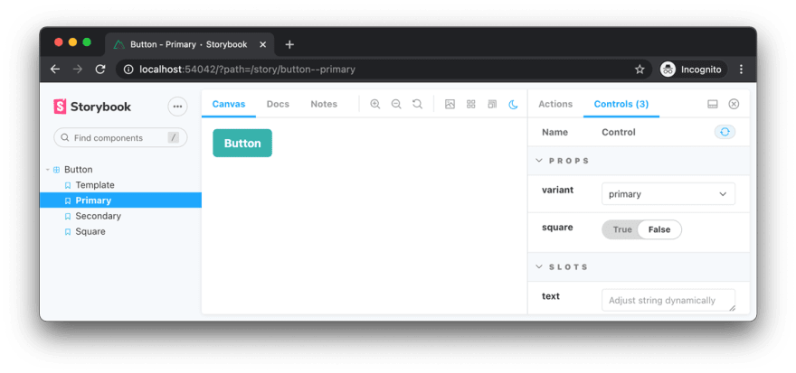
A third-party Dark Mode addon for Storybook allows switching both UI and component view between light and dark mode. Optional: Add argTypes to interact with a component's arguments dynamically via a graphical UI. See Storybook's control addon docs for more information. For instance, switch between rectangular and default (round) buttons by modifying component props via Storybook's UI.
import Button from "./Button"

export default {
  title: "Button",
  component: Button,
  argTypes: {
    variant: {
      control: {
        type: "select",
        options: ["primary", "secondary"],
      },
      defaultValue: "primary",
    },
    square: { control: "boolean" },
    text: {
      control: "text",
    },
  },
}

export const Template = (arg, { argTypes }) => ({
  components: { Button },
  props: Object.keys(argTypes),
  template: '<Button v-bind="$props" />',
})

export const Primary = Template.bind({})
Primary.args = {
  variant: "primary",
}

export const Secondary = Template.bind({})
Secondary.args = {
  variant: "secondary",
}

export const Square = Template.bind({})
Square.args = {
  square: true,
}
Adding dark mode support directly within Storybook enables effortless display of stories and components in both color modes – in the same way users would switch between modes – i.e., based on CSS class inheritance: A dark class is added to Dark Mode Plugin for Tailwind CSS to the <head> tag, while Color Mode module for Nuxt adds the dark class to the <html> tag.
The top right corner of the center toolbar enables switching between light and dark mode. This will switch the UI between color modes, and, as configured in the companion repository, at the same time modify the component view with a specified dark class, effectively simulating an user's color mode preference.
Optional – Tailwind Config Viewer
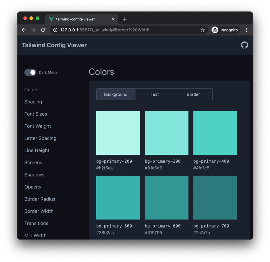
A useful tool for previewing your Tailwind CSS configuration is Tailwind Config Viewer, which is integrated into Nuxt's Tailwind CSS module since v3.4.0. Simply launch Nuxt in dev mode and access /_tailwind/ in your browser.
Conclusion
I hope this article proves insightful to anyone wanting to set up Nuxt with Tailwind CSS and Storybook. As shown here, supporting dark mode for component prototyping and design, and subsequent integration in your frontend app requires some additional tooling. See the companion repository for specific configuration of all moving parts. Let me know if you have suggestions – I'm curious to learn of alternative approaches!

Posted on December 29, 2020
Join Our Newsletter. No Spam, Only the good stuff.
Sign up to receive the latest update from our blog.


