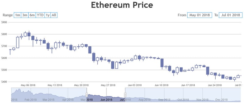
Easily Create StockCharts for your Dashboards using CanvasJS

Vishwas R
Posted on July 22, 2020
‘A picture is worth of thousand words; a chart is worth of thousand sets of data’
Data visualization has now risen to ubiquity in the realms of Business Intelligence and data journalism. All those infographics you see? Data visualization in action. Charts are usually used to analyze trends and patterns in data sets. Let's say you have been recording the sales figures in Excel for the past three years. Using charts, you can easily tell which year had the most sales and which year had the least. You can also draw charts to compare set targets against actual achievements.

While charts are used for analysis, few advanced features are required for stock data analysis – generally called as StockChart. This article briefs about how to create StockChart & customize it to match it with website theme.
Why to Choose CanvasJS StockCharts?
- Elegant Themes & Colors.
- Smooth Animations.
- Navigator, Slider.
- Range Selector.
- Multiple Charts (Panels / Panes) within a StockChart.
- Auto sync of tooltip & crosshair across multiple charts.
- Supports all major browsers including Chrome, Firefox, Safari, Opera, Edge, IE8+
- Runs smoothly across devices including iPhone, iPad, Desktop, Android Phones, etc.
- Easy customization options to match themes, colors & fonts of StockChart with Website.
How to Create StockChart?
- Download CanvasJS StockChart from their website.
- Include canvasjs.stock.min.js in your dashboard.
- Create StockChart, add dataPoints & render it.
var dataPoints = [];
var stockChartOptions = {
  charts: [{
    data: [{
      type: "spline",
      dataPoints: dataPoints
    }]
  }]
};
var stockChart = new CanvasJS.StockChart("stockChartContainer", stockChartOptions);

//Reading data from JSON
$.getJSON("https://api.npoint.io/5ac670dd66db71dffa1f", function(data) {
  for(var i = 0; i < data.length; i++){
    dataPoints.push({x: new Date(data[i].date), y: Number(data[i].close)});
  }
  stockChart.render();
});
Checkout live example @ StackBlitz.
Customizing StockChart
CanvasJS provides options to change the colors of data, title, labels and all other elements along with customizing font properties like font-family, font-size, font-color, font-weight. These customization options help in making StockChart match with dashboard font and color properties. Refer to their documentation for complete list of customization options available.
You can further have multiple charts (charts – as termed by the library which developers generally call as panels or panes) and synchronizes tooltip & crosshair across them automatically. Checkout this page for demo.

Posted on July 22, 2020
Join Our Newsletter. No Spam, Only the good stuff.
Sign up to receive the latest update from our blog.