Build a Password Strength Checker With Angular

Uzochukwu Eddie Odozi
Posted on June 15, 2019
In this post, we are going to create a simple form with password input field. We will then add a password strength checker functionality. We are going to add the following rules to the password input form. Password
- Must be at least 6 characters long
- Must contain at least one uppercase letter
- Must contain at least one lowercase letter
- Must contain at least one number
- Must contain at least one special character
We are going to validate each of the rules above using RegExp and then display some color bars to indicate how strong the password is. At the end of the post, we are going to see how to use
- Reactive Forms (In a simple way)
- Component interactions using @Input and @Output decorators
- Colors and bars to represent password strength
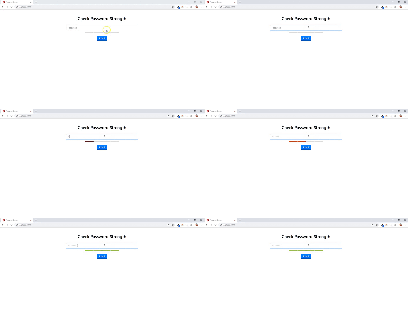
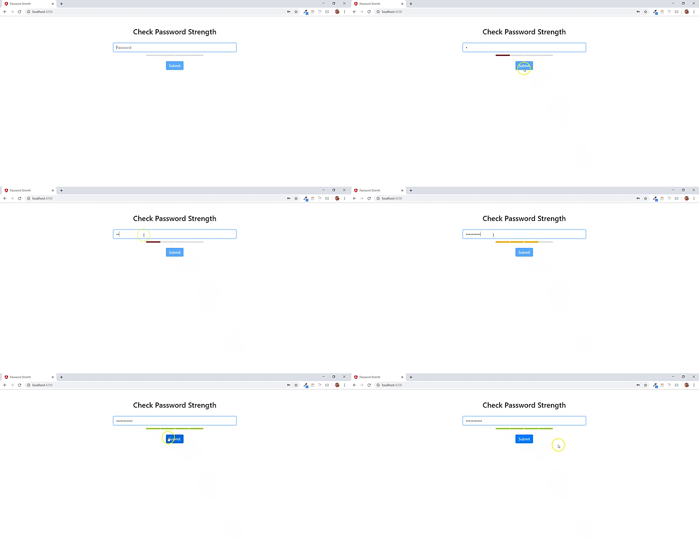
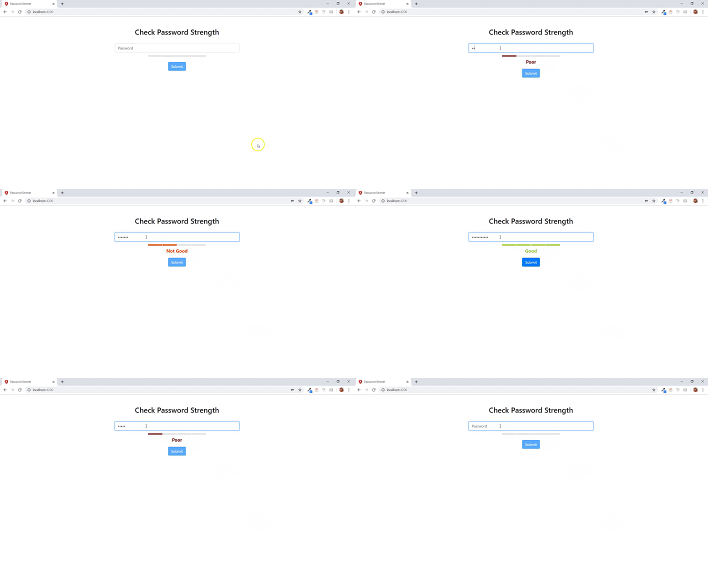
Here is how the final app will look like:
Getting Started
First, we are going to create a new project using the Angular CLI by running the command
ng new password-strength
In this application, there is no navigation so there is no need to add a routing file.
For simplicity sake, let us install bootstrap 4.
npm install bootstrap
Add this
@import '~bootstrap/dist/css/bootstrap.min.css';
to your styles.scss or styles.css file in the src directory of your project. Note that you can use any other library of your choice for styling the app.
If you are using yarn
yarn add bootstrap
Creating the Form
In the app.module.ts, add the import of ReactiveFormsModule
import { ReactiveFormsModule } from '@angular/forms';
Then add the ReactiveFormsModule into the imports array
imports: [
    BrowserModule,
    ReactiveFormsModule
]
You can use a Template Driven Form if you so choose. Here I decided to go with with Reactive Forms.
Now, in the app.component.html file, add the html template
<div class="container">
  <div class="row">
      <div class="col mt-5 col-xs-6 col-md-6 col-lg-6">
        <h2>Check Password Strength</h2>
        <br>
      <form>
        <div class="form-group">
          <input type="password" class="form-control" autocomplete="off" placeholder="Password">
        </div>
        <button type="submit" class="btn btn-primary">
          Submit
        </button>
      </form>
    </div>
  </div>
</div>
The form contains a password input field. The classes added to the div elements are from bootstrap 4.
In the app.component.scss or app.component.css depending on what you selected, add to the file
.col {
  margin: 0 auto;
  text-align: center;
}
To use a Reactive Form in Angular, we need to add a formGroup property to the form and then add a formControlName to the input field.
On the form, add
[formGroup]="passwordForm"
So the form looks something like
<form [formGroup]="passwordForm">
    ...
</form>
Also, on the password input field, add
formControlName="password"
Next, we need to initialize the Reactive form. In the app.component.ts file, add the imports
import { FormGroup, FormBuilder, Validators } from '@angular/forms';
The FormGroup tracks the state of the form-control elements. The FormBuilder helps to reduce the boilerplate required to create the form. Validators provides some set of built-in validators to be used. We are using the classes so we can initialize the form.
Create a property of type FormGroup.
passwordForm: FormGroup;
We need the construtor and ngOnInit methods. First, we need to implement the OnInit interface and then import from @angular/core. The export class line will become
export class AppComponent implements OnInit
Add both methods
constructor(private fb: FormBuilder) {}

ngOnInit() {
    this.passwordForm = this.fb.group({
        password: ['', Validators.required],
    });
}
In the constructor, the FormBuilder class is injected so that we can use methods available in the class. In the ngOnInit method, the passwordForm is initialized using the FormBuilder and then validating the password field. The key in the object inside the group method must match the formControlName in the template. The required validator is added to the input field. Now we have the form and the password field setup. We can now create a new component that will be used to display the password strength.
Password Strength Component
The password strength component which will be added as a child of the main component will be used to display some bars that will indicate the strength of the password the user types. As the user types into the password field, the bars will automatically be updated with different colors.
To create a new component, we run
ng generate component password-strength
This component will be automatically added to the app.module.ts file. In the password-strength.component.html file, add
<div class="strength">
  <ul class="strengthBar">
    <li class="point" [style.background-color]="bar0"></li>
    <li class="point" [style.background-color]="bar1"></li>
    <li class="point" [style.background-color]="bar2"></li>
    <li class="point" [style.background-color]="bar3"></li>
  </ul>
  <br>
</div>
Add these properties to the password-strength.component.ts file
bar0: string;
bar1: string;
bar2: string;
bar3: string;
In the styles file of the component, add
.strengthBar {
  display: inline;
  list-style: none;
  margin: 0;
  padding: 0;
  vertical-align: 2px;
}

.point:last-of-type {
  margin: 0 !important;
}

.point {
  background: #DDD;
  border-radius: 2px;
  display: inline-block;
  height: 5px;
  margin-right: 1px;
  width: 62px;
}

p {
  font-weight: bold;
  font-size: 20px;
}
Go to the app.component.html file and add the password-strength component as a child component by using the component selector name <app-password-strength></app-password-strength>. The component should be added after the password input field.
<div class="container">
  <div class="row">
      <div class="col mt-5 col-xs-6 col-md-6 col-lg-6">
        <h2>Check Password Strength</h2>
        <br>
      <form [formGroup]="passwordForm">
        <div class="form-group">
          <input type="password" class="form-control" formControlName="password" autocomplete="off" placeholder="Password">
          <app-password-strength></app-password-strength>
        </div>
        <button type="submit" class="btn btn-primary">
          Submit
        </button>
      </form>
    </div>
  </div>
</div>
The component consists of a div with ul and li tags. The li tags represent the bars on the page. As a user types into the input field, the color that will be specified in the component's class will be displayed. Once the password matches all specified characters, the color of all bars will become green.
Password Strength Functionality
The interaction between the parent and child component will be achieved using the @Input decorator. The password from the password form will be bound to an Input property coming from the password strength component. There are different ways whereby the data can be intercepted. We are going to intercept the data using the ngOnChanges method.
Let us create an input property called passwordToCheck
@Input() public passwordToCheck: string;
Then create an array of colors to be displayed on the bars. The number of colors in the array should match the number of bars in the component.
private colors = ['darkred', 'orangered', 'orange', 'yellowgreen'];
Now, let us create a method to check the strength of the password. Add the following code
checkStrength(p) {
// 1
let force = 0;
// 2
const regex = /[$-/:-?{-~!"^_@`\[\]]/g;
const lowerLetters = /[a-z]+/.test(p);
const upperLetters = /[A-Z]+/.test(p);
const numbers = /[0-9]+/.test(p);
const symbols = regex.test(p);
// 3
const flags = [lowerLetters, upperLetters, numbers, symbols];
// 4
let passedMatches = 0;
for (const flag of flags) {
passedMatches += flag === true ? 1 : 0;
}
// 5
force += 2 * p.length + ((p.length >= 10) ? 1 : 0);
force += passedMatches * 10;
// 6
force = (p.length <= 6) ? Math.min(force, 10) : force;
// 7
force = (passedMatches === 1) ? Math.min(force, 10) : force;
force = (passedMatches === 2) ? Math.min(force, 20) : force;
force = (passedMatches === 3) ? Math.min(force, 30) : force;
force = (passedMatches === 4) ? Math.min(force, 40) : force;
return force;
}
```
First, a property called force of type number is defined which is used as the return type of the method. The value assigned to the property will be used to determine the strength of the password. The 2nd part is where the regular expressions are defined. The regex of special characters, lowercase test, uppercase test, number test and regex test. The 3rd part is an array that contains the regular expressions to be used. In the 4th part, a property called `passedMatches` of type number is defined and its value is incremented inside the loop depending on the regular expression that is satisfied. So, if the first criteria in the flags array is met, the value of `passedMatches` is incremented by 1. If the second criteria is met, the current value is also incremented by 1 until all criterias are met. Otherwise, the value 0 is added. The 5th part checks if the password length is greater than 10 and then multiplies the `passedMatches` value by 10. The 6th part is where the length of the password (which needs to be at least 6 characters) is checked. The 7th part is where the final `force` value is set based on the value of `passedMatches`. Then the force value is returned.
Next we need to bind the `passwordToCheck` input property to the form password. Add `[passwordToCheck]="signupForm.value.password"` to the child component inside `app.component.html`.
```html
<app-password-strength [passwordToCheck]="signupForm.value.password"></app-password-strength>
```
The `passwordToCheck` is the `@Input` property defined in the password strength component. It is bound to the password value from the `formGroup`. So whatever value is stored in the password value field, it will be received in the child component.
Like i said earlier, there are multiple ways the password value can be intercepted in the child component. You can checkout out this [documentation](https://angular.io/guide/component-interaction#pass-data-from-parent-to-child-with-input-binding). We are going to be using the ngOnChanges method to intercept the changes.
Implement the `OnChanges` interface in the `PasswordStrengthComponent` class and then import the interface from `@angular/core`. Next is to add the method
```js
ngOnChanges(changes: { [propName: string]: SimpleChange }): void {
const password = changes.passwordToCheck.currentValue;
this.setBarColors(4, '#DDD');
if (password) {
const c = this.getColor(this.checkStrength(password));
this.setBarColors(c.index, c.color);
}
}
private getColor(s) {
let index = 0;
if (s === 10) {
index = 0;
} else if (s === 20) {
index = 1;
} else if (s === 30) {
index = 2;
} else if (s === 40) {
index = 3;
} else {
index = 4;
}
return {
index: index + 1,
color: this.colors[index]
};
}
private setBarColors(count, col) {
for (let n = 0; n < count; n++) {
this['bar' + n] = col;
}
}
```
The `ngOnChanges` method takes in property of type `SimpleChange`. In the SimpleChange property, we have the `passwordToCheck` input property which contains the password's currentValue. As the value changes, the password is intercepted by the ngOnChanges method. The `setBarColors` defined before the if statement is used to set a default color for the bars. If the password is available then the `getColor` method is called and it takes in the `checkStrength` which in turn takes the password as a parameter. Note that the `checkStrength` returns a number which is used in the `getColor`. The `setBarColors` is used to set the colors in the colors array on the bars.
In the `getColor` method, if the return value of the `checkStrength` is equal 10 then we set the index value to zero and so on. Then an object with the index and color is returned. Recall that the bars have a style property with a number appended to the name. E.g: `bar0, bar1, bar2, bar3`. The `setBarColors` is just used to set the colors from the array on the bars.

We can add more functionalities by displaying a message as the user types and also disabling the submit button unless the password is valid.
### Disable Button
To disable the submit button, we are going to use the `@Output` decorator to send data from child to parent. In this case from the password strength component to the main component.
Add this line to the password strength component class:
```js
@Output() passwordStrength = new EventEmitter<boolean>();
```
Add the `Output` interface and `EventEmiiter` to the `@angular/core` imports. The EventEmitter will emit a boolean value. In this case a true value when the password becomes valid and the emitted value will be used to enable the submit button.
In the `ngOnChanges` method, add the below line into the if statement
```js
const pwdStrength = this.checkStrength(password);
pwdStrength === 40 ? this.passwordStrength.emit(true) : this.passwordStrength.emit(false);
```
Here we are setting the return value of `checkStrength` method to a variable. Then using a ternary operator to emit a boolean value. If pwdStrength is equal to 40 then emit `true`. If the pwdStrength is less than 40 then emit `false`. The line is the same as
```js
if (pwdStrength === 40) {
this.passwordStrength.emit(true)
} else {
this.passwordStrength.emit(false)
}
```
The next step is to use this `@Output` eventemitter in the main component. In the component `<app-password-strength></app-password-strength>`, add
```js
(passwordStrength)="passwordValid($event)"
```
which then becomes
```html
<app-password-strength [passwordToCheck]="signupForm.value.password" (passwordStrength)="passwordValid($event)"></app-password-strength>
```
The `passwordStrength` is the output property while `passwordValid($event)` is a method that needs to be defined in the main class component. The `$event` property added as a parameter will contain the emitted boolean value.
Add a new property to the main component's class.
```js
passwordIsValid = false;
```
And also add the `passwordValid` method
```js
passwordValid(event) {
this.passwordIsValid = event;
}
```
The emitted value from the EventEmitter is set to the `passwordIsValid` property. We can now use this property to disable the button.
On the submit button, add `[disabled]="!passwordIsValid"`.
```html
<button type="submit" class="btn btn-primary" [disabled]="!passwordIsValid">
Submit
</button>
```
So if the value of `passwordIsValid` is false then the button will be disabled. When the password is valid, the button will be enabled on the page.

The last part to take care of is to add a message as the user types. Create two new variables
```js
msg: string;
msgColor: string;
```
in the password strength component class. Then add a `p` tag after the `ul` tag in the template with the `msg` varaible.
```html
<p [style.color]="msgColor">{{msg}}</p>
```
Inside the if statement in the `ngOnChanges` method, add this switch statement
```js
switch (pwdStrength) {
case 10:
this.msg = 'Poor';
break;
case 20:
this.msg = 'Not Good';
break;
case 30:
this.msg = 'Average';
break;
case 40:
this.msg = 'Good';
break;
}
```
If the `pwdStrength` is 10 then the msg is set equal to `Poor` and so on. So as the user types into the input field, the msg variable is updated. Also, we want to be able to clear the message if the user decides to clear the input field. So add an else part to the if statement and add
```js
this.msg = '';
```
If the input field is empty then the msg should be cleared. In the `getColor` method, add `this.msgColor = this.colors[index]` before the return statement. The method now becomes
```js
private getColor(s) {
...
this.msgColor = this.colors[index];
...
}
```

# Conclusion
So far we have been able to add the password strength functionality. We saw how to use Reactive Forms in Angular, @Input and @Output decorators for component interactions. You can add more regular expression validations to the password.
[Find the github repo for the sample app here](https://github.com/uzochukwueddie/password-strength).
If you are interested in more Angular related stuff, you can follow me [Twitter](https://twitter.com/uzochukwueddie) and also subscribe to my [YouTube channel](https://www.youtube.com/channel/UCqTEGhqVPcjfhs7_bQjnoRA/videos?view_as=subscriber).

Posted on June 15, 2019
Join Our Newsletter. No Spam, Only the good stuff.
Sign up to receive the latest update from our blog.


