Josefine Schfr
Posted on August 11, 2021

Web Accessibility is the decisive tool to make the internet a more inclusive place, it is absolutely crucial and benefits everyone - period. Sadly, the reality doesn’t yet reflect that, though - more often than not, accessibility seems like more of an afterthought. This is not only tragic on a humanitarian level but could also lose you money through fines and SEO shortcomings (to name only two of many reasons).
But what can we do about it?
I feel like accessibility is often overlooked, partly because there is no time, budget or resources to implement it. But partly also because it can be really daunting to address, especially if you have no or little previous experience with it. If you have read this far, I don’t have to convince you that you should care - You likely already do. So what can we do?
Maybe, this could be changed if we all talked a little more about what can be done to improve accessibility in straightforward terms.
What are your Accessibility quick wins?
Especially if time and resources are limited, where do you concentrate your efforts? Do you have any accessibility hacks to share? Things you wish you knew before? Let’s collect some ideas to make it easier for everyone to create more inclusive experiences online.
My top 3 1/2 things to improve accessibility
Among the first things that I like to check are for example the HTML structure : Making sure each element is wrapped in the correct semantic tag, that images have alt tags and forms have input labels and there are no empty links or buttons floating around the page.
I also find it handy to tab through the page and see whether the tab order works the way it is intended. This is absolutely crucial for people relying on their keyboard to navigate the web but as with most things accessibility, it benefits everyone. You can of course do this manually or use accessibility auditing tools (there are many options, I like working with taba11y which can help you visualize the page flow.)
It can also be very insightful to turn on a screen reader and navigate the page by keyboard only - you should become aware of many shortcomings this way quickly and can always use these outcomes as a base for further investigation.
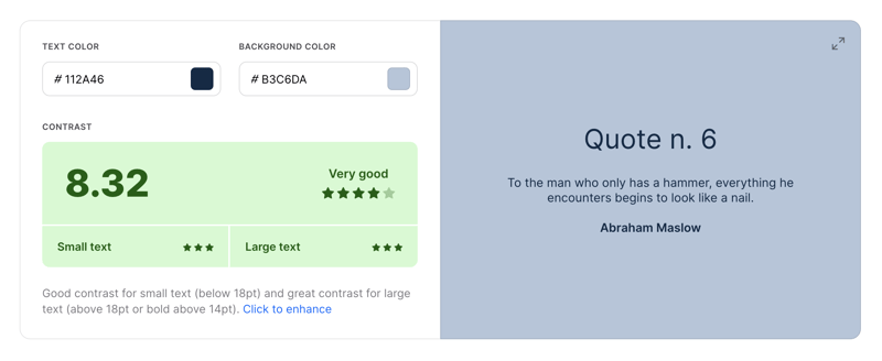
Another thing which can be done with relatively little effort is checking the color contrast ratio. There are a couple of handy tools (for example the Webaim contrast checker ) to help you make sure contrast is sufficient by WCAG standards.

Contrast Ratio checker making your life easier Tool by coolors.co
This of course is by no means an exhaustive list - it’s a place to start. Where do you usually start? What’s your favorite web a11y quick win? Any tips and experiences are highly appreciated - please feel free to share below :)
And keep in mind: in this case, 10% done is definitely better than 0 - it’s ok to start somewhere. Even if it’s not possible to make every single part 100% accessible, it might be better to get started than to wait for that magic moment when all problems can be solved equally.
In case you want to get started now and are still looking for some inspiration, here are three links to do so:
- Check out the tiny helpers web accessibility tools
- Browse around the different color contrast checkers presented by CSS Tricks
- Interested in specific components? Chances are, they are listed in Smashing Magazine’s extensive list of accessible frontend components

Posted on August 11, 2021
Join Our Newsletter. No Spam, Only the good stuff.
Sign up to receive the latest update from our blog.
