Updating your SvelteKit & Storyblok project (after the latest changes)

Josefine Schfr
Posted on August 23, 2022

The new version of SvelteKit brought along some much discussed (breaking) changes and required a little overhaul on many fronts - likely paving the way to release SvelteKit 1.0 (soon!?).
If you are interested in using Storyblok with Sveltekit, you might have stumbled across our new Ultimate Tutorial Series for Sveltekit (which now, a little sadly, has become outdated only a couple of days after publication). We will update this fully, once 1.0 is reached, don’t worry. In the meantime, let’s see what changes need to be made in order to work with SvelteKit and Storyblok.
SvelteKit & Storyblok
Let’s get started by installing the latest version of SvelteKit:
npm create svelte@latest your-app

cd your-app
npm install
npm run dev
You will be guided through the create svelte installation - of course these settings highly depend on your requirements, but for this tutorial, we are using the Skeleton app with ESLint & Prettier, no Typescript or Playwright.
After running npm run dev you should be able to see the basic starter app on localhost:5173.
To work with Storyblok V2, we'll have to set up a secure connection with HTTPS. We'll do so by installing the mkcert plugin and including it in our vite.config.js:
npm i vite-plugin-mkcert -D
vite.config.js:
import { sveltekit } from '@sveltejs/kit/vite';
import mkcert from 'vite-plugin-mkcert'

/** @type {import('vite').UserConfig} */
const config = {
    plugins: [sveltekit(), mkcert()],
    server: {
        https: true
    },
};

export default config;
Now in Storyblok, everything (except the localhost URL) stays the same as before:
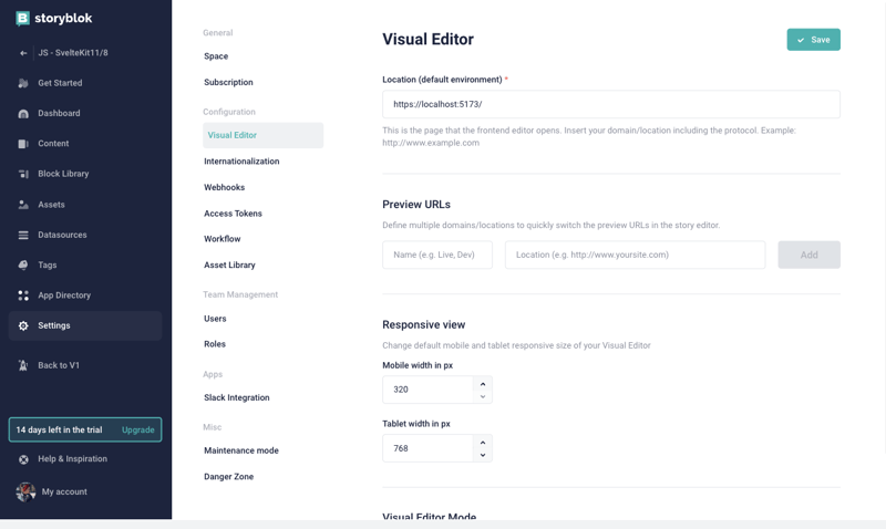
We'll create a new Space from scratch, give it a catchy name and head over to our Settings to change the default environment URL for the Visual Editor to https://localhost:5173/.
In the Visual Editor configuration, you can set the real path to "/". Now you should be able to see your localhost in the Visual Editor.
Next, let's install Storyblok with the Storyblok Svelte SDK:
npm install @storyblok/svelte
Awesome 🎉
From here, things get really exciting:
Connecting Storyblok to SvelteKit
Now we can create a +page.js file to initialize our library, add the API Plugin and the access token to our space. Before, this was done in the __layout.svelte. Note the new + sign indicating that a new route is created.
import { storyblokInit, apiPlugin } from "@storyblok/svelte";


storyblokInit({
    accessToken: "your-access-token",
    use: [apiPlugin]
});
Here, you can add your access token with you can retrieve from the settings tab in your Storyblok Space.
Next, we'll fetch the content using the useStoryblokAPI - before, this was done in index.svelte, but now we can actually do it in the same +page.js, because we need this data loaded before we can actually render the page:
/** @type {import('./$types').PageLoad} */
export async function load() {

    const storyblokApi = useStoryblokApi();
    const { data } = await storyblokApi.get("cdn/stories/home", {
        version: "draft",
    });
    return {
        story: data.story
    }
}
Now to listen to our changes from the Visual Editor, we need to set up the the Storyblok Bridge. With the Storyblok Bridge, we'll be able to see our changes in real-time. For this, we'll create a +page.svelte file and import our useStoryblokBridge and StoryblokComponent from storyblok/svelte.
 <script>
    import { onMount } from "svelte";
    import { useStoryblokBridge, StoryblokComponent } from "@storyblok/svelte";

    export let data;

    onMount(() => {
        useStoryblokBridge(
            data.story.id,
            (newStory) => (data.story = newStory)
        );
    });
</script>

<div>
    {#if data.story}
        <StoryblokComponent blok={data.story.content} />
    {/if}
</div>
And that's basically it 🔥
Now that we have connected our SvelteKit App with Storyblok, let's add some components to represent our default Bloks Grid, Page, Feature & Teaser:
Page.svelte
<script>
    import { storyblokEditable, StoryblokComponent } from '@storyblok/svelte';

    export let blok;
</script>

{#key blok}
    <div use:storyblokEditable={blok} class="px-6">
        {#each blok.body as blok}
            <StoryblokComponent {blok} />
        {/each}
    </div>
{/key}
Grid.svelte
<script>
    import { storyblokEditable, StoryblokComponent } from '@storyblok/svelte';

    export let blok;
</script>

<div
    use:storyblokEditable={blok}
    class="container mx-auto grid md:grid-cols-3 gap-16 place-items-center"
>
    {#each blok.columns as blok}
        <div class="flex-auto px-6">
            <StoryblokComponent {blok} />
        </div>
    {/each}
</div>
Feature.svelte
<script>
    import { storyblokEditable } from '@storyblok/svelte';

    export let blok;
</script>

<div use:storyblokEditable={blok} class="w-full p-12 bg-[#f7f6fd] rounded-[5px] text-center">
    <h1 class="text-2xl text-[#1d243d] font-bold">{blok.name}</h1>
</div>
Teaser.svelte
<script>
    import { storyblokEditable } from '@storyblok/svelte';

    export let blok;
</script>

<div use:storyblokEditable={blok} class="py-32 text-6xl text-[#50b0ae] font-bold text-center">
    {blok.headline}
</div>
To be able to see our Tailwind styles, we are adding a script tag in our app.html:
<script src="https://cdn.tailwindcss.com"></script>
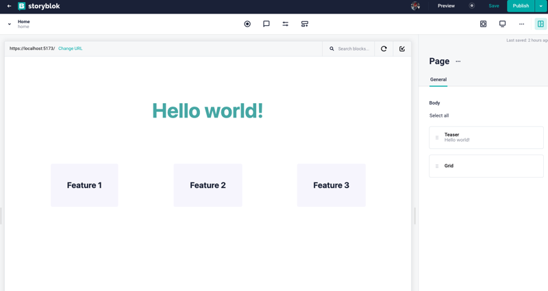
Now your Components should be visible in all their glory in your visual editor:
Yay, great job! 🎉
This is still a work in progress was we are adapting to the latest changes in Sveltekit - but we'd love to hear what you think! What was your experience migrating your Storyblok & Sveltekit project to the latest version?

Posted on August 23, 2022
Join Our Newsletter. No Spam, Only the good stuff.
Sign up to receive the latest update from our blog.

