6 Outstanding Status Page Examples to Inspire You in 2023

Eduardo Messuti
Posted on October 30, 2023

We're StatusPal. We help you effectively communicate to customers and stakeholders during incidents and maintenance with a super-charged hosted status page. Check us out—your status page can be up and running in minutes
In the digital landscape of 2023, transparency and communication are pivotal pillars for building and maintaining trust with your user base. As your online operations expand, so does the imperative for clear, transparent, and proactive incident communication.
A well-designed status page not only keeps your users informed during downtimes or technical issues but also reinforces your brand’s commitment to openness and quality service.
To spark your inspiration, we’ve curated a list of six outstanding status page examples that have set a high bar on incident communication. These exemplars demonstrate a variety of key components which separate them from the pack.
- Fly.io - Clean layout for global incidents, links to private status page for customers.
- Soracom - Embedded information notices.
- Okta - Simplicity and audience-specific restrictions.
- Finmatics - Nice header customization with multi-language.
- Auth0 - Simple design with access to private cloud status.
- KVK - Minimal design with scheduled maintenance & multi-language.
1. Fly.io
Let's start off with Fly.io's status page. They present a simple public status page showcasing each component with its available regions grouped inside so customers can subscribe to the service and region they care about.
What Fly.io does particularly well, however, is their audience-specific status pages, or "personalized status," as they call it. They make them available directly as part of their customer's dashboard and will only display issues specific to each customer's services in use, making it unambiguously clear when an incident affects a given customer.
Since we are users of Fly.io ourselves, we can show you what the personalized status pages look like from Fly.io's dashboard:
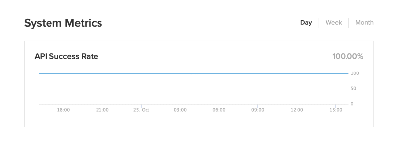
Lastly, they also showcase their API success rate in a custom metric at the bottom, which is a nice touch for building trust.
2. Soracom
Soracom's status page does a great job of customizing its header design according to its branding.
What's also very interesting about Soracom's status page is its use of information notices to communicate important information regarding its systems, so not only do they communicate about incidents and maintenance, but also information events.
We've seen these types of information notices used more and more to communicate product updates, and system changes that don't affect status.
3. Okta
Okta does a great job at communicating the status of all its services at a glance in a compacted status panel. They also showcase the 30-day history of their incidents in a nicely formatted timeline view.
They also support signing in as administrators for customers to get access to status reports specific to their organizations.
How Okta status page can do better
We do see a small detail that Okta could improve. They could include more notification channels like Webhook, Slack, SMS, or at least emails. Currently, they only support RSS feeds, which is better than nothing 🤷♂️.
4. Finmatics
Finmatics enhances its status page by combining branding and functionality. The branded header immediately grabs attention with its clean design and color scheme, establishing a professional tone for the page.
Furthermore, they also implement multi-language support, allowing their customers to switch from English to German in one click. These languages will also be supported when sending status notifications over Email and RSS, which it supports.
5. Auth0
Besides the Auth0 status page's nice and minimalistic branded header and footer, there are a few outstanding components to Auth0's status page we'd like to highlight:
Region selector
Auth0 status page displays a global status indicator while also allowing you to select each region in order to display the full status report on them. This is an excellent approach for when the number of services is too large to display all the services in each region at once.
Private cloud login
Auth0 allows users to authenticate directly with their platform credentials to access their audience-specific private status page. If you don't have any, as I do, you'll see a message saying, "No Private Cloud Environments Found."
Environment selector
Auth0 also lets you select from different environments like "Preview" and "Production." This is extremely useful as teams working to integrate Auth0 will regularly use the Preview environment and could also be affected by downtimes and degradation. This way, they can know when this is the case.
6. KVK
KVK (the Chamber of Commerce in the Netherlands) does a great job of communicating recurring maintenance events on its status page. Letting their customers know about upcoming maintenance windows ahead of time.
They also have nicely branded header and footer customization and communicate their incident notifications in English as well as Dutch thanks to nicely placed links at their header.
Conclusion
The digital world is constantly changing, but the principles of transparency, communication, and customer trust remain constant. These six exemplary status pages demonstrate that a carefully designed status page is more than just a technical requirement. It serves as a powerful channel for embodying a brand's values, building user trust, and facilitating seamless communication.
Whether it’s the clean and personalized approach of Fly.io, the informative notices of Soracom, the straightforward design of Okta, the multilingual and metrics-driven layout of Finmatics, the region and environment selection of Auth0, or the bilingual communication of KVK—there is a diverse range of ideas to inspire your own status page endeavors.
Configure your own hosted status page—with support for any of the outstanding components discussed above—in two minutes at StatusPal.io 🚀.

Posted on October 30, 2023
Join Our Newsletter. No Spam, Only the good stuff.
Sign up to receive the latest update from our blog.


