Sofia Tarhonska
Posted on September 2, 2022

For a lot of folks out there, HTML on its own is boring, after all, nothing is exciting when there is no color in it. Now add some Cascading Style Sheets (CSS) either to your web page or an email, and things are colorful, engaging, and begin to stand out.
But dealing with HTML email building that has CSS in it can be tricky due to the way email clients “read the code”. In this article, we will go over the main principles of using CSS in emails and take a look at some examples that demonstrate how to do so.
CSS for HTML emails: Why is it so important?
Before we plunge deeper into examining the types of CSS that exist, reviewing the examples, and how to use CSS in emails, it’s important to understand why even use it and the impact it has.
Branding aspect
When it comes to branding colors, they play a huge role in having a consistent look that influences recognition. If you were asked to draw Pepsi’s logo from memory, chances are you’d struggle a bit with getting the shape of that white line right. But if you were given a pallet of colors and asked to select the colors that are present in the logo, you’d have no trouble quickly selecting the signature red, blue, and white. The same principle applies to companies’ emails, especially marketing ones.
Responsive design
Although, in emails, it goes even beyond the colors. It’s also the layout of the content that needs to be consistent on every device the user is viewing it from and dynamic so it raises engagement. The good news is that web development has come a long way and today CSS is written with a Responsive Web Design (RWD) approach. Meaning that any responsive email will automatically adjust in appearance based on the device used to read it and the styles are all set in one just one place. Instead of having a chunk of code for each size range.
Better conversion
By using CSS it’s possible to make a set of email templates that can act as “packaging” for your product. However, besides setting the general style and tone that is consistent with your brand, using CTA buttons, visual hierarchy and simple CSS animation in emails can be a great way to prompt the reader to make a favorable action that brings measurable results. As an example, let’s take a look at this Evernote marketing email that does an excellent job with the CTA buttons and the general design.
Can you avoid using CSS for HTML emails?
A plain HTML email that only has text in it and no CSS can definitely be done. But why? The size of an email with CSS in it might be slightly larger but not to a point where it has any effect on deliverability or any other aspect related to it. What is possible is to minimize using CSS, for example, if it’s a simple transaction or confirmation email with the sole purpose of delivering information and minimal or no action from the user is required. In fact, this is what a lot of companies out there do and market data shows that simple confirmation emails have high engagement and click rates. On average, the open rate is 65% and 17% for clicks, making confirmation emails a great venue to promote additional services or products a company is offering.
Instead of figuring out when and where to avoid using CSS, a more accurate question would be “How to use CSS in emails?”. Let’s take a look at the type of CSS and which one is best for emails.
Inline, Embedded, or External CSS for emails?
The style of a web page can be written with CSS in three ways, external, embedded, and inline. Each method is good for different purposes and slightly varies. Let’s take a closer look at each one.
External CSS
The advantage of external CSS is that it allows you to make changes in one place and every connected HTML page will update automatically. The separate .css file is connected in the <head> </head> tags of the main HTML document via a <link> tag.
For websites, this works just fine but for an email that uses an SMTP server, this will not work. Apart from ease of maintenance, this method also positively affects the load speed of a page. A .css file can be stored on the same server as the rest of the files that make up the website, but certain parts like third-party packages or Google fonts that are present in the file can be pulled from a separate server. But since this is not the case with emails, a different type of CSS is needed.
Internal or Embedded
Another frequently used CSS type is embedded or also known as internal. With this method, the actual style code is placed directly in the HTML file’s <head> </head> tags. However, email client CSS support for the embedded method is still limited despite most of them being updated after 2016 to support it. The issue is that globally many users still use either older versions of email clients or those that still don’t have the support and remove the <head> and <style> tags, thus causing errors for an email to be displayed properly.
Inline
With the first two methods not being the most optimal for emails, it leaves us with inline CSS. An HTML email with inline CSS virtually causes no rendering issues for email clients.
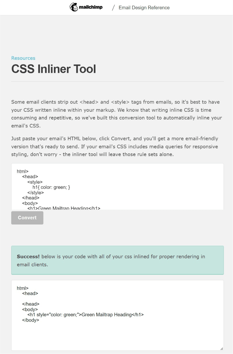
Now generally, inline CSS is a “bad idea” since it lacks reusability, limits the use of selectors, has poor readability, and is hard to maintain. On top of all of this, inline CSS takes up developers’ time since it requires you to style each HTML element separately. The best solution for this hurdle is using an inliner tool that does the conversion and saves time. Here is an example of an embedded CSS:
<html>
    <head>
        <style>
            h1{ color: green; }
        </style>
    </head>
    <body>
        <h1>Green Mailtrap Heading</h1>
    </body>
</html>
And this is how the inliner tool converts it:
<h1 style="color:green;">Green Mailtrap Heading</h1>
Top HTML and CSS email development tools
Developing an email that renders just fine on all devices by all email clients is a giant task, and using some of the available tools on the market will definitely help you.
Mailchimp CSS Inliner
This simple yet convenient and effective tool from Mailchimp allows you to paste the embedded CSS in one window and get an email-friendly inline version in another. Additionally, the conversion tool leaves any media queries for responsive design untouched.
Responsive Email CSS Inliner
Another tool worth mentioning is the Responsive Email CSS Inliner by HTML Email. Just like other conversion tools, this inliner works similarly by reading your embedded CSS in one window and making it inline in another. The feature that makes it stand out from the rest is that it also has a third window that demonstrates what the actual email would look like, both on mobile and desktop. Additionally, there is an option to download a .html file of the email. Since the tool is powered by Juice, an open-source project, it can also be easily integrated into your Node.js projects and works in client JavaScript.
Litmus Builder
Litmus Builder is not a standalone inliner tool but rather a code editor that developers particularly use to design and develop emails. The editor has an impressive list of functions, one of them being an inliner. Another handy feature, that the code editor has, is the ability to automatically sync code directly with your Email Service Provider (ESP).
Mailtrap Email Sandbox: Test your CSS for email client support
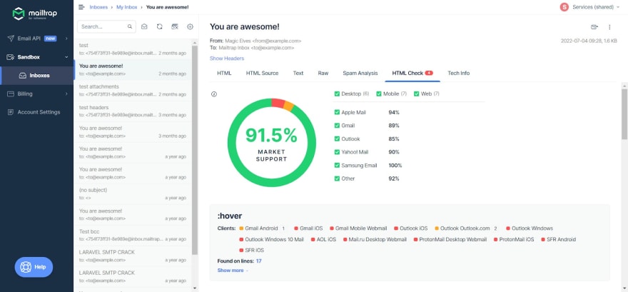
Developing emails is one thing, but what you also want to do is test them before sending them out. This is exactly where our own Email Sandbox comes in and simplifies the entire email testing process. Our time-saving Sandbox acts as a safe environment that allows developers to catch emails from staging to preview, analyze content and generate a comprehensive spam report, and of course, includes an HTML & CSS Email Checker.
Using the HTML & CSS Email Checker a verification is done by an algorithm that indicates the degree of email support for desktop, mobile, and web email clients. Besides the overall market support score, it’s possible to dive deeper and see which CSS selectors and HTML tags from your code are either fully, partially, or not supported at all by top email clients.
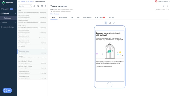
In case there is an element or a tag that is not supported, then you can correct the email code, resend it and see a preview of how the new email would render on a desktop or mobile device.
To wrap up
Crafting HTML and CSS emails can be quite a challenge, especially if you’re just starting your journey as a developer. But it doesn’t have to be if you enjoy the process and use the right tools to craft those emails. We hope this guide will help you develop better emails and save you time in coding them the right way.
I hope you enjoyed reading our guide on CSS in emails, which was originally published in the Mailtrap Blog by Denys Kontorskyy.

Posted on September 2, 2022
Join Our Newsletter. No Spam, Only the good stuff.
Sign up to receive the latest update from our blog.


