Dharmen Shah
Posted on February 20, 2020

This article was originally published on blog.shhdharmen.me
TL;DR
I have created a repo called bootstrap-checkbox. You can simply get started from that, files to check for are: src\styles\abstracts\_functions.scss, src\styles\abstracts\_variables.scss, src\styles\components\_checkbox.scss and src\styles\components\_radio.scss.
You can see the final output at https://shhdharmen.github.io/bootstrap-checkbox/ which will look like below:
Bootstrap
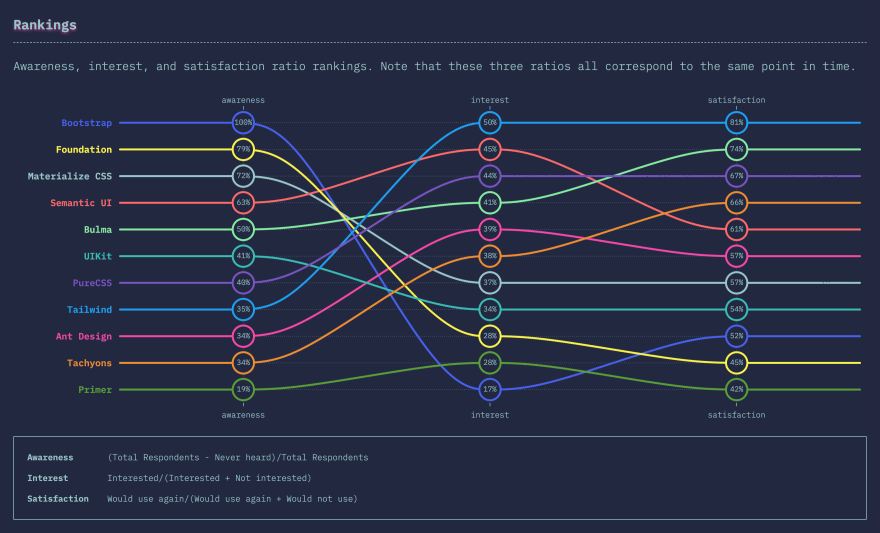
Bootstrap, I use it, you use and I guess every web developer must have used it in their career. In fact, according to State of CSS 2019, Bootstrap is the framework which has most awareness among developers.
Feature
I have used Bootstrap for last 4-5 years. The main feature that I look forward each time is, theming. By theming, I am not referring to only colors and typographics, I also need to change how buttons, checkboxes, radios, cards (and their shadows) look. Thanks to Bootstrap's SASS implementation, it has been really easy to achieve such things.
Let's talk business.
Custom checkboxes and radios
We are going to use an existing project for this, which provides all the needed setup and functionalities to get started very quickly.
1. Fork the project and complete initial setup
So, first, fork bootstrap-theme-kit repo and complete its getting started guide, now you've browser open at 3000 port.
2. HTML Content
You can simply replace all body content in html file, with below:
<!-- keep head tag as it is -->
<body>
  <div class="container">
    <div class="col-sm-12 col-md-12 mb-5">
      <p class="text-gray">Checkbox</p>
      <div class="custom-control custom-checkbox">
        <input type="checkbox" class="custom-control-input" id="customCheck1" />
        <label class="custom-control-label" for="customCheck1"
          >Check this custom checkbox</label
        >
      </div>
      <div class="custom-control custom-checkbox mb-5">
        <input
          type="checkbox"
          class="custom-control-input"
          id="customCheck2"
          checked
        />
        <label class="custom-control-label" for="customCheck2"
          >Or this one</label
        >
      </div>
      <p class="text-gray">Radios</p>
      <div class="custom-control custom-radio">
        <input
          type="radio"
          id="customRadio1"
          name="customRadio"
          class="custom-control-input"
          checked
        />
        <label class="custom-control-label" for="customRadio1"
          >Toggle this custom radio</label
        >
      </div>
      <div class="custom-control custom-radio">
        <input
          type="radio"
          id="customRadio2"
          name="customRadio"
          class="custom-control-input"
        />
        <label class="custom-control-label" for="customRadio2"
          >Or toggle this other custom radio</label
        >
      </div>
    </div>
  </div>
  <script type="text/javascript" src="js/bundle.js"></script>
</body>
3. SCSS
Let's edit our style files.
3.1 Functions
We will need one function, let's add it in src\styles\abstracts\_functions.scss:
// src\styles\abstracts\_functions.scss

@function str-replace($string, $search, $replace: "") {
  $index: str-index($string, $search);

  @if $index {
    @return str-slice($string, 1, $index - 1) + $replace + str-replace(str-slice($string, $index +
            str-length($search)), $search, $replace);
  }

  @return $string;
}
From code it's pretty clear that it can used to find replace.
3.2 Variables
Bootstrap handles everything through scss variables. So, to modify look and feel, we need to handle those variables in src\styles\abstracts\_variables.scss. Let's replace it's content:
// src\styles\abstracts\_variables.scss

// 1. Colors

$primary: #ea1c2b;
$white: #ffffff;
$dark: #000000;

// 2. Custom form control

$custom-control-indicator-size: 1.25rem;
$custom-control-indicator-border-color: $dark;
$custom-control-indicator-border-width: 0.125rem;
$custom-control-indicator-checked-color: $white;
$custom-control-indicator-checked-bg: $primary;
$custom-control-indicator-checked-border-color: $primary;
$custom-forms-transition: background-color 0.15s ease-in-out, border-color 0.15s
    ease-in-out, box-shadow 0.15s ease-in-out, background-size 5s ease-in-out;

// 3. Checkbox
$custom-checkbox-indicator-border-radius: 0.125rem;
$custom-checkbox-indicator-icon-checked: str-replace(
  url("data:image/svg+xml,%3csvg xmlns='http://www.w3.org/2000/svg' viewBox='0 0 24 24' %3e%3cpath fill='#{$custom-control-indicator-checked-color}' d='M21,7L9,19L3.5,13.5L4.91,12.09L9,16.17L19.59,5.59L21,7Z'/%3e%3c/svg%3e"),
  "#",
  "%23"
);

// 4. Radio

// 4.1 new variables
$custom-radio-indicator-icon-checked-color: $primary;
$custom-radio-checked-background-color: $white;

$custom-radio-indicator-icon-checked: url("data:image/svg+xml,<svg xmlns='http://www.w3.org/2000/svg' width='12' height='12' viewBox='-4 -4 8 8'><circle r='3' fill='#{$custom-radio-indicator-icon-checked-color}'/></svg>");
Let's see what's happening above:
- Colors - These are set of colors which will be used by bootstrap. You can change the colors with your choice, and whole theme will be changed.
- Custom Form Control - Bootstrap has Custom Form Controls for more customizations and cross browser consistency. We have modified related variables to achieve desired output.
- Checkbox - This variables are just related to checkbox. Note how we easily changed the icon for checkmark. Here we have also utilized
str-replacefunction fromsrc\styles\abstracts\_functions.scss, so that it gives us url friendly string. - Radio - As bootstrap uses common custom form control variables for both, checkbox and radio, we had to introduce 2 new variables for our need. Also note the easiness of changing the icon for checkmark.
3.3 Checkbox
To finally give a last touch-up, we need to change content of src\styles\components\_checkbox.scss with below:
// src\styles\components\_checkbox.scss

.custom-checkbox {
    .custom-control-label {
        &::before {
            border-width: 2px;
            border-radius: 2px;
        }

        &::after {
            transition: background-size 0.15s ease-in-out;
            background-repeat: no-repeat;
            background-position-y: center;
            background-position-x: 50%;
            background-size: 0%;
        }
    }

    .custom-control-input:checked {
        &~.custom-control-label {
            &::after {
                transition: background-size 0.15s ease-in-out;
                background-size: 100%;
            }
        }
    }

}
You can clearly see that we have optimized transition effects to give nice animation effects.
3.4 Radio
// src\styles\components\_radio.scss

.custom-radio {
    .custom-control-label {
        &::after {
            transition: background-size 0.15s ease-in-out;
            background-size: 0%;
        }
    }

    .custom-control-input:checked {
        &~.custom-control-label {
            &::before {
                background-color: $custom-radio-checked-background-color;
            }

            &::after {
                transition: background-size 0.15s ease-in-out;
                background-size: 80%;
            }
        }
    }
}
3.5 Order
Now, we have changed the files. but, order of import is also very important. If you have cloned bootstrap-theme-kit and started the project, you're good to. Otherwise, please make sure you have following order of import in your main scss file:
- functions
- variables
- checkbox
- radio
4. Output
You can see the final output at https://shhdharmen.github.io/bootstrap-checkbox/.
Conclusion
We saw how easy it is to change look and feel of checkboxes and radio buttons in bootstrap, thanks to it's sass implementation. Let me know how you've utilized bootstrap's themes using sass/scss variables/function/mixins in your project. And if you want to start now, bootstrap-theme-kit will surely come handy.
You can reach out to me on twitter @shhdharmen and on github shhdharmen.
Credit
A special thanks to https://undraw.co/ for cover image.

Posted on February 20, 2020
Join Our Newsletter. No Spam, Only the good stuff.
Sign up to receive the latest update from our blog.

