Leading a UI design team as a developer

Seva
Posted on October 1, 2022

This article is for those responsible for the frontend of a web app, particularly building the UI.
Managing the launch of a new app takes a lot of coordination. When I became responsible for managing a design team, I had to put together a framework to help our team collaborate efficiently. Therefore, I want to share my own experience in order to help you successfully launch your web app project.
Who am I?
I'm a frontend developer with UX & UI design background. Usually, I work on the designs I'll eventually develop. My combined experience helps me understand designers and developers and manage their collaboration smoothly.
Teamwork framework
For the project to be successful, you will need to establish a framework for collaboration between the designers and developers. Let's build a framework from scratch.
Firstly, we must define two things:
- What will the result of the design work look like?
- What tasks do the designers need to understand so they can complete them correctly?
In other words, we are going to define the input and output of the design tasks.
Design tasks output
The purpose of the design is to help the developers to build the product. That's it. The design itself is useless because it doesn't deliver anything to the user, the developed app does. However, defining the UI design is an important first step in the process. That means the output of the designer's work is a defined task for the developers. The most obvious solution for this is a Figma Prototype.
Design tasks input
Since we know the output now, let's define the input: what do designers need to create a prototype?
Note: Keep in mind that you, not the designers, have to write the technical requirements of the development task. You're a developer, aren't you?
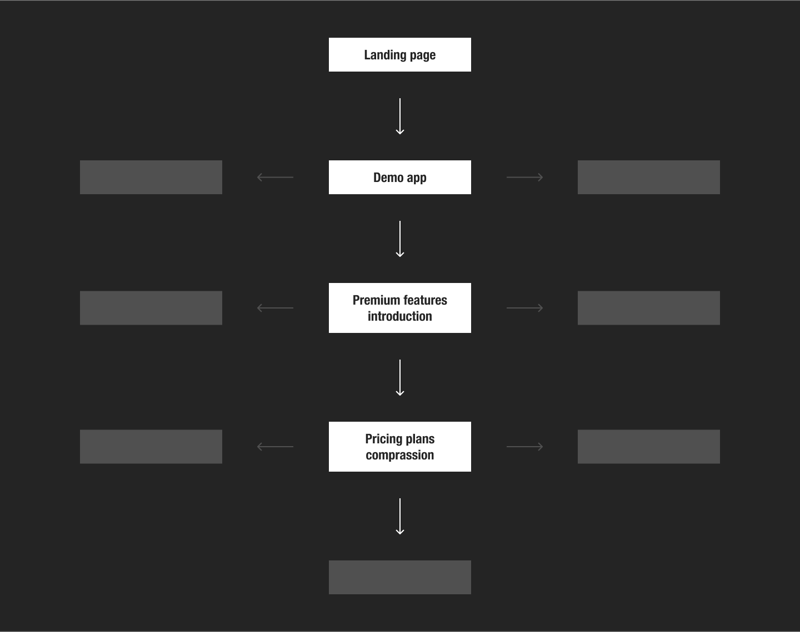
Before UI designers start working on the visuals, you (or the UX designer, or lead designer, etc.) have to define the User Flow for all of them.
User Flow is a path a user will take in an application to complete a task, typically displayed as a chart or a diagram.
Usually, it means a single path, but I include all of these paths in a single scheme.
Then I have a call with the designers to ensure they understand the whole picture (the User Flow might require adjustments during the team review). Another purpose of the meeting is to split the User Flow into assignments. Once we describe the task cards, we go through them and decide who will be responsible for each.
Make sure each task card on your board includes a checklist that defines what users must be able to accomplish via that feature.
Summing up, the input of the designer's work is a User Flow.
Design sprint
Congratulations. The tasks board is defined are the responsibilities are split. But the work isn't done yet.
From this point, you'll have regular calls to check in on everyone's tasks, suggest ideas for each other's assignments, and offer feedback to colleagues.
It doesn't mean everyone has to bring something ready for each call. Sometimes the better option is to sketch ideas and improve them iteratively.
Note: Sometimes creatives dive deeply into the assignment and design much more than the developers are expected to implement. In most cases, it's better to design the feature well, not perfect. There's always room for improvement, but time is limited, so we must spend it carefully. You can enhance the UI after getting the user's feedback. Your responsibility is to keep designers aware of that. But be careful to never throw the designer's ideas into the trash. You should start a backlog and revisit the designer's postponed concepts later in the project, when it may be more appropriate to implement their ideas.
Let's say the designers are ready. Everyone's done a Figma Prototype of their assignments.
Now it's time to describe the design to the developers
Ask every designer to explain their ideas in a development task card.
Note: Sometimes, a text description of the designer's idea is more straightforward than a prototype. If the designer can precisely explain their idea with words or/and gestures, don't force them to spend time on moving pixels.
For developers to do their job smoothly, check if the design meets the following requirements:
- All the grids and layouts are precise.
- There are no random colors or font sizes (e.g., the design's primary font size is 16px, but they're also 15px and 17px)
- All the new elements are transformed into Figma components.
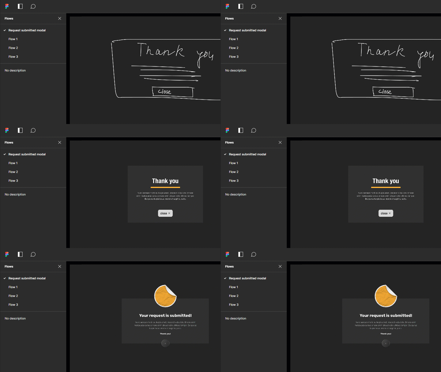
- There's a Figma Flow for each of the tasks.
If a designer hasn't provided enough description for a feature, let the developer do it the easiest way. For example, if the hover state of a button is missing, let the developer code any hover effect of their choice. If the developer's implementation is inconvenient from the design perspective, it's the designer's charge to provide a hover effect for the following sprint.
Agile Design
Now developers are starting to work on their tasks, the designers can begin with the next ones.
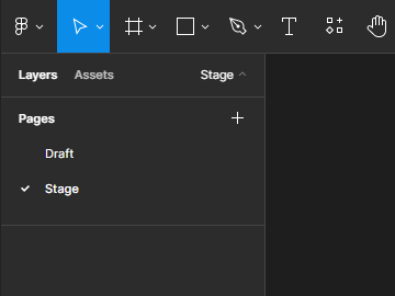
I recommend splitting the design workspace into two parts:
- Draft
- Stage
During the design sprint, the creatives work in Draft. Once the sprint ends, the result of their work moves to Stage. The Stage is for developers to look at while implementing the design.
Stage enriches every sprint, and so does your User Flow. Once finish the basic design and are ready to implement new features, you don't start with User Flow from scratch. Instead, you add new features from the backlog and determine how they fit into the existing User Flow.
The cycle repeats.
Summary
Building an app requires clear expectations and consistent communication between designers and developers. I believe every leader or manager of a product must figure out the framework that fits their unique team and project. There is no catch-all solution, but I hope the described ideas will help you define your own.
Thank you.

Posted on October 1, 2022
Join Our Newsletter. No Spam, Only the good stuff.
Sign up to receive the latest update from our blog.


