Cursed custom selects

Alexey Osipenko
Posted on September 18, 2018
When a design requires something special from inputs, layout designers crouch in the twine and do pretty crazy things, like an image inside the input, but still leave the tag <input> on the page. However, if suddenly it comes to styles of a drop-down list, the tag <select> along with a set of <option> tags go to the dump, and then <div> and javascript appear to take their place. Well, you are not allowed to customize selects in browsers even with the latest html/css, and that's very sad!
A traditional select is awesome, it is opened with "Cmd+down", closed with "Esc", it supports search (just open a select and start typing), and nothing of this, as a rule, cannot be done by all your custom selects. Just because a design developer, working on this component, has not gotten around to that yet.
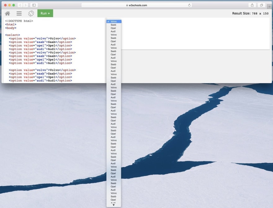
Of course, there are some successful solutions, for example, custom selects from bootstrap, jQuery, and similar and famous React.js component. But even in these cases the number of leaky abstractions is not zero, but simply less than in other analogs. If you think that you know an example that proves the opposite, where a set of divs behaves exactly the same as an original select and no abstraction leaks, then you should immediately remember about autocomplete of forms in browsers or about long drop-down lists and low browser windows.
By the way, when browsers were young Internet Explorer only dreamed of the seventh version and Chrome did not exist at all, the selects were even more independent. Some browsers, apparently due to some internal limitations, refused to implement drop-down lists in standard ways and tricks were used instead. Such clumsy unpolished heavy kludges. There could be no question of additional styles for selects at all, there were much more serious problems. For example, no div with an absolute position and an increased z-index could have select-input components inside just because a drop-down list was not a part of the document. All selects were rendered separately from the whole document and, in fact, atop of the document. If you suddenly wanted to create something like a modal window, then with help of an extra javascript code you could apply such a ninja trick: while opening any modal div-element, all drop-down lists on the page were updated with visibility: hidden. You could also notice on slow computers that calculation of the select's position were lagged a little behind when scrolling a page. Select calculated its position a bit later than a page itself did that, and moved with a slight delay.
Currently we're working on custom selects.
In that one, which is "multi", I still tried to implement a proper work with a keyboard, but I dumped it when it came to a usual select. If you try to copy the behavior of a native element, you can waste a week, while nobody ever estimates a div with a text and another div with a drop-down list at a whole week.
And you should not forget about custom selects on mobile devices. This is a separate pain for the user, and native selects are completely different anything else, take, at least, those iOS "drums". And, surely, the user won't be delighted with custom designer's garbage.
Another interesting idea is of the evolution of native controls. Take, for example, the scrollbars. In the past, we had bags and bags of libraries implementing custom scrollbars. And if at that time a designer could not resist the temptation to add a little beauty to his creation, now his scroll, no matter how cool it was before, will look pretty dull against the backdrop of neat, sometimes even self-removing in passive state native scrolls. Of course, no design lives for so long, but it's great to always keep in mind the possibility of browser evolution when working on a design.

Posted on September 18, 2018
Join Our Newsletter. No Spam, Only the good stuff.
Sign up to receive the latest update from our blog.
