Nimmo
Posted on October 11, 2019
Accessibility is a big topic. It covers all sorts of things that affect people in different ways, but it's also something we can improve with some minor changes. For example, take the following element:
Looks fine, right?
Well...not quite. This looks like a normal select input, but it's really a div and a span, both with an onClick handler, as well as a span that has the same onClick handler.
The problem is that neither divs nor spans should have onClick functionality.
When someone types in this field the application suggests booking statuses as they're typing. These appear in a drop-down that looks like a select:
The user is presented with more divs containing suggestions, each with onClick handlers. What happens when you select one of them?
Now we have extra buttons: one for deleting the selected item, and one for deleting all the selected items. Would it surprise you to learn that these aren't buttons either? Spoiler alert: both are also spans.
What if all of the things that are pretending to be buttons right now really were buttons?
This basically looks the same, but it isn't. We've changed the placeholder text to reflect what was previously hidden functionality. The arrow is now a button, which can be understood by screen-readers. Awesome.
I can hear you now: "But I don't use a screen-reader". I'm happy for you and your sightedness. But did you know that making this a button instead of a span gives us keyboard controls for free?
I won't bore you with screenshots of the rest of the states this element can be in, but we've changed all of them to use buttons in the same way. Now every suggestion can be navigated through solely through the keyboard. The remove buttons can be selected in the same way. And it all looks exactly as it did before.
But you can use ARIA to solve this, right?
Yes, you can. But, your application will happily let you forget.
ARIA will help screen-readers understand that your elements are acting as buttons etc., but we should use HTML the way in which it was intended here. This is inherently understood by screen-readers as it has accessibility built-in by default.
That said, surely there's a way we can make this easier for people. Surely we can work towards accessibility being easier to implement. Surely we can make our applications accessible to the widest possible audience?
Enter: Elm's accessible-html module
Tessa Kelly is an engineer at NoRedInk. She has created an Elm module called "accessible-html" to solve this problem.
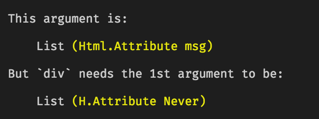
This module ensures that people can't accidentally write HTML that falls foul of accessibility rules. It achieves this by failing to compile if you accidentally do so, for example:
Here I've tried to call a div with an "onClick", but Elm's compiler has rightly pointed out that this is not possible.
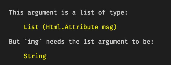
Here's another example:
The compiler is telling me that the "img" function needs a String as its first argument. This is because accessible-html won't allow you to have an image without alternate text. This means that the image will always be described if it doesn't load for any reason, including for people using screen-readers.
Here, our own tooling makes us better engineers by actively teaching us the rules of accessibility.
Since this module extends the core HTML module, it is almost a drop-in replacement. The only things that need attention are where accessible-html's API differs from HTML's, as it does with the "img" function we've already looked at.
As I mentioned at the start of this post, accessibility is a big topic. We need to ensure we're considering it at design and implementation stages. Tools like this make it a lot easier.
Things mentioned in this post:

Posted on October 11, 2019
Join Our Newsletter. No Spam, Only the good stuff.
Sign up to receive the latest update from our blog.


