Build a Simple Contact Form with Next.JS and Netlify

Michael La Posta
Posted on December 29, 2023

Adding forms to a website can be a simple matter, or a complex one, depending on the requirements and environment the website is running on.
In the dev and production environments I've worked in professionally, I've simply built-up any forms I needed using React and JavaScript, and then sent the form data to one of my ExpressJS API endpoints, which would either spit the data into a database, or shoot off an email using corporate SMTP servers.
On the other hand, if you're hosting a site in the cloud, you might not have access to a backend API, or SMTP server, or you might not want to have to deal with the hassle of setting up and maintaining one. That's where something like Netlify's serverless form handling can come in really handy!
Netlify Forms
Netlify’s serverless form handling allows you to manage forms without extra API calls or additional JavaScript. Once enabled, the built-in form detection feature allows our build system to automatically parse your HTML at deploy time, so there’s no need for you to make an API call or include extra JavaScript on your site.
docs.netlify.com
So with Netlify form handling, you can create HTML-only forms, and Netlify will handle the rest for you. Simple as that.
You do however have the option to use JavaScript, or a library like React, or even a system that will statically render the form for you, like Next JS, which is what I'll be using in this post.
Now a lot of the examples I found online gave some basic info on how to set things up, but generally using plain old HTML. Even the ones using Next JS, as I was doing, didn't include examples of how to do custom success or error fetching or omitted important details. So I figured I'd write this post to help others out who might be looking for a more complete example.
Bootstrapping the Next JS App
You can bootstrap your app anyway you like, but for simplicity, I'm using the next-app template. I'm also calling my project (and folder) nextjs-netlify-form, but you can call it whatever you like.
Using yarn:
yarn create next-app nextjs-netlify-form
Or, if you're using npx, you can use the following:
npx create-next-app nextjs-netlify-form
After the project initialized, I used the following settings:
✔ What is your project named? … nextjs-netlify-form
✔ Would you like to use TypeScript? … No
✔ Would you like to use ESLint? … Yes
✔ Would you like to use Tailwind CSS? … Yes
✔ Would you like to use `src/` directory? … No
✔ Would you like to use App Router? (recommended) … No
✔ Would you like to customize the default import alias? … No
Once that's all done, change into the project directory:
cd nextjs-netlify-form
And then open up your code editor.
Setting up the Form
Now, for this example form, I don't really care too much about styling, as the main focus here is on the form handling. I'll use some minimal Tailwind CSS styling for the form, but won't be discussing it here as that's beyond the scope of this post.
So in your code editor, open the pages/index.js file, remove everything, and then add the following:
import { useState } from "react";

export default function Home() {
  return (
    <div className="container mx-auto">
      <h1 className="text-3xl font-bold text-center">Contact Form</h1>
    </div>
  );
}
Next, open the styles/globals.css file, and remove the body styling, so it now looks like this:
@tailwind base;
@tailwind components;
@tailwind utilities;

:root {
  --foreground-rgb: 0, 0, 0;
  --background-start-rgb: 214, 219, 220;
  --background-end-rgb: 255, 255, 255;
}

@media (prefers-color-scheme: dark) {
  :root {
    --foreground-rgb: 255, 255, 255;
    --background-start-rgb: 0, 0, 0;
    --background-end-rgb: 0, 0, 0;
  }
}
Now we'll need to add the three basic contact form elements, which will be:
- Name
- Message
So back in the pages/index.js file, modify it as follows:
import { useState } from "react";

export default function Home() {
  return (
    <div className="container mx-auto max-w-lg">
      <h1 className="text-3xl font-bold text-center">Contact Form</h1>

      <form className="flex flex-col space-y-4">
        <label className="flex flex-col">
          <span className="text-lg font-bold">Name</span>
          <input
            className="border border-gray-300 rounded-md"
            type="text"
            name="name"
            placeholder="Name (required)"
            required
          />
        </label>

        <label className="flex flex-col">
          <span className="text-lg font-bold">Email</span>
          <input
            className="border border-gray-300 rounded-md"
            type="email"
            name="email"
            placeholder="Email address"
          />
        </label>

        <label className="flex flex-col">
          <span className="text-lg font-bold">Message</span>
          <textarea
            className="border border-gray-300 rounded-md"
            name="message"
            placeholder="Message (required)"
            required
          />
        </label>

        <button className="bg-blue-500 hover:bg-blue-700 text-white font-bold py-2 px-4 rounded">
          Submit
        </button>
      </form>
    </div>
  );
}
Notice in the above code, for the
nameandmessagefields, I've added therequiredattribute. This will make sure that the user has to fill in those fields before the form can be submitted. I've left the email as optional for a few reasons:
Email validation is a tricky business, and even expert developers disagree on the one true way to validate an email address. There's also the argument that no matter what client-side validation you do, the only real way to test the validity of an email address is to send an email to it, and see if it bounces. And that's way beyond the scope of this post.
The end-user might not want to supply their email address for any number of reasons, especially in this day and age of privacy concerns. They might also just want to drop a simple "Hey, your site sucks and you can't code for sh!t!" message, and not want to be contacted back. So forcing them to supply an email address would be a bad user experience. 🤪
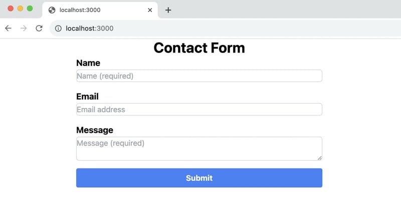
Now, if you run the app from the command shell using yarn dev or npm run dev, you should see the following in your browser:
Ok, so we've got a basic form with the fields we need, but it currently doesn't do anything! So we'll now add the Netlify form handling data.
Adding the Netlify Form Handling Data
Still in the pages/index.js file, in the <form> tag, we'll add the following attributes:
<form
  className="flex flex-col space-y-4"
  name="contact"
  method="POST"
  action="/"
  data-netlify="true"
  data-netlify-honeypot="bot-sniffer"
>
The important things to note here are:
- The
nameattribute, which Netlify will use to identify the form. - The
actionattribute, which will allow us to remain on the same page after the form is submitted. You can omit the action attribute if you want, but that will cause Netlify to redirect to their success page after the form is submitted successfully, which isn't something I want. Note that I've used the single forward-slash ('/'), because in this example, we are running from the root of the site. If you were running from a sub-directory, you'd need to add that route to the action attribute after the '/'. - The
data-netlify="true"attribute, which is the "hook" that tells Netlify to handle the form submission. - And the
data-netlify-honeypot="bot-sniffer"attribute, which is a "honeypot" field that will help prevent spam submissions. We'll go into this next ...
Under the <form> tag we just added, we'll now add a hidden <input> tag, followed by our honeypot field as follows:
<form
  className="flex flex-col space-y-4"
  name="contact"
  method="POST"
  action="/"
  data-netlify="true"
  data-netlify-honeypot="bot-sniffer"
>
  <input type="hidden" name="form-name" value="contact" />
  <label className='hidden'>
    <input name='bot-sniffer' />
  </label>
The 1st <input> tag is the one that Netlify needs to use to identify the form, without which Netlify's hook won't run. Note that the value attribute of this <input> tag must match the name attribute of the <form> tag.
The 2nd <input> tag is our honeypot field. The honeypot <input>'s name attribute must match the data-netlify-honeypot attribute in the <form> tag for the honeypot to work. The hidden class will hide the field from the user, as we don't want the actual user filling it out.
The idea behind the honeypot field is that bots will fill out all the fields in a form, including the hidden ones, whereas humans won't. So if the honeypot field is filled out, we know it's most likely a bot, and Netlify's workflow will automatically flag the submission as spam.
Adding Some JavaScript for Validation and Posting
Now, as the form is currently, we're almost ready to call it a day. But if we want to do some custom error handling, or success handling, we'll need to add some JavaScript to the mix.
Additionally, while the form will require the name and message fields to have some text in them due to our use of the required attribute on the inputs, it won't actually check to see if a valid name or message was entered.
What's a valid name and message you ask? Well, I suppose that's debatable. But for this example, I'll say that a valid name is one that has at least 3 letters, and a valid message is one that has at least 10 non-special characters.
So, in the pages/index.js file, we'll make the following changes to the top of the file:
import { useState } from "react";

const MIN_NAME_LENGTH = 3;
const MIN_MESSAGE_LENGTH = 10;

const formDefaults = {
  'form-name': 'contact',
  name: '',
  email: '',
  message: '',
};

const validatedDefault = {
  name: true,
  message: true,
};
The MIN_NAME_LENGTH and MIN_MESSAGE_LENGTH constants will be used to validate the name and message fields, the formDefaults constant will be used to set/reset the form fields, and the validatedDefault constant will be used to set the initial state of the form validation.
In the formDefaults constant above, the form-name key will be mirroring the role of the crucial <input type="hidden" name="form-name" value="contact" /> tag we added at the beginning of our form, that's required by Netlify. Because we're using React / Next JS, and submitting the data in a state variable, I'm adding that key to the state variable, as it needs to be POST'ed when the form is submitted. The value of the form-name key must match the name attribute of the form or Netlify won't be able to identify the form.
Next, we'll add the following code to the top of the Home component, right above our return statement:
export default function Home() {
  const [formContents, setFormContents] = useState(formDefaults);
  const [validated, setValidated] = useState(validatedDefault);
  const [errorMessage, setErrorMessage] = useState('');

  const handleChange = (e) => {
    setFormContents((prev) => ({ ...prev, [e.target.name]: e.target.value }));
    setErrorMessage('');

    if (validated[e.target.name] === false) {
      validateFields();
    }
  };

  const handleSubmit = (e) => {
    e.preventDefault();

    if (validateFields()) {
      fetch('/', {
        method: 'POST',
        headers: { 'Content-Type': 'application/x-www-form-urlencoded' },
        body: new URLSearchParams(formContents).toString(),
      })
        .then((res) => {
          if (res.status === 200) {
            alert('Message sent!');

            setFormContents(formDefaults);
            setErrorMessage('');
          } else throw new Error(`${res.status} - ${res.statusText}`);
        })
        .catch((error) => {
          setErrorMessage(
            `Oops, looks like there was an error while sending your message: ${error.message}`
          );
        });
    }
  };

  const validateFields = () => {
    let tempValidated = true;

    if (formContents.name.replace(/[^A-Z]/gi, '').length < MIN_NAME_LENGTH) {
      setValidated((prev) => ({ ...prev, name: false }));
      tempValidated = false;
    } else setValidated((prev) => ({ ...prev, name: true }));

    if (
      formContents.message.replace(/[^A-Z0-9]/gi, '').length <
      MIN_MESSAGE_LENGTH
    ) {
      setValidated((prev) => ({ ...prev, message: false }));
      tempValidated = false;
    } else setValidated((prev) => ({ ...prev, message: true }));

    return tempValidated;
  };
In the above code, the handleChange function will simply update the state object keys, clear any existing error message, and then call the validateFields function if the field that was changed was previously invalid.
The handleSubmit function will prevent the default form submission, call the validateFields function, and if the fields are valid, it will POST the form data to Netlify using a fetch() promise, and then reset the form fields and clear any existing error message. If there was an error while submitting the form, it will set the error message to display the error, otherwise it will display a simple success alert.
Update the JSX to Work with the JavaScript
Now that our JavaScript code is in place, we'll need to update the JSX to work with it.
First, we'll add a submit handler (onSubmit={handleSubmit}) below the data-netlify-honeypot attribute to the <form> tag as such:
<form
  className='flex flex-col space-y-4'
  name='contact'
  method='POST'
  action='/'
  data-netlify='true'
  data-netlify-honeypot='bot-sniffer'
  onSubmit={handleSubmit}
>
Next, add an onChange={handleChange} attribute to each of the <input> and <textarea> tags. This will allow us to update the state variables as the user types in the form fields. Then we'll modify the code to add error display <div>'s below the name and message fields, as such:
For the name input field, modify it as follows:
<label className='flex flex-col'>
  <span className='text-lg font-bold'>Name</span>
  <input
    className='border border-gray-300 rounded-md'
    type='text'
    name='name'
    placeholder='Name (required)'
    value={formContents.name}
    onChange={handleChange}
    required
  />
  {validated.name === false && (
    <div className='text-red-500 text-sm'>
      Please enter a name at least
      {' ' + MIN_NAME_LENGTH + ' '}
      characters long.
    </div>
  )}
</label>
and for the message textarea field, modify it as follows:
<label className='flex flex-col'>
  <span className='text-lg font-bold'>Message</span>
  <textarea
    className='border border-gray-300 rounded-md'
    name='message'
    placeholder='Message (required)'
    value={formContents.message}
    onChange={handleChange}
    required
  />
  {validated.message === false && (
    <div className='text-red-500 text-sm'>
      Please enter a message at least
      {' ' + MIN_MESSAGE_LENGTH + ' '}
      characters long.
    </div>
  )}
</label>
And then finally, we'll add one last error display <div> above the submit button, as such:
{errorMessage !== '' && (
  <div className='flex justify-center'>
    <div className='text-red-500 text-sm'>{errorMessage}</div>
  </div>
)}
The 1st two error display <div>'s will only show if the user has entered an invalid name or message, whereas the last one will only show if there was an error while submitting the form.
Whew, that was a lot of changes to make! Hopefully I didn't make any typos or confuse you too much along the way, but if I did, you can always check out the GitHub repo for this post. You can also go straight to the pages/index.js file here to check out the final code.
Enabling Netlify Form Handling
Ok, so now that we've got the form all set up, we need to enable Netlify form handling.
Now, I'm going to assume you have a Netlify account already, which is why you're reading this post in the first place. If you don't, you can sign up for a free account on netlify.com.
I'm not going to go over the steps to create a new site on Netlify, as that's pretty straight forward. But once you've created your site, you'll need to enable Netlify form handling, which is what we'll be doing next.
Now if you want to get the details straight from the horses mouth, you can check out Netlify's docs on form handling, which goes over the steps in detail, and also gives HTML and JavaScript setup examples. They don't however give any examples using React or Next JS, which is why I wrote this post.
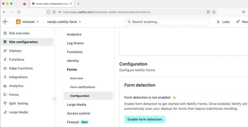
So, in order to enable Netlify form handling:
- Log into your Netlify account and go to your site's dashboard.
- Select the Site configuration option from the left-hand menu.
- To the right of the main menu, click on Forms to expand the Forms sub-menu, and then either select the Configuration item, or simply scroll down to the bottom of the page.
- In the Form detection card, click on the "Enable form detection" button.
Once that's done, you'll simply need to deploy (or redeploy) your site, and Netlify will take care of the rest!
Note that if you enabled the form detection after you deployed your site, you'll need to redeploy your site for the form detection to work. That's a mistake I made at first, and was confused when the form wasn't working! 🤣
Testing the Form
Now that we've got the form all set up, we'll want to test it out to make sure it's working as expected.
Unfortunately, one of the major drawbacks with this system is that you can't fully test it locally. You can test for simple things like the length of the name and message fields, but you can't test the actual submission of the form.
To do that, you'll need to deploy your site to a live environment in order to properly test it. This is because Netlify needs to be able to parse the HTML at deploy time, and then inject the necessary JavaScript into the page.
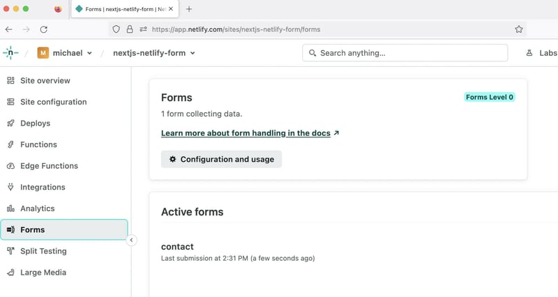
So after deploying it to my Netlify site, I submitted a basic test message, and then checked the Forms menu item in my Netlify dashboard.
After expanding the contact submission in the Active forms card, my message was there ...
Phew, it worked! 🎉
Enabling Email Notifications
You don't need to worry about always checking your Netlify console for new messages, as you can set up email notifications to be sent to you whenever a new message is submitted.
Doing so is a super simple process, which you can read about in Netlify's docs on form notifications.
That wraps it up for this post.
I hope you found it useful, and if you had any issues with your own form, you were able to fix them using this tutorial.

Posted on December 29, 2023
Join Our Newsletter. No Spam, Only the good stuff.
Sign up to receive the latest update from our blog.


