🚀Hack Your Design Skills: Basic Rules of Design for Non-Designers 🎨🌎

Athreya aka Maneshwar
Posted on December 24, 2023

Discover design essentials for non-designers from 'The Non-Designer’s Design Book' and Joe Natoli's 'Design Rules.' Improve your skills and make designs that have a strong impact. Take a quick guide to understand design principles better and boost your design abilities.
Entering the world of design can be intimidating, particularly for those without a design background. I found myself in a similar position until stumbling upon a Hacker News recommendation for "The Non-Designer’s Design Book." By applying its principles and gaining additional insights from Joe Natoli's "Design Rules" course,I acquired new design principles, thereby improving the user's experience. Now, I've distilled these valuable lessons into a concise guide. Whether you're a novice or an experienced designer, uncover essential skills to elevate your design skills and create meaningful designs.
Example: Case Study Snapshot
In the following example, the primary focus is on the function's purpose: email verification. By highlighting the "verify" button as the most prominent element, users can swiftly identify the key action without unnecessary searching.
The careful application of proximity groups the related content, aiding users in recognizing crucial sections intuitively. Perfect alignment reduces the user’s eye movement.
Consistency in element styling helps users associate similar styles with the same category, simplifying navigation. Lastly, the use of contrast emphasizes priority and repetition, providing a clear visual hierarchy. Experiment with these principles, starting with a black-and-white approach, to elevate your design.
PPARC stands for Priority, Proximity, Alignment, Repetition, and Contrast. These principles serve as the foundation for effective design, guiding you to create visually appealing and user-friendly layouts.
Understanding Design: Beyond Decoration and Trends
Design is problem solving. Usually, we want the user to do something. If the problem remains undefined or ambiguous, the design will serve random purposes and will not produce usable results. Design is not decoration.
Have you avoided starting from themes or merely following trends? The task is to solve the problem for yourself and your clients. Someone else's solutions will not fit your needs; inspiration doesn't solve problems.
Decoration is part of design, but not all of it, in fact, not even a big part of it. The designer must aim at appropriateness through research, investigation and facts
Design begins where engineering ends. Form doesn't follow function (contrary to popular belief). Form adds value over function. Form is an additive. Source Bauhaus School of Design
The goal of the design process is to "transform" the implementation model to user model. The design must conceal unnecessary details from the user yet still expose sufficient power to be useful.
Form should be determined by success criteria -- not by function or personal aesthetic preferences.
form = function(audience needs, client desires, ethical obligations, aesthetic inclinations, tech constraints, cultural constraints, functional requirements, display/medium properties, time, money, human resources)
Smaller screen - drastically reduce clutter and increase focus; or you'll lose customers; however a button should look like a button, a dropdown must look like one. Don't pare it down so much that you stray away from the user's mental model.
The Five Basic Principles
Priority
Prioritize ruthlessly. Not everything deserves equal attention. Boldly emphasize the crucial, de-emphasize the secondary, and eliminate the unnecessary. Guide users' eyes and focus by establishing a clear hierarchy of importance.
Proximity
Items relating to each other should be grouped close together. When several items are in close proximity to each other, they become one visual unit rather than several separate units. This helps organize information, reduces clutter, and gives the reader a clear structure.
Alignment
Nothing should be placed on the page arbitrarily. Every element should have some visual connection with another element on the page. This creates a clean, sophisticated, fresh look.
Repetition
Repeat visual elements of the design throughout the piece. You can repeat colours, shapes, textures, spatial relationships, line thicknesses, fonts, sizes, graphic concepts, etc. This develops the organization and strengthens the unity.
Contrast
The idea behind contrast is to avoid elements on the page that are merely similar. If the elements (type, colour, size, line thickness, shape, space, etc.) are not the same, then make them very different. Contrast is often the most important visual attraction on a page—it’s what makes a reader look at the page in the first place.
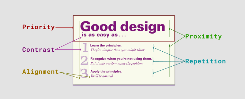
The below image shows where all the principles are used.
- The title of the card is taking the highest priority. (red box)
- There are two groups which show how proximity has been applied. (green indicator)
- The title and the points are aligned to the left which makes it easy to navigate and reduces stress on eyes. (yellow indicator)
- The points are repeated in the same style which also indicates all three points are of the same type of component. (blue indicator)
- The title has been applied the highest contrast which helps in prioritizing the element. (violet indicator)
Continue reading Deep Dive into Design Principles with examples and more.

Posted on December 24, 2023
Join Our Newsletter. No Spam, Only the good stuff.
Sign up to receive the latest update from our blog.


