Hi, my name's Jeremy and I accepted a browser notification.

Jeremy Osborn
Posted on January 26, 2020

A few months ago I made an slightly sarcastic tweet about accepting a browser notification that was actually helpful. The ever vigilant (and perhaps skeptical?) Dave Rupert suggested that this warranted a blog post.
Challenge accepted.
Offhand, I can't think of a web technology that's more despised than browser push notifications. This browser feature was immediately misused and abused when it hit the mainstream around 2015, particularly after Chrome 42 was released and made the feature available to users on a wide scale.
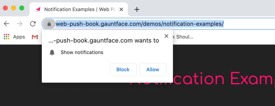
Here's what a default browser notification traditionally looks like.
Chances are you've seen hundreds of these mini-popup windows and clicked “Block” every single time while simultaneously clenching your hand into a fist and shaking it at the screen. The good news is this intrusive browser behavior is going away very soon (more on that in a second), but first, let's examine the fundamental flaw with the whole idea.
Notifications are typically triggered when you first visit a site, before you know if the content is any good (or even if you're in the right place). Imagine walking into a store and immediately being asked for your phone number. Are you going to give it to them? No, no you're not.
Furthermore, you're going to be distrustful of every single interaction in the store from that point on. A browser notification demanding your immediate response is no different.
What Would You Say…You Do Here?
This raises the curious question of why desktop notifications exist. The most common reason is letting you know when new content (such as a blog article) is released, or perhaps (if you're an e-commerce site) when there's a new sale or offer to promote.
However, there are a few major flaws with this value proposition:
- Is this really a problem that was waiting to be solved? I don't know about you, but when my favorite blogger or website publishes something new I don't drop everything and run to the site, because I'm, you know, working.
- The entire idea simply doesn't scale. If you accepted even 10% of the browser notifications you've encountered over the last year, your life would be a living hell of constant interruptions.
To understand why there's been a blight of browser notifications over the last few years all you have to do is think like a marketing department. They see it as a low risk, high reward method for acquiring new customers. After all, there is nothing more saliva-producing than having a direct channel to a loyal audience, which is what notifications look like at first blush. The reality, however, is quite different.
Notification Backlash
The folks at Firefox studied user behavior in 2019 and came to the conclusion that only 3% of people accepted a notification prompt. That's crazy! Talk about a feature that nobody wanted (or is using).
Luckily for all of us, the browser makers are taking notice and there are changes afoot. The dreaded popup behavior seen above will soon be a thing of the past. The latest version of Firefox replaces this UI with a notification bubble in the URL bar and Google will be doing something similar when they release Chrome 80. Perhaps more significantly, virtually all modern browsers have added preferences allowing you to turn off notifications completely.
 So are browser notifications a dead end technology, destined to become a shameful footnote in the history of the web? Perhaps, but as the sophistication of “web applications” continues to grow, I wouldn't put them to sleep quite yet.
A respectful notification request
I've recently become quite fond of an online transcription service called Otter. The service will take your video or audio clips and convert them to text. This process can take anywhere between 10-60 minutes depending on the length and quality of your source material.
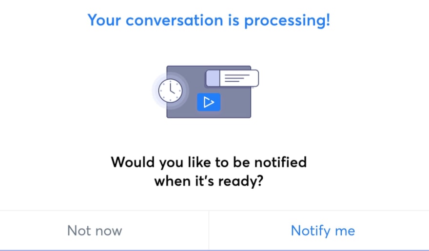
I had been using the service for about a month, when one day I saw something new. I had just finished uploading an audio file to transcribe when I saw the following window.
Hmm, this looked promising. First, the timing of the message felt appropriate, having appeared immediately after my upload was completed. Second, the microcopy and artwork were consistent with the rest of the site, making the experience feel more seamless and less like an intrusion.
So, fighting the inertia of my past bad experiences with notifications, I accepted the request.
It's worth the interruption
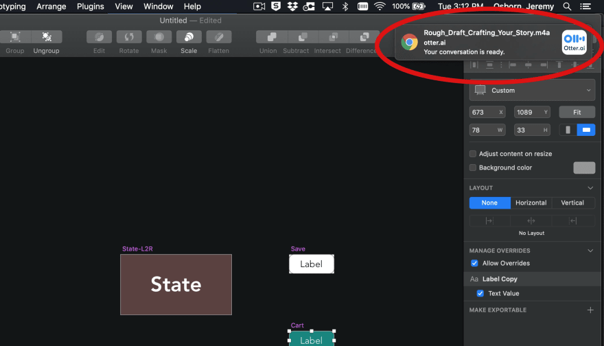
About 15 minutes later, while I was working in Sketch, a desktop notification informed me that my file was done by sliding out from the top-right corner of my screen.
I clicked on it and was immediately send back to the completed project file on the Otter site. This speediness was very handy for this particular project as I was on a tight deadline. I estimate the total amount of time from when the file was ready to when I was accessing it to be approximately 5 seconds.
In other words, the entire interaction represented a notable upgrade over my “traditional” workflow. Before the browser notification feature was added to Otter, I would receive an email when the transcription was done. However, this is often delayed and of course there's absolutely no delight in dealing with your inbox.
Summary
To be honest, I think notifications on the desktop will have limited use, especially compared to their mobile cousins. However, if used wisely, they can bring value and yes, even delight, to your users. Here's a few recommendations if you dare go down this path.
- Be specific about how notifications will benefit your users. Marketing departments love to claim how notifications will benefit themselves. (It's easier than writing an email! We will convert casual visitors to customers!) No. Be explicit about the benefits: are you saving the visitor time? Are you actually solving a problem of theirs? How are you going to measure the effectiveness?
- Respect your users with a custom opt-in message. Technically speaking it's not that much harder to integrate a well-designed notification into your website instead of relying on the default browser workflow. Matt Gaunt's open source Web Push Book is a great place to start.
The way in which notifications are evolving should give us hope that the browser ecosystem actually works. Yes, we had to deal with annoying notifications for a few years, but we've compensated and the technology can now be used as intended.

Posted on January 26, 2020
Join Our Newsletter. No Spam, Only the good stuff.
Sign up to receive the latest update from our blog.


