Exploratory Data Analysis The Ultimate Guide

Jadieljade
Posted on March 2, 2023
So, a man walks into a bar, no this is not a bar joke, looks around and the first thing he notices is a grand black polished piano. He heads towards it but notices that two keys are missing. He has a problem with imperfections so he looks around to find the missing keys and snaps them back on. He sits to play the piano but sees a guitar on the side and that the couch he was about to sit on is missing a leg. He looks around now aware of the bars interior and notices the beautiful art on the walls, a hole on the right wall, a spider crawling up near the window and that one bulb does not work.
He then notices the people in the bar, specifically that of the twenty people in the bar only five are ladies and all five have a pizza on their table. He feels the gaze from the all who mare in the bar and decides against playing piano. Instead he walks to the counter and pulls up a chair. As he sits down, he looks up and notices three pieces of meat hanging from the ceiling.
"Hello so how do you like my bar?", the bar keeper asks. The man goes ahead to describe everything he has noticed in his initial look around.
That in a nutshell is what EDA is. It is the initial analysis and exploration on data with the aim to find correlation a pattern or something off or odd in the data. EDA is all about making sense of data in hand, before getting dirty with it. it is an essential step in the data analysis process that involves understanding and summarizing the main characteristics of a dataset.
‘Understanding the dataset’ can refer to a number of things including but not limited to;
- Extracting important variables and leaving behind useless variables
- Identifying outliers, missing values, or human error
- Understanding the relationship(s), or lack of, between variables
- Ultimately, maximizing your insights of a dataset and minimizing potential error that may occur later in the process.
Now the joke. The bartender says that the bar is owned by Eminem and He asks the bartender “what’s with the meat then?" The bartender says, “If you can jump up and slap all three pieces at once, you get free drinks for an hour. If you miss even one, you have to pay for everyone else’s drinks for the rest of the night. Want to give it a go?”
The man takes another look at the meat, then says, “I think I’ll pass. The steaks are too high. Give me 2 shots of…”.
The bartender cuts him off saying, “You only get 1 shot.” Ha!
In this article I am going to share my understanding on EDA by doing one but first here is a step-by-step guide to conducting EDA:
- Data Collection: The first step in EDA is collecting the data. You can get the data from various sources such as databases, APIs, websites, or by using web scraping techniques.
- Data Cleaning: Once you have collected the data, the next step is to clean it. This involves removing any duplicates, missing values, or irrelevant data. You may also need to convert the data into a suitable format for analysis.
- Data Exploration: After cleaning the data, the next step is to explore it. This involves understanding the basic statistics of the data, such as mean, median, and standard deviation. You can also create visualizations such as histograms, scatter plots, and box plots to understand the distribution of the data.
At this point the EDA is done but as a data scientist building models from the data you are working with, you have a few more steps to go;
- Feature Engineering: Feature engineering involves creating new features from existing ones. This can help in improving the performance of the model. For example, you can create a new feature that calculates the age of a person based on their date of birth.
- Data Preprocessing: Data preprocessing involves preparing the data for modeling. This can involve normalizing the data, scaling it, or encoding categorical variables. You may also need to split the data into training and testing sets.
- Model Building: Once you have preprocessed the data, the next step is to build the model. This involves selecting the appropriate algorithm and tuning the hyperparameters.
- Model Evaluation: After building the model, the next step is to evaluate its performance. This can be done by using metrics such as accuracy, precision, recall, and F1-score. You can also use visualizations such as confusion matrices and ROC curves to understand the model's performance.
- Model Interpretation: Once you have evaluated the model's performance, the final step is to interpret the results. This involves understanding the model's predictions and how they relate to the original data.
By following these steps, you can conduct a thorough EDA and build an accurate and interpretable machine learning models.
To share my understanding of the concept and techniques I know, I’ll take an example of Complete collection of Cars available to buy in India with their specs dataset available here and try to catch hold of as many insights from the data set using EDA.
Types of EDA.
There are a few different types of exploratory data analysis (EDA) that are commonly used, depending on the nature of the data and the goals of the analysis. Here are a few examples:
- Univariate EDA: Univariate EDA, short for univariate exploratory data analysis, examines the properties of a single variable by techniques such as histograms, statistics of central tendency and dispersion, and outliers detection. This approach helps understand the basic features of the variable and uncover patterns or trends in the data.
- Bivariate EDA: This type of EDA is used to analyze the relationship between two variables. It includes techniques such as creating scatter plots and calculating correlation coefficients and can help you understand how two variables are related to each other.
- Multivariate EDA: This type of EDA is used to analyze the relationships between three or more variables. It can include techniques such as creating multivariate plots, running factor analysis, or using dimensionality reduction techniques such as PCA to identify patterns and structure in the data.
- Time-series EDA:This type of EDA is used to understand patterns and trends in data that are collected over time, such as stock prices or weather patterns. It may include techniques such as line plots, decomposition, and forecasting.
- Spatial EDA:This type of EDA deals with data that have a geographic component, such as data from GPS or satellite imagery. It can include techniques such as creating choropleth maps, density maps, and heat maps to visualize patterns and relationships in the data.
To start with, we import the necessary libraries (Normally we import pandas, numpy,matplotlib and seaborn but you can just import pyforest which takes care of everything) and load the data set.
import pyforest
pyforest imports automatically pandas as pd, numpy as np, seaborn as sns, matplotlib.pyplot as plt, or OneHotEncoder from sklearn and many more. In addition, there are also helper modules like os, re, tqdm, or Path from pathlib.you can look at its documentatuon here.
To me, there are three main components of exploring data:
- Understanding your variables
- Cleaning your dataset
- Analyzing relationships between variables
So step one will be understanding the variables.
You don’t know what you don’t know. And if you don’t know what you don’t know, then how are you supposed to know whether your insights make sense or not? You won’t. This means that we have to get a grasp of what the data looks like and what it contains.
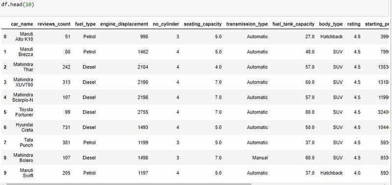
We can start by looking at a sample of the data. To do so we can use the .head() function which normally returns the first 5 rows of my dataset but we can specify the number we want to see by adding a number in the parenthesis. This is useful as you want to see some example values for each variable.
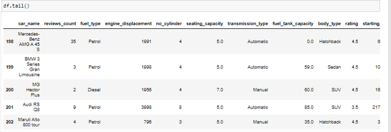
We can also look at the last five rows by using the **.tail() **function.
Now that we have seen a sample of the data lets get all the names of the columns in the data using the .columns method.
Next, let's get some basic information about the dataset such as its shape using the .shape method. This gives us a count of the rows and columns.
In our case here it means that we have 203 rows and 16 columns.
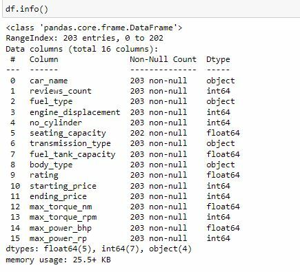
It is also a good practice to know the columns and their corresponding data types, along with finding whether they contain null values or not. We do so by using .info().
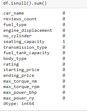
Now that we have a basic understanding o what the data looks like we can go to the next step which is now cleaning your dataset. So, let's try and get the number of missing values. We do this by entering df.isna().sum()
Let me break this down. What is happening here is the isna() part checks to see if there is any values that are missing per column returning true for every null value and false for every non-null value. Then the sum () part counts the number of true values in every column.
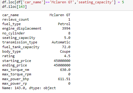
We see that there is a missing value in the seating capacity column so let's actually see the row in which the value is missing.
As it is one missing value we can just look up the capacity online and fill the value as we are dealing with unique cars.
The best way is to go to the source of the data and try to get the missing value. In this case it is here.
Now lets add the 5 in place of the missing value.
As you can see we have successfully entered the value as 5. iloc and** loc** methods are very crucial when working with data frames as when using loc you can explicitly tell the program where you want to be and with iloc you can specify the index. To learn more about the two and their various uses click here.
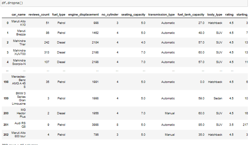
However incase you cannot identify or cannot get the missing value or deem it unimportant according to your analysis you can simply drop it using the dropna() function.
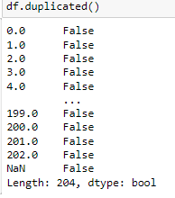
Next we can check to se if there are any duplicated columns. we do so by using the .duplicated() method.
Now that we have cleaned the data, let's start exploring.
To start we can look at the summarized statistics. Descriptive statistics are a set of tools for summarizing data in a way that is easy to understand. These can provide a quick overview of the data and can help identify the central tendency and spread of the data. To do so we use the .describe() function. This function returns the count, mean, standard deviation, minimum and maximum values and the quantiles of the data.
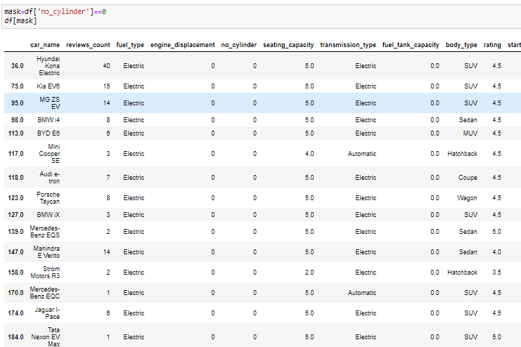
Immediately, you notice there is a problem with the engine displacement number of cylinder and fuel tank capacity as they have their min values as 0, so we have to dig deeper to see whether more cleaning is required maybe from extreme outliers.
From the data all cars that have 0 as the values for number of cylinders are electric which us accurate as they use batteries.
The data is now ready for Univariate Analysis.
Let's start by looking at the distribution of the numerical variables in the dataset.Below is a plot of the distribution of the starting price.
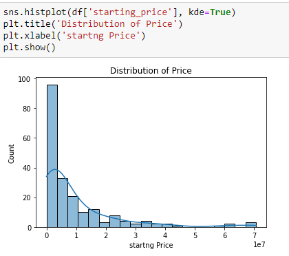
Kernel Density Estimation (KDE) is a way to estimate the probability density function of a continuous random variable. It is used for non-parametric analysis. Setting the hist flag to False in distplot will yield the kernel density estimation plot.
Correlation analysis
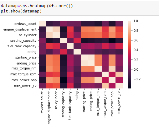
Correlation analysis is a technique for understanding the relationship between two or more variables. You can use correlation analysis to determine the degree of association between variables, and whether the relationship is positive or negative. We can do this by using a seaborn heatmap and the inbuilt corr() function in pandas to output a heatmap of the correlations in the dataset.
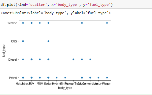
It’s pretty hard to beat correlation heatmaps when it comes to data visualizations, but scatterplots are arguably one of the most useful visualizations when it comes to data.
A scatterplot is a type of graph which ‘plots’ the values of two variables along two axes, like age and height. Scatterplots are useful for many reasons: like correlation matrices, it allows you to quickly understand a relationship between two variables, it’s useful for identifying outliers, and it’s instrumental when polynomial multiple regression models.
I have used .plot() and set the ‘kind’ of graph as scatter. I also set the x-axis to ‘body type’ and y-axis as ‘fuel type’, since we want to see how different body types fuels are distributed.
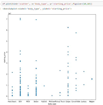
This narrates the same story as a correlation matrix. What’s neat about scatterplots is that it communicates more information than just that. Another insight that you can assume is that body type has a decent effect on the starting price. In other words, the type of car body determines its pricing. You can see this as the plots show a not so even pricing
distribution.
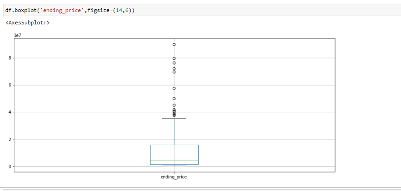
Another way to visualize the distribution of a variable is a boxplot. We’re going to look at ‘ending_price’ this time as an example.Boxplots are not as intuitive as the other graphs shown above, but it communicates a lot of information in its own way. The image below is an example of a boxplot.
There are several other types of visualizations that weren’t covered that you can use depending on the dataset like stacked bar graphs, area plots, violin plots, and even geospatial visuals.
By going through the three steps of exploratory data analysis, you’ll have a much better understanding of your data, which will make it easier to choose your model, your attributes, and refine it overall.
Thank you for reading. The data and notebook file is available here.

Posted on March 2, 2023
Join Our Newsletter. No Spam, Only the good stuff.
Sign up to receive the latest update from our blog.
