Custom Theme for Angular Material Components Series: Part 3 — Apply Theme

Dharmen Shah
Posted on April 4, 2020

Updated version of this article is present at: angular-material.dev
Apply Theme to Angular Material and its different Components. 😎
Summary
This is the third article of Custom Theme for Angular Material Components Series. In previous articles, we understood how Angular Material’s and its components' themes work.


Custom Theme for Angular Material Components Series: Part 1 — Create a Theme
Dharmen Shah for ITNEXT ・ Mar 24 '20


Custom Theme for Angular Material Components Series: Part 2 — Understand Theme
Dharmen Shah for ITNEXT ・ Apr 3 '20
In this article we will proceed to modify default theme of components. Below is what we will be doing:
- Understand theme of
MatToolbar - Apply
MatToolbar's theme toMatSidenavandMatDialog - Create a different theme for
MatSnackbarand nice styling for different kind of notifications (default, info, success, warning, error)
1. Understand theme of MatToolbar
Now as you know, how each components theme is included in our application, let’s move ahead and see MatToolbar's theme, src/material/toolbar/_toolbar-theme.scss:
Look at line 31, they have created a mixin called mat-toolbar-theme. In this mixin, first they are fetching all theme colors using palette functions. Then, default background and font-colors are assigned. For each themed toolbar, they are creating classes .mat-primary , .mat-accent and .mat-warn. In those classes, they are calling a mixin _mat-toolbar_color (which is defined at lines 6–9). That mixin is responsible for assigning background and font colors based on theme color.
You can go through each component’s theme file and see how they're created. Ok, so now we know how MatToolbar's theme is created. Let's apply it to MatSidenav and MatDialog.
2. Apply MatToolbar's theme to MatSidenav and MatDialog
MatSidenav
As you know (if not read this), MatToolbar has an attribute/property called color that's the reason, when we directly call color="primary" (or [color]="themeColor" in our application) it applies the respective theme. But, color attribute is not there for MatSidenav. So, we would need to handle that.
Let’s open up our project and go to file: src/app/shared/components/sidenav/sidenav.component.html :
To really check if MatSidenav supports color attribute or not, you can try by adding color="primary" in mat-sidenav tag. You will see nothing changed in the output. To actually see the error, change it to [color]="themeColor". You will see the error in browser console: Error: Template parse errors: Can't bind to 'color' since it isn't a known property of 'mat-sidenav'. So, to assign themeColor to color attribute of MatSidenav, we can do the Attribute Binding. Change it like below:
ℹ️ Pro Tip: You can set the value of an attribute directly with an attribute binding. You must use attribute binding when there is no element property to bind. You can read more about the same at Attribute Binding Guide.
As you would see, attribute biding won’t cause any errors, but as we haven’t done anything related to styling, it won’t make any difference to the output. Let’s do that.
For custom component theme, we will follow this naming convention: <component-name>.scss-theme.scss. Let's create a stylesheet at: src/app/shared/components/sidenav/sidenav.component.scss-theme.scss :
As you can see, we are importing ~@angular/material/theming, so that we can use some basic Material mixins, like mat-color and MatToolbar's colored mixin _mat-toolbar-color. We are creating a mixin called sidenav-component-theme to handle our SidenavComponent's theme. In our mixin, we are first fetching all theme colors using map-get. Then, in class .mat-sidenav, which is applied to <mat-sidenav> tag, we are giving MatToolbar default theme and then colored themes to color attributes. Now, we need to include sidenav-component-theme mixin somewhere.
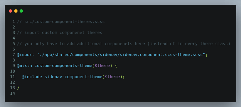
Let's include it in src/custom-component-themes.scss:
Let's run the project: ng serve -o and you should see the output like below:
Hooray… 🎉🎉🎉 We have applied same theme as MatToolbar to MatSidenav.
MatDialog
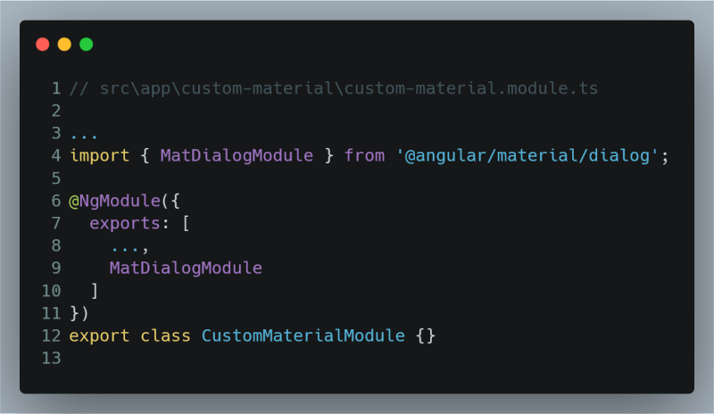
First, let's import MatDialogModule in CustomMaterialModule:
Then, create a component using terminal command: ng g c shared/components/dialog:
Note that we have added [attr.color]="data.themeColor" in h2[mat-dialog-title]. That will help us to apply dynamic theme to header.
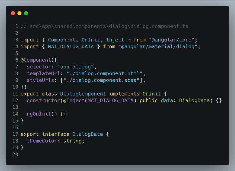
Class file is pretty straight-forward. We are injecting data using MAT_DIALOG_DATA, this will be coming from where we make a function to open the dialog.
We will also create a theme file for dialog at : src/app/shared/components/dialog/dialog.component.scss-theme.scss.
We have to make some adjustments to make mat-dialog-title take some spacing, so that background color is nicely visible. Also note that we have created a class .custom-dialog, we will use this when creating dialog.
We have to include this theme in our src/custom-component-themes.scss:
AppComponent
First, import MatButtonModule in CustomMaterialModule:
Let's open MatDialog from app.component.html. Just change the content to:
We also need to add a function openDialog in app.component.ts:
Note that, we have created themeColor property and used the same in HTML and in creation of dialog. Also note the use of panelClass: 'custom-dialog' , this class we have created in dialog theme file.
Let’s look at the output:
It’s looking great, isn’t it!!??
3. Create a different theme for MatSnackbar and create nice styling for different kind of notifications (default, info, success, warning, error)
First, import MatSnackBarModule in CustomMaterialModule:
Then, let's create a notification service, which will help us to call notifications from anywhere in the application:
ng g s shared/services/notification
We will change the content of service to below:
Note the use of panelClass. For each type of notification, we are adding different panelClass, which will help us in styling.
Next, create a style theme file: src\app\shared\services\notification.scss-theme.scss:
Notice the use of $notifications-theme. That would be a map of colors needed for notifications' left borders. As you can see in the theme file, I have added relevant icon to indicate it's importance.
ℹ️ Pro Tip: These icons are from Material Icons' Codepoints, you can change them if you wish.
Let's create that map of colors in src/theme.scss. Add below content:
Of course, you can use colors of your choice. We will also need to export this theme to styles.scss and eventually to custom-component-theme.scss and notification.scss-theme.scss. Let’s do that.
First, let's add an argument for notifications theme in custom-components-theme and also import notification-theme from src/app/shared/services/notification.scss-theme.scss:
Next, in styles.scss, add our new theme in custom-component-theme:
Let’s open a notification on a button click from our app.component.html:
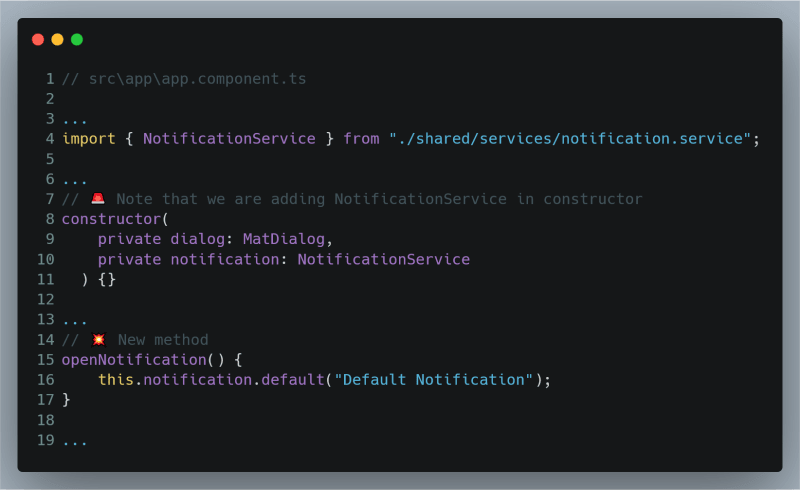
Modifications are required in app.component.ts file, too:
If you change this.notification.default(…) to info(…), success(…), warn(…) or error(…), you would see respective outputs:
Great!!! With this, we have finished the article.
Thank You,
for reading this article. This was the last part of the series. You can visit Part One and Part Two on their respective links in the series.
The final code is uploaded at Github repo. Please let me know your thoughts and feedbacks in the comments.
And yes, always believe in yourself.
Credits
Cover image: Photo by Moose
Start photo: Photo by Jon Tyson on Unsplash
Hooray GIF: https://tenor.com/tlFR.gif
Finish image: Photo by Aw Creative on Unsplash
Believe mural painting photo – Free Human Image on Unsplash: Photo by Ran Berkovich on Unsplash

Posted on April 4, 2020
Join Our Newsletter. No Spam, Only the good stuff.
Sign up to receive the latest update from our blog.
Related

April 3, 2020


