Compound components pattern for creating reusable Rating component

Gleb Krishin
Posted on February 13, 2023

👋 Hey folks
This article will give you an explanation of a "Compound components" pattern.
🤔 Why should I know about the "Compound components"?
"Compound components" is a pattern that helps to create reusable components dependent on each other. Such a pattern helps to achieve better isolation. This approach allows developers to easily create dynamic and interactive user interfaces while keeping the code clean and organized. This is just one of the many benefits of using React and compound components in web development.
👨🔬 Could you show me an image explanation?
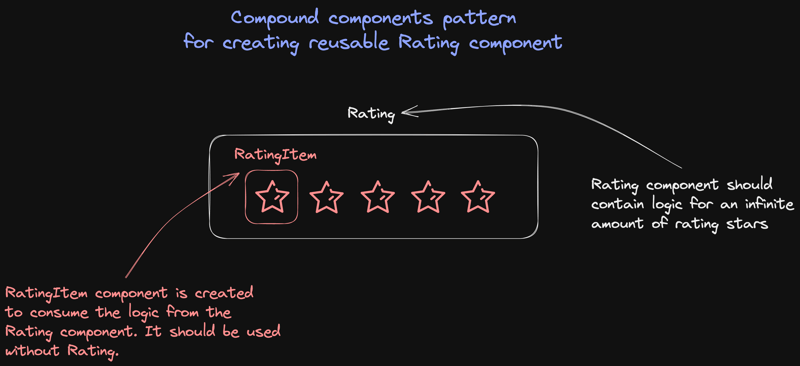
Rating - component should contain logic for enormous stars and be easily scalable and reusable.
The RatingItem - component should consume the logic from the Rating component and don't contain any styling, to reuse across different projects or designs. Because the UI design can be changed in the future, and your star will become a smile or something else.
👨🔬 Ok, before implementing, let me explain the Rating components deeper!
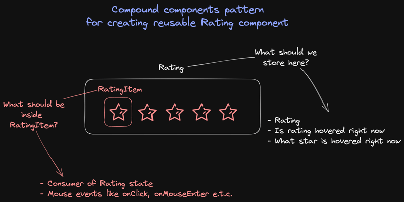
What should we store in the Rating component?
- Rating state, in our case, ranges from 1 to 5.
- Hovered boolean to know if our user hovers over our rating component?
- Hovered state, from 1 to 5, to create a good UI experience.
What will be inside the RatingItem component?
- No styling because the design can be different in projects, and it will be a pain to change the
RatingItemeach time we have a new design. - Different handlers, like
handleClickorhandleMouseLeave, depending on your needs.
👨💻 Let's code it!
folder structure

contexts/RatingContext.ts
providers/RatingProvider.ts
components/Rating.tsx
components/RatingItem.tsx
components/Feedback.tsx
1) Creating Context and Provider for a Rating component.
contexts/RatingContext.ts
export const RatingContext = createContext({
  rating: 0,
  setRating: (_rating: number) => {},
  hoverRating: 0,
  setHoverRating: (_rating: number) => {},
  isHovering: false,
  setIsHovering: (_isHovering: boolean) => {},
});
providers/RatingProvider.ts
export const RatingProvider = RatingContext.Provider
We're creating Context because we need to pass information from Rating to RatingItem, whatever nesting it will be.
2) Creating a Rating component with the basic state needed.
components/Rating/Rating.tsx
type Props = {
  children: ReactNode
}

export const Rating: FC<Props> = ({ children }) => {
  const [rating, setRating] = useState(0) // used to store the current rating
  const [hoverRating, setHoverRating] = useState(0) // store information about the current hovered state
  const [isHovering, setIsHovering] = useState(false) // information about is the rating hovered right now or not

  const contextValue = useMemo(
    () => ({
      rating,
      hoverRating,
      isHovering,
      setRating,
      setHoverRating,
      setIsHovering,
    }),
    [rating, hoverRating, isHovering],
  )

  return <RatingProvider value={contextValue}>{children}</RatingProvider>
}
3) Let's create a hook to consume the RatingContext
import { useContext } from "react"

import { RatingContext } from "../../contexts/RatingContext"

export const useRatingContext = () => {
  const context = useContext(RatingContext)

  if (!context) {
    throw new Error("useRatingContext must be used within a RatingContext")
  }

  return context
}
📝 Note: Here, we have a "Compound components" logic. The idea is that this hook will throw an error wherever we try to use the component with this hook outside of the
Rating.
4) Creating <RatingItem /> component.
components/RatingItem.tsx
type Props = {
  value: number
  children: JSX.Element
}

export const RatingItem = ({ value, children }: Props) => {
  const { setRating, rating, hoverRating, setHoverRating, setIsHovering } = useRatingContext()

  return (
    <span className="cursor-pointer">
      {cloneElement(children, { needed_props_here })}
    </span>
  )
}
- Prop
valueis used to pass information about what value of the rating will represent yourRatingItemlike 1, 2, or 0.5, depending on your needs. -
useRatingContextgives access to provider values. -
{cloneElement(children, { neededPropsHere })}will provide to your icon all props that are needed in the future to control this icon UI state. We're using here the cloneElement API.
5) Improving <RatingItem /> component by adding additional handlers.
export const RatingItem = ({ value, children }: Props) => {
  const { setRating, rating, hoverRating, setHoverRating, setIsHovering } = useRatingContext()

  // new code
  const handleMouseEnter = () => {
    setHoverRating(value)
    setIsHovering(true)
  }

  const handleMouseLeave = () => {
    setHoverRating(0)
    setIsHovering(false)
  }

  const handleClick = () => {
    if (rating === value) {
      setRating(0)

      return;
    }

    setRating(value)
  }

  const isCurrentRating = rating === value
  const isHoveredRating = hoverRating === value
  const isRatingNotSet = rating === 0
  const isFilled = isRatingNotSet || isCurrentRating || isHoveredRating

  return (
    <span
      onMouseEnter={handleMouseEnter}
      onMouseLeave={handleMouseLeave}
      onClick={handleClick}
      className="cursor-pointer"
    >
// end of new code
      {cloneElement(children, { isFilled, isChoose: isCurrentRating })}
    </span>
  )
}
- We added code to handle the mouse events
handleClick,handleMouseLeave, andhandleMouseEnter. - We added constants
isCurrentRating,isHoveredRating,isRatingNotSet, andisFilled, which will be used to implement the needed UI pattern. This part can vary depending on your design!
6) We created almost all the needed logic to display our rating.
components/Feedback/feedback.tsx
export const Feedback = () => {
    return (
        <Rating>
            <div className={styles.rating}>
              <RatingItem value={1}>
                <IconVeryBad />
              </RatingItem>
              <RatingItem value={2}>
                <IconBad />
              </RatingItem>
              <RatingItem value={3}>
                <IconNeutral />
              </RatingItem>
              <RatingItem value={4}>
                <IconGood />
              </RatingItem>
              <RatingItem value={5}>
                <IconVeryGood />
              </RatingItem>
            </div>
        </Rating>
    )
}
7) But what if we need to know in the Feedback component what is the rating right now?
components/Rating.tsx
type Props = {
  children: ReactNode
  onRatingChange?: (rating: number) => void // new prop onRatingChange
}

export const Rating: FC<Props> = ({ children, onRatingChange }) => {
  const [rating, setRating] = useState(0)
  const [hoverRating, setHoverRating] = useState(0)
  const [isHovering, setIsHovering] = useState(false)

  const contextValue = useMemo(
    () => ({
      rating,
      hoverRating,
      isHovering,
      setRating,
      setHoverRating,
      setIsHovering,
    }),
    [rating, hoverRating, isHovering],
  )

  useEffect(() => {
    onRatingChange?.(rating) // a prop function be called each time rating is changing
  }, [rating])

  return <RatingProvider value={contextValue}>{children}</RatingProvider>
}
-
onRatingChange- a function that will be called when the user changes the rating.
8) Usage of the Rating component
component/RatingFeedback.tsx
export const RatingFeedback = () => {
  const [isShowText, setShowText] = useState(false)

  const handleRatingChange = (rating: number) => {
    if (rating > 0) {
      setShowText(true)
      setRating(rating)
    } else {
      setShowText(false)
      setRating(0)
    }
  }

  return (
    <>
      <Rating onRatingChange={handleRatingChange}>
        <div className="flex justify-between w-full pointer-events-auto background-color-300 mt-4 max-w-[300px]">
          <RatingItem value={1}>
            <IconVeryBad />
          </RatingItem>
          <RatingItem value={2}>
            <IconBad />
          </RatingItem>
          <RatingItem value={3}>
            <IconNeutral />
          </RatingItem>
          <RatingItem value={4}>
            <IconGood />
          </RatingItem>
          <RatingItem value={5}>
            <IconVeryGood />
          </RatingItem>
        </div>
      </Rating>
      {isShowText && (
        <label>
            Please write to us
            <textarea/>
        </label>
      )}
    </>
  )
}
-
handleRatingChangeis responsible for showing a text field when the user chooses a rating
🏁 Summary
In this article, we demonstrated the use of "Compound components" for creating a rating system using React. Compound components allow you to create complex UI components by combining simple and reusable components. This approach improves code organization, making it easier to maintain and extend. The example we used showed how to create a rating system that is both user-friendly and customizable.
To test the code and see the example in action, you can follow the link: https://codesandbox.io/p/sandbox/compound-components-for-rating-y6getu.

Posted on February 13, 2023
Join Our Newsletter. No Spam, Only the good stuff.
Sign up to receive the latest update from our blog.

