Dara Olayebi
Posted on September 9, 2022

In the spirit of being transparent, I haven't always prioritised accessibility. This is not to say that I've deliberately built applications to be inaccessible, but rather, that it was often an afterthought - something I needed to "tackle" at the end. Because of this mindset, I didn't spend enough time making sure all parts of the user interface were accessible. Over time, I have realised how important it is to make it a natural part of my development process from the jump.
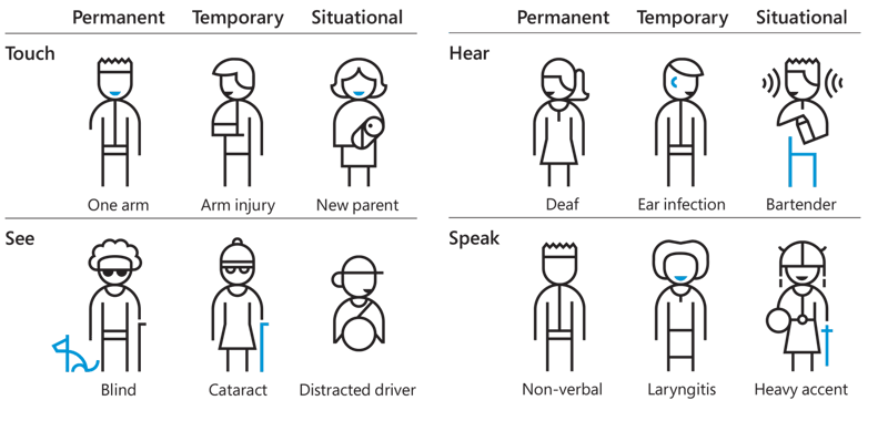
In a nutshell, accessibility on the web refers to the ability for everyone to successfully perceive, operate, understand and access a website or web application. People with disabilities use assistive technologies - screen readers, screen magnifiers, Braille displays, voice control, to name a few - to access the web.
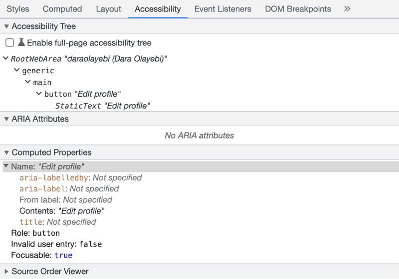
Before diving in, we'll go behind the scenes a little bit. When a browser loads a webpage, a couple of things happen. One of those things is the creation of what is called the Accessibility Tree - the browser takes the DOM tree and transforms it into a version that assistive technologies can understand. The Accessibility Tree consists of the name, role, value and state (along with other properties) of elements on a webpage. Technologies such as screen readers will refer to this tree to relay information to its users.
To ensure website developers stick to accessibility rules, the WCAG (Web Content Accessibility Guidelines) were introduced many years ago. This article highlights some of these guidelines in a checklist format that can be easily followed during the development process.
✔️ Are you using semantic HTML?
By default, HTML is accessible. However, the more elaborate a website becomes - as is the case nowadays - the greater the need to ensure that it remains accessible. Using semantic HTML sets the foundation.
Semantic elements (header, footer, main, aside, article, button, nav, menu cite, em, to name a few) introduce meaning to a webpage which means that assistive technologies are able to establish landmark regions and identify what the layout and sections of the page are.
As I read somewhere, "developing semantic websites solves more than 50% of the most common accessibility issues."
In some cases, there might be no semantic element in existence for what needs to be achieved - for example, building a dropdown menu - and the alternative would be to create a custom element. This has the potential to affect accessibility which is where ARIA comes in (discussed later on).
More on semantics: HTML semantics cheat sheet.
✔️ Does every element have a name?
Just as people are addressed by name, so are web elements when it comes to accessibility. The name of an element (also called "accessible name") is one of the values that screen readers will announce to users as they navigate a website.
Elements get their default accessible names from different sources:
- Image names come from the alt attribute.
- Button names come from the button's text contents (or from the alt value of an enclosing image, if one exists).
- Table names come from the title attribute.
- Form input names come from the placeholder, associated label or title attribute.
Here are some examples of three web elements followed by a screenshot of the MacOS screen reader announcement of each element:
<button class="button">Settings</button>
<a href="/settings/labels">Manage Labels</a>
<form role="search">
   <label for="q">Search:</label>
   <input type="text" id="q" name="q" />
</form>
Sometimes, an element needs to be explicitly given its accessible name. Here are two example scenarios:
A "Read more" link that requires additional context for visually impaired users
Icon buttons that have no text
ARIA to the rescue!
If you scroll up to the screenshot of Chrome's Accessibility Tree at the beginning of the article, you'll notice the section titled "ARIA attributes".
ARIA (Accessible Rich Internet Applications) is a set of roles, states and properties that can be added to an element to specify how it should behave.
The aria-label attribute will override an element's accessible name.
<button class="button" aria-label="Shopping Cart">
  <svg>
     ...
  </svg>
</button>
<button aria-label="Read more about the blog post on global travel">
   Read more
</button>
Key things to note:
- All images should have an
altattribute.- If the image is purely decorative (e.g. a question mark icon next to a Help button or a magnifying glass icon within a search input), the alt text should be an empty string (this prevents screen readers from announcing a redundant element).
- If the image is not redundant and serves a purpose, the alt text should describe exactly what the image is or in some cases, what the image does.
- All HTML form inputs should have an associated descriptive label to enhance accessibility.
So it's pretty obvious that an element with no name could affect a user's experience. Examining the Accessibility Tree to make sure elements have proper naming will increase the amount of context screen readers provide to users.
More on accessible names: What's in a name?
✔️ Are headings in hierarchical order?
Some assistive technology users prefer to navigate a page using headings, especially on sites that have a lot of content, for example Wikipedia. Headings should have the correct hierarchy (i.e. <h3> must come before <h4>) to give users a sense of how the page content is structured.
Headings should also be as succinct and as descriptive as possible to properly illustrate the content they introduce.
WCAG says: The heading elements should be organized in descending order without skipping a level, meaning that an h4 should only come after an h3. Skipping heading levels will cause screen reader users to wonder if content is missing.
It can be tempting to order headings by size and not by level. In such cases, CSS utility classes can be used to make elements appear visually smaller or bigger regardless of their heading level.
More on headings hierarchy: Accessible heading structure
✔️ Does your content have a logical tab order and visible focus indicators?
Not all users make use of a mouse or a trackpad. Some have to rely on the keyboard, while others choose to. Regardless, ensuring that this group of users can successfully navigate a webpage should be a priority.
HTML elements are either presentational (div, span, section, article) or interactive (a, button, input, select, textarea). By default, interactive elements are focusable. A keyboard user will click the tab key to jump from one focusable element to the next.
The order in which users tab through the page is based on the order of the DOM, and the order of the DOM is based on the order of the HTML markup. Therefore, it is important to prioritise how you write your code as it will determine how keyboard users navigate your site. For example, if your UI is supposed to display article content to the left and the article heading to the right, your HTML should be written in the normal order with the article heading appearing first and the article content second. CSS can then be used to adjust the visual appearance of the page.
The page tab order can also be altered using tabindex - this attribute determines where an element will fall in the tab flow. The default tabindex value of interactive elements is 0. An element given a value of -1 will be removed from the tab flow, while an element given a value of 1 will take precedence over other elements. The latter should be avoided as it could affect the user's navigation flow on the page.
<div tabindex="1">I will be focused before all other elements</div>

<div tabindex="0">I am the default</div>

<div tabindex="-1">I will never be in focus</div>
Key things to note:
- Make sure any element that the user needs to interact with, particularly custom controls like a dropdown menu, have a
tabindexvalue of 0. Otherwise, a keyboard user will never be able to access it. - If an element is visually hidden but may be interacted with at some point by the user (e.g. a pop-up modal), it should be set to
display: noneorvisibility: hiddento prevent focus until it becomes visible. - If an element is visually hidden and will never involve any interaction from the user, it should be given a
tabindexvalue of -1 to remove it from the focus flow entirely. - When used for interactive controls, non-semantic elements are inaccessible via the keyboard (e.g. using a
<div>to create a button) and will require some Javascript to be written to be made accessible. Semantic elements on the other hand have built-in keyboard accessibility.
So how does a keyboard user know what element is in focus while they tab through the page?
A keyboard user’s cursor equivalent is the focus indicator.
Removing the browsers default focus indicator (using outline: none) without replacing it with another one makes a site inaccessible. Today, in addition to :focus, most browsers support the :focus-visible pseudo-class which will be applied when an element is in focus and the user's input is a keyboard.
Here's how to use :focus-visible from MDN's docs:
.button {
  margin: 10px;
  border: 2px solid darkgray;
  border-radius: 4px;
}

.button:focus-visible {
  /* Draw the focus when :focus-visible is supported */
  outline: 3px solid deepskyblue;
  outline-offset: 3px;
}

@supports not selector(:focus-visible) {
  .button.with-fallback:focus {
    /* Fallback for browsers without :focus-visible support */
    outline: 3px solid deepskyblue;
    outline-offset: 3px;
  }
}
More on focus indicators:
- A guide to designing accessible, WCAG-compliant focus indicators
- WCAG guidelines on focus indicators
✔️ Are you using ARIA attributes appropriately?
As we saw above, ARIA lets you modify the way an element is presented to assistive technologies.
You can use ARIA to define the role of an element e.g. role="dialog", or set its state e.g. aria-checked="true". You can also use it to make custom controls accessible. For example, if you choose to create a checkbox instead of using HTML's native checkbox element, you would need to add ARIA states and properties to make your checkbox usable and accessible.
As useful as ARIA is however, it is not always required. Semantic markup should always be used where possible.
More on ARIA: When should you use ARIA
✔️ Are you choosing colours carefully?
Very often, when it comes to colours, I have prioritised aesthetics over accessibility without realising it, neglecting a large group of people in the process.
With more awareness comes more consideration for users who are blind or have low vision. This means prioritising the following:
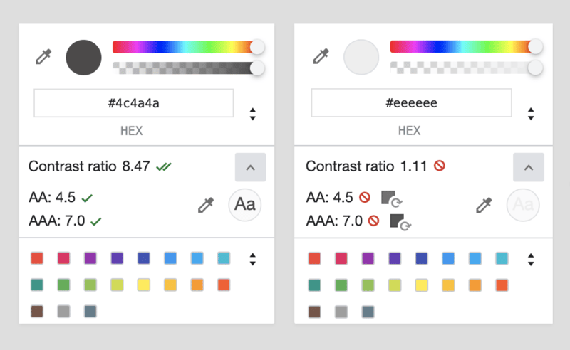
- Making sure all text has the right amount of contrast with its background. WCAG expects a website's background to text contrast ratio to be at least 4.5:1.
Including text alternatives to depict different coloured interactive states. For example, error, success or warning states.
Using focus indicators that have enough contrast with the surrounding element or background.
Although this is unrelated to colour, it's important to also take into account other UI elements like font sizes, line heights and letter spacing, and consider how well content can be perceived on a website.
More on colour: Here's why you should never use pure black for text or backgrounds.
✔️ Are you letting users know when dynamic content changes?
Imagine a visually impaired user sending messages on a website's customer service chat widget but not being made aware whenever they receive a response?
If you have any time sensitive notifications on your website that are vital to a user's experience, you should explore using aria-live. This attribute can be added to any element and allows website developers determine how screen readers should notify users about changes on a webpage.
-
aria-live="off": No announcements will be made ("off" is the default). -
aria-live="polite": Announcements will be made only after a user has completed a process i.e. the user will not be interrupted. -
aria-live="assertive": The user will be interrupted so the announcement can be made.
Web accessibility is a much broader topic than this article covers. However, as I started to prioritise it in all the ways mentioned above, it led to a major shift in my perspective, motivated me to re-evaluate the way I build user interfaces, and is ultimately making me a more thoughtful developer.
Helpful resources:

Posted on September 9, 2022
Join Our Newsletter. No Spam, Only the good stuff.
Sign up to receive the latest update from our blog.


