5-minute fun with GSAP ⏲️✨

Daniel Petho
Posted on October 2, 2022

I've been experimenting a lot lately with different micro-interactions, and I was really surprised how GSAP allows you to create something in a matter of minutes ⏲️.
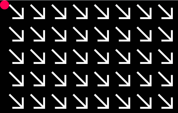
For example, this funky animation was made in just 5 minutes and I spent most of the time drawing the arrow in SVG.
I thought I'd share my latest experiment in this 5-minute blog post. You can find the code on CodePen, I think it's self-explanatory enough, but if you want a beginner-friendly explanation, just read on. 🤓
Setup and cursor
So, to recreate this animation, first, we will change the default cursor to a more visible one, animate it, and then we will create the arrows and the animation with GSAP.
Let's start with the HTML file. Nothing special, we need a div for the cursor and a div for the arrows. In the script tag we import our app.js and of course GSAP.
<!DOCTYPE html>
<html lang="en">
<head>
    <meta charset="UTF-8">
    <meta name="viewport" content="width=device-width, initial-scale=1.0">
    <link rel="stylesheet" href="styles.css">
    <title>Arrows follow the cursor</title>
</head>
<body>
    <div id="cursor"></div>
    <div id="main-container"></div>
</body>
<script src="https://cdnjs.cloudflare.com/ajax/libs/gsap/3.11.1/gsap.min.js"></script>
<script src="app.js"></script>
</html>
Create a CSS file, set the body background to black and set the overflow to hidden to avoid scrolling. Then hide the default cursor and create a new id ruleset for the new red-colored circle cursor. I set the new cursor size to 30x30px. Don't forget to set its z-index to 1 so it will appear on top of the other elements.
body {
    background: #010101;
    overflow: hidden;
    cursor: none;
}

#cursor {
    width: 30px;
    height: 30px;
    position: fixed;
    top: 0;
    left: 0;
    background-color: #ff0055;
    border-radius: 100%;
    pointer-events: none;
    z-index: 1;
}
Cursor animation
Cool, but as you can see it's just a red circle in the corner, we need to get this div to follow the cursor. Create the app.js file and create a function called followCursor(). This function will be the backbone of the animation. Add two event listeners, one for mouse movement and one for touch movement (since there is no mouse movement on mobile devices).
const followCursor = (event) => {

}

window.addEventListener('touchmove', followCursor);
window.addEventListener('mousemove', followCursor);
Okay, let's animate the cursor. First we need to access the cursor div. Then we need to get the x and y position of the mouse in followCursor(), or if we are on a mobile device, the position of the first touch.
Then use GSAP to set the cursor div position to the actual mouse/touch position. Since the (0,0) point of each element is the top left corner, we need to offset the circle cursor by 15 pixels (because our circle-cursor's size is 30x30px) at each coordinate so that the center of the circle is exactly at the mouse/touch position. It's that simple!
const cursor = document.getElementById('cursor');

const followCursor = (event) => {

    const x = event.type === "touchmove" ? event.touches[0].clientX : event.x;
    const y = event.type === "touchmove" ? event.touches[0].clientY : event.y;

    gsap.set(cursor, {
        x: x - 15,
        y: y - 15
    })
}

window.addEventListener('touchmove', followCursor);
window.addEventListener('mousemove', followCursor);
Neat, we have a new red-colored circle cursor!🔴
Arrows
We'll use a simple SVG as an arrow, and instead of inserting the same svg tag 30 times in the HTML file, we'll create them dynamically in app.js. To do this, let's create an addArrow() function whose job is to create a div with an svg tag in it, and this svg will describe our arrow. The arrow is just three different straight lines, I hope that's pretty self-explanatory. I've set the size of the arrow to 50x50px, but feel free to use different sizes.
const addArrow = () => {
    const div = document.createElement('div');
    div.className = 'arrow';
    div.innerHTML += '<svg viewBox="0 0 20 20" width="50" height="50"><rect x="5" y="17.5" width="15" height="2.5" fill="#fefefe"></rect><rect x="17.5" y="5" width="2.5" height="15" fill="#fefefe"></rect><line x1="2" y1="2" x2="20" y2="20" style="stroke:#fefefe;stroke-width: 2.5;" stroke-linecap="square"></line></svg>'
    document.getElementById("main-container").appendChild(div);
}

for (let i = 0; i < 300; i++) {
    addArrow();
}
To make this animation responsive, let's edit our styles.css file and make the #main-container a flex container. I also added a small padding to the arrows to give them some breathing room.
#main-container {
    display: flex;
    flex-wrap: wrap;
    justify-content: center;
}

.arrow {
    padding: 10px;
}
Arrows animation
Cool, we have a bunch of arrows, we just need to animate them. To do this, we need to access all the divs of the .arrow class and rotate them in the followCursor() function to follow the cursor. Since each arrow is in a different position, we need to rotate each one to a different angle.
But at what angle? Think about what we know: the position of the cursor and the position of our arrow. From this data we need to calculate the angle. Let's pull up our dusty high-school trigonometry skills!
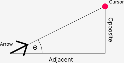
If you remember the definition of tangent, you're in luck, because that's what we need: In a right-angled triangle, the tangent of an angle is the ratio between the opposite and adjacent sides of that given angle.
Imagine that we place a right-angled triangle on our scene. In this case, the adjacent side of the triangle is the distance between the x position of the cursor and the x position of the arrow, and the opposite side of the triangle is the distance between the y positions. Once we have these two distances, we need to divide them to get the tangent, and to get the angle we need the arc tangent. We will use JavaScript's Math.atan2() function because it returns the angle between -π and π (instead of Math.atan() which returns the angle between -π/2 and π/2).
If you want to dive deeper, here is a more detailed explanation: https://stackoverflow.com/questions/283406/what-is-the-difference-between-atan-and-atan2-in-c
Okay, one last thing. Since the arrow points to the bottom right by default, and atan2 measures the angle from the positive x-axis, we need to subtract π/4 from our angle to align the arrow with the axis, and to point to the right direction.
Finally, we need to apply ✨ GSAP magic ✨ and rotate our arrow by the resulting angle.
The app.js file should look like this at this point:
const addArrow = () => {
    const div = document.createElement('div');
    div.className = 'arrow';
    div.innerHTML += '<svg viewBox="0 0 20 20" width="50" height="50"><rect x="5" y="17.5" width="15" height="2.5" fill="#fefefe"></rect><rect x="17.5" y="5" width="2.5" height="15" fill="#fefefe"></rect><line x1="2" y1="2" x2="20" y2="20" style="stroke:#fefefe;stroke-width: 2.5;" stroke-linecap="square"></line></svg>'
    document.getElementById("main-container").appendChild(div);
}

for (let i = 0; i < 300; i++) {
    addArrow();
}

const cursor = document.getElementById('cursor');
const arrows = document.getElementsByClassName('arrow');

const followCursor = (event) => {

    const x = event.type === "touchmove" ? event.touches[0].clientX : event.x;
    const y = event.type === "touchmove" ? event.touches[0].clientY : event.y;

    gsap.set(cursor, {
        x: x - 15,
        y: y - 15
    })

    for (const arrow of arrows) {

        const rect = arrow.getBoundingClientRect();

        const a = x - (rect.x + rect.width / 2);
        const b = y - (rect.y + rect.height / 2);

        const angle = Math.atan2(b, a) - Math.PI / 4;
        gsap.to(arrow, {
            duration: 0.01,
            rotation: angle + "_rad"
        });
    }
}

window.addEventListener('touchmove', followCursor);
window.addEventListener('mousemove', followCursor);
That's it friends, we had this neat little micro-animation in just 5 minutes. Hope you got something useful from this blogpost, and see you in the next one.👋

Posted on October 2, 2022
Join Our Newsletter. No Spam, Only the good stuff.
Sign up to receive the latest update from our blog.

