Building a Great UX Outside of your App

Nočnica Mellifera
Posted on September 7, 2022

Recently I had a chance to talk to DevOps
Minneapolis about the true nature of user experience. The audience found this information to be particularly interesting, so I thought it would be helpful to share it with a wider audience. This post will be the first in a series of three posts that will discuss user experience beyond your app’s UI and how you can optimize it.
So where is your user experience? More generally, where does your application happen? For those of us who work in SaaS, the answer is simple: the application occurs inside the application interface. Whether we’re selling business tools or teaching Spanish, the application happens when our users access the UI.

Your UX is inside your application… right?
When we talk about our users having a good experience, that much-vaunted UX, the things we’re tweaking will be inside this application. We have several specialists who worry about user experience. Whether that’s UX thinking about existing users or data and product people making sure the experience for new users is frictionless.
I don’t mean to trivialize this process: it’s much more than tweaking colors and moving buttons by a pixel. Those tasked with UX often have to ask the most basic questions: what do our users want, and what’s the best way to give it to them? This matters because however cool our technology is behind the scenes, if the user doesn’t have a good experience with it, they’re unlikely to return.
This article argues that there’s a more important user experience than the one inside your app. In fact, your app has a whole interface that has more impact on your users, that touches them more deeply than your application interface.
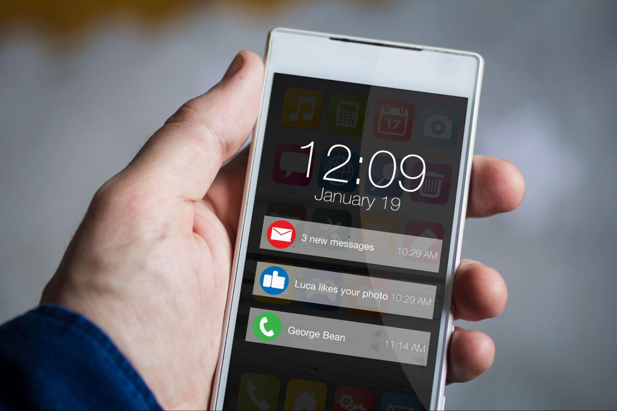
It’s your notifications

This is where your notifications really happen.
Many of our favorite apps largely interact with us through notifications, the examples are everywhere.
- Tools for observability and security most frequently have all our interaction starting with notifications. After all, we're probably not checking our APM tools until we know something is wrong.
- For social media applications, the best moment we experience with them is seeing that X number of people loved our post.
- And for communication and collaboration applications the notifications should have most of the information that people want you to see.
In fact, I’d argue that for many of our most valued tools and services, most of our interface, for good or ill, is through notifications. Notifications bring you into the application. They provide reassurance, warnings, anxiety, or annoying notifications about sales of pizza. Notifications are your application.
I mention all this because I believe that your UX is in danger. Primarily, the experience of notifications has been ceded to teams outside of the product team. Instead of our product team controlling notifications, it’s the operations or marketing/growth teams that control most of the notifications we send.
Let me show you far we have strayed from g-d’s light:
The tale of the signup campaign
The time after a user creates an account is critical for any SaaS tool. Even when users sign up and immediately start using the product, there will be features or extended use cases that we, the developers, want them to try.
Put yourself in the shoes of a product team that’s trying to improve the rate at which new sign ups become committed users. In (almost) all product teams, we’ll realize that we want to get in touch with users after they sign up to encourage them to keep going with our product.
The platform doubtlessly sends a signup confirmation, and we start by tweaking that. We get our new copy and links to the operations team, or platform dev, and they change the post-signup email. But soon, we want more. First off: we don’t really want to email users the instant they sign up, we’d like to wait at least a few hours, to let the platform feel a bit familiar first. Then we’d like to follow up after a few days, and a few days after that.
Even better, we, the product team, would like to customize these messages a bit, depending on their team size, what license they have, etc.
The operations team, who implement all outbound notifications, is rightfully a bit frustrated by this. They’re used to solving bugs and feature requests for the platform, not tweaking an email. Scheduling? Audience customization? This sounds like a job for….
The CRM, where for a time it was good
With all the need for custom targeting, a good first solution is to have a signup get sent as an event to a Customer Relationship Management (CRM) tool like Salesforce. From there, it’s easy to start a ‘signup campaign.’ Since the CRM should know things like the org size and license level of the user, the messages can be nicely customized.
And for a time, it was good. However, trouble starts when we go one step further with targeting and customization.
You see, our signup campaign encourages users to use certain features, like say Reports Export. We want to tell the users about the feature, demo it for them, walk them through the concept. “Please” our emails beg, “export your reports, with the Reports Export.”
This message will seem super weird if the user has already used Reports Export. So we, the product team, go to whomever runs the CRM and say ‘can we cancel this email if they’ve used Reports Export.’ Of course, the CRM doesn’t know that. So we end up back with platform engineering, asking them to send an event to the CRM when someone first uses Reports Export.
The ‘quick and dirty’ solution of CRM wasn’t a durable solution to our problem.
The problem is a ceding of territory
The inherent problem in the scenario above is a ceding of territory by the product team. If the product team wanted to move a button, or change the order of a toolbar, it wouldn’t make sense for the marketing team to say ‘no.’ But when we want to send a correctly targeted sign-up campaign, our reliance on our CRM means Marketing has to say ‘no’ to a better user experience.
Similarly, we wouldn’t let ops or platform engineering keep us from adding a helpful tooltip, but we are letting them keep us from sending a helpful email to the right users.
What we can do to solve the problem
The problem here is a lack of tooling, either external or internal. Every new notification stream requires engineering time, and that means technical limitations keep us from delivering the experience our users deserve.
Whether it’s by using Courier or an internal spike to create a messaging microservice, you want to develop a robust set of features that make it easy to send multiple notification types direct from your platform.

Posted on September 7, 2022
Join Our Newsletter. No Spam, Only the good stuff.
Sign up to receive the latest update from our blog.
