Crafting a Contemporary UI Design: 5 Essential Tips for Your Business App

Anzhelika
Posted on February 22, 2024

Embarking on the journey to develop an app UI design that resonates with today's standards? Explore these 5 key considerations to kickstart your efforts. Discover the art of crafting an instinctive user experience, harnessing the right palette of colors and fonts, and more. Elevate your app's UI for optimal impact.
In the contemporary digital landscape, the significance of a visually captivating and user-centric app cannot be overstated for business prosperity. A modern app UI design not only enhances the aesthetic appeal but also elevates the overall user experience, fostering heightened customer satisfaction and loyalty. As per Salesforce research, an appealing mobile app design has the potential to boost client loyalty by up to 39%. Moreover, an Adobe report highlights that 38% of consumers are likely to disengage from a website with unappealing layout and content.
Armed with these insights, it becomes evident that committing to a cutting-edge app UI design is imperative for businesses aiming to thrive in the fiercely competitive app market. Delve into these five crucial pointers to shape a stellar app UI design:
1. Keep your design simple and clean by using straightforward lines and shapes
UI design styles change over time, and what was cool a few years ago might not be in vogue now. Using simple and minimal lines and shapes in UI design has been a popular trend for a while. This trend is liked for several reasons, mainly because it makes the interface more user-friendly.
When used well, clean lines and shapes can guide the user's attention to the most important parts of the screen, which is crucial on smaller screens like those on mobile devices. Designers can make it easier for users to find information by using clear lines and shapes.
Another reason clean lines are popular in UI design is that they create a sense of order and organization. When everything on the screen is chaotic, users might struggle to figure out where to look first. Designers can help by using clear lines to establish a visual hierarchy, making it easier for users to access the information they need.
Lastly, using clean lines and shapes also makes interfaces look more attractive.
2. Limit the range of colors you use.
In UI design, remembering color is super important. Keeping things simple with a few colors can make your design look good and fit together.
Think about who will see your design and what you want it to achieve. A serious website might do well with calm colors, while a fun one for kids can use brighter ones.
Once you pick your colors, try to use them a lot. Use the same colors for different parts like buttons and headlines. Avoid using too many different colors or fancy tricks that might make your design look messy.
Designers who stick to a small set of colors can make clean and nice designs. This helps users understand and enjoy using the website. Mixing in some cool fonts can also make things interesting.
3. Enhance user experience through Typography
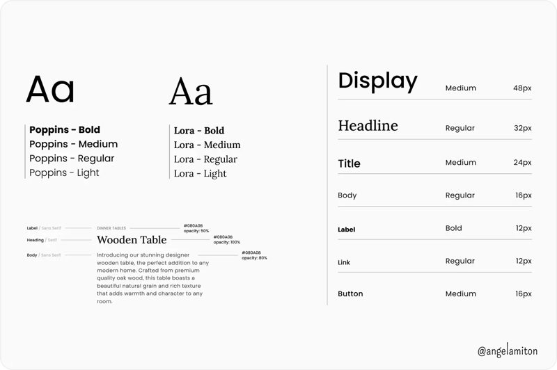
Fonts are like the building blocks of good design. They make things look interesting and stand out in UI design.
When picking fonts for your UI designs, think about what you want to express and the emotions you want to evoke. Once you know the design's purpose, narrow down your font choices. With so many fonts out there, be careful in your selection.
Check if the font is easy to read, especially in small text, and if it contrasts well with the background color. Consider the font's style – is it fun or serious, modern or traditional?
After selecting a few fonts, play around with them. Mix and match different fonts to see what looks best.
Always keep in mind that UI design is about giving users a simple and pleasant experience. Choosing the right fonts can enhance the user experience.
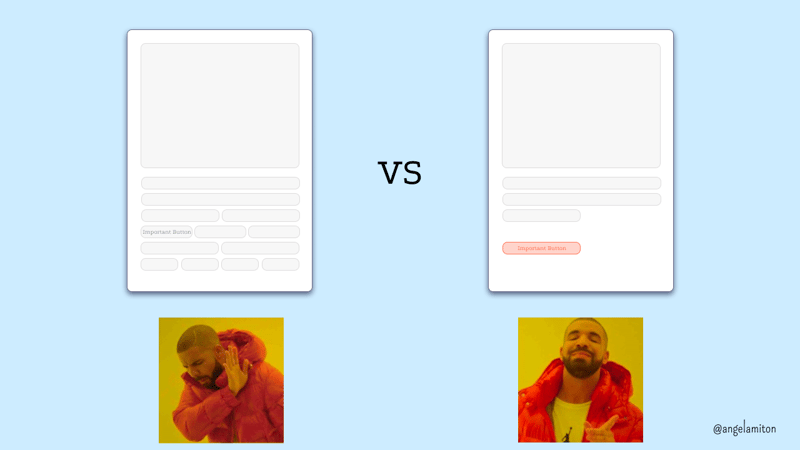
4. Utilize empty space strategically
Negative space, also called "white space," is the blank area on a page or screen. It includes margins, gaps between sections, and empty spots around elements. In graphic design, it helps balance the layout.
In UI design, negative space is the empty area around items. It makes interfaces look cleaner and easier to use. When used well, it directs attention to important parts and simplifies complex interfaces.
But too much negative space can make a design look unfinished. Finding the right balance may take some experimenting.
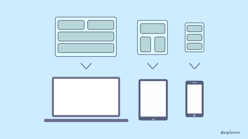
5. Maintain uniformity in your UI design across varying screen sizes
Ensuring our UI design stays the same across different screen sizes is really important. It helps users understand our product easily and avoids any frustration. Consistency makes it simple for users to find what they need and get used to our product quickly.
In today's competitive market, having a modern app UI design is crucial. Designers can make sure your app stands out and provides a great user experience by following the tips in this article. Using market insights and data analysis can also help tailor the design to our target audience, boosting user engagement and retention. It's important to keep updating and improving the UI design to stay current.
Please share your thoughts on this matter 💬

Posted on February 22, 2024
Join Our Newsletter. No Spam, Only the good stuff.
Sign up to receive the latest update from our blog.


