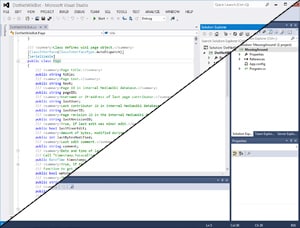
Making Visual Studio 2012 look nice

Adam K Dean
Posted on January 28, 2013

So in line with my 2013 new years resolution to pull my finger out and become the developer I'm supposed to be, I have been checking out some of the new .NET stuff that is floating around nowadays. I'm loving most of it, some of the features of C# 3.0 and 4.0 I already know and use, but some of them are actually pretty awesome.
One thing that isn't awesome is Visual Studio 2012 (Visual Studio 11).
I've been using VS since I was like 10, I had Visual Basic 6.0. I then moved up to Visual Studio .NET which introduced this new world of .NET applications. VB6 moved to VB.NET, people kept talking about something called C#.NET, and ASP.NET - all these dot nets. I was dubious at first but soon embraced it, by 2006 I was learning C# and using Visual Studio 2005. At some point I moved up to 2008, and it looked just how it should. The way Visual Studio had always looked.
But then I tried VS2010. My god, the dark colours, the changes, your eyes just focused on the editor and the rest was dark. It was horrible, at first. But then slowly you think actually it's not so bad, and then you like it, and then you love it. Visual Studio 2010 looked amazing.
And then Visual Studio 2012 hits. Hits, skids, and misses the mark that is.
I have yet to find one thing I like about it. I don't like the way it looks. I don't like the icon. I don't like the caps. I don't like the colours. It's ugly, it's blocky, it's a thousand steps back in the evolution.
But there is a fix, and I'm pretty happy with the way it's worked out.
1. The first thing you want to do is install Visual Studio 2012 Color Theme Editor, found here:
http://visualstudiogallery.msdn.microsoft.com/366ad100-0003-4c9a-81a8-337d4e7ace05
Install that extension and restart your visual studio. It'll prompt you to select a theme, take a look at them, but I chose Blue - the theme for VS2010.
Update: I have removed the links to the NiceVS extension as it just causes crashes, and also to the icon as, well, I guess I've just got used to the purple one.
Congratulations, you (should) now have a Visual Studio 2012 installation that doesn't make your eyes bleed... too much.

Posted on January 28, 2013
Join Our Newsletter. No Spam, Only the good stuff.
Sign up to receive the latest update from our blog.
