Esther Adebayo
Posted on March 24, 2022

Accessibility (a11y) is an essential part of web development because it provides unrestricted access to millions of users. Unfortunately, many developers fail to take the necessary steps to ensure web accessibility and often overlook it. A recent report revealed that 98% of the top websites do not offer fully accessible experiences.
If you're building a web app or website, you'd want it to be usable by everyone irrespective of their disabilities, age, and physical circumstances. Accessibility shouldn't be an afterthought carried out close to production; instead developers should include it from the start of the development process.
Luckily, accessibility isn’t so difficult to implement. Once you understand the issues that make a site nearly impossible to use by certain people, you can take the measures to prevent those issues and ensure your site is welcoming to all.
What is Web Accessibility?
Web accessibility is the method of making websites and web applications usable by everyone, including those with a form of disability, impairments, or limitations.
Nearly 15% of the world's population lives with some form of disability. Safe to say, if you don't develop your site to work with Assistive Technology (AT) like a screen reader, you prevent almost 1 billion people from engaging with your content.
When you build an accessible website, you're breaking down the walls of web exclusion and granting all users equal access to the web.
Reasons for Web Accessibility
Building an accessible web is important for the following reasons:
1. Improves usability: Usability involves creating an effective, efficient, and satisfying product. When you make the web accessible, you automatically remove restrictions and make it available for everyone with or without a disability.
2. It is the law: Some government policies and laws mandate web accessibility compliance. Failure to comply with these laws could cause legal actions to be taken against your company, as in the case of Domino's Pizza. Hence, to prevent risks of lawsuits and complaints, it is best to ensure your website or app is accessible.
3. It is the right thing to do: At the end of the day, accessibility is the right thing to do. You’d want to promote inclusion and diversity to everyone who wishes to use the web. Building an accessible web implies that you're opening the door to anyone who wants to use your site regardless of their physical or cognitive ability.
Web Accessibility Standards
The two main guidelines that set web accessibility standards are:
1. The Web Content Accessibility Guidelines (WCAG 2.1)
The Web Accessibility Initiative (WAI), managed by the World Wide Web Consortium (W3C), published these guidelines. They are basic rules that explain how developers can create more accessible content for people with disabilities.
The WCAG is based on four principles, known as "POUR."
1. Perceivable: All information and user interface components must be
presented to users in a way they can perceive it.
2. Operable: User interface (UI) components and navigation must be operable.
3. Understandable: All information and the operation of the user interface must be understandable by users
4. Robust: Content must be robust enough to be interpreted by many users and assistive technologies.
2. The Web Accessibility Initiative — Accessible Rich Internet Applications (WAI-ARIA)
The Accessible Rich Internet Applications Working Group
(ARIA WG), also run by the W3C WAI, came up with these guidelines. WAI-RAI focuses on more complex web apps and best practices for building accessible web components and offers the following:
- Roles that describe widgets used, such as "menu," "slider," and "progress bar."
- Roles that describe web page structure, such as headings and tables.
- Properties that tell the state widgets are in, such as "checked" for a check box.
- A way to provide keyboard navigation for various web events.
- Properties that describe the live regions of a page that usually get frequent updates
10 best practices for building an accessible web
To build accessible websites and web apps following the principles and guidelines above, let's examine some action items and best practices you can implement:
1. Write Semantic HTML
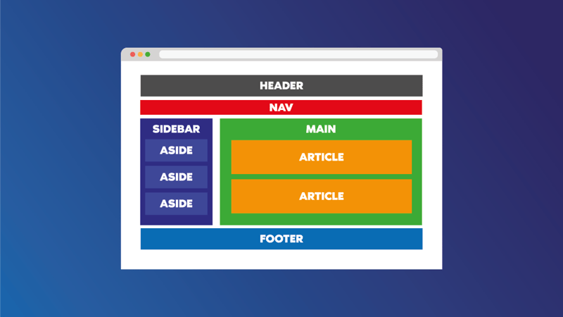
HTML comprises both semantic and non-semantic elements.
Semantic HTML is the foundation for good web accessibility practices because it specifies the type of content within the tags.
An example of a semantic HTML tag is the <button> tag because it conveys a button and a user should take action. What about the <div> tag? You probably guessed right! The <div> tag is a non-semantic HTML because it only acts as a wrap and doesn't communicate the meaning of its enclosed content.
When developing a product, strive to write semantic HTML because assistive technologies like screen readers use semantic HTML to understand how best to interpret each element to a user.
Source:SoftTeco
2. Use ALT texts for images
Images make content more appealing and easy to understand. For visually impaired web users who cannot see these images on the web, the ALT text helps them understand that image.
ALT provides descriptive text to images. These ALT texts allow screen readers to notify users of the kind of image. Without an ALT text, a screen reader would simply say <image> and not the image's description.
Here's an example ALT text for the image below:
<img src='/images/towerbridge.jpg' alt='Tower bridge at dawn' />
Source: Flickr
3. Avoid using div for button
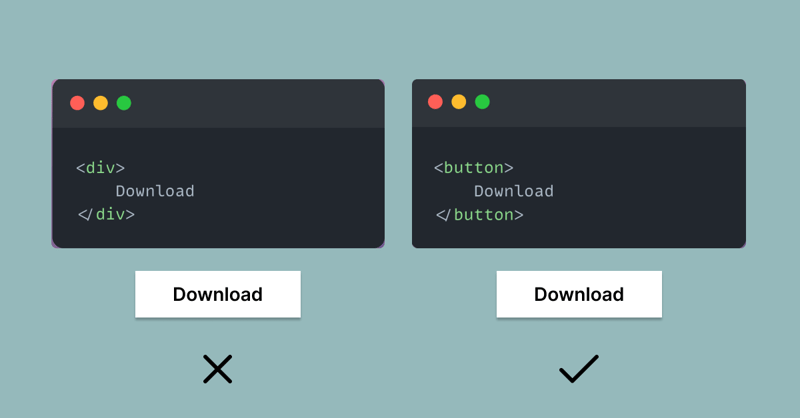
As a developer, the chances are that you can style a <div> to look exactly like a <button>.
Visual representation of div styled as a button vs a button
Although, these two elements may look alike, they don't communicate the same thing to a screen reader. In the first instance, the screen reader will only read out the text content, and users aren't aware they should click the button for the download. In the second instance, a screen reader will announce that users should click the button to download.
To be fair, some people may argue that assigning 'role=button' makes the div a button. However, this approach is bad practice as you'd need to get many "bells and whistles" going, such as onClick handlers, preventDefault, and more.
By all means, avoid using <div>s to build <button>s and other interactive elements. Rather, use <div>s and <span>s as generic boxes for grouping elements at the block or inline levels.
4. Use headings properly
Headings do more than give your text a fancy big, and bold look. They provide a solid structure to your web page. Think of them as guides that help readers quickly scan through the various sections of your webpage to get an idea of what each entails.
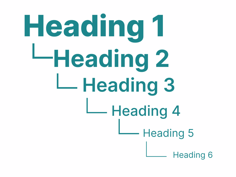
A good heading structure uses the <h1> to <h6> tags to organize web content for accessibility and a good user experience.
HTML Heading Structure
Without proper headings, visually impaired users won't be able to do a quick scan of the page sections and would have to read the entire web page for information. However, with a proper heading structure, screen readers can read a page's layout aloud, allowing users to quickly jump from one heading to another.
A golden rule is to avoid using headings to set font sizes or for visual styling. For instance, using a <h2> tag because you need a large font size. Doing this will result in a poor HTML structure and overall a bad user experience for assistive technology users. In short, use CSS for styling.
5. Support keyboard navigation
Not all users navigate a site page using a trackpad or mouse; many users (with or without motor disabilities) rely on the keyboard to navigate.
Developers need to be aware of the following to enforce keyboard accessibility:
Keyboard focus: This enables sighted users to know what element on the webpage has focus. If the keyboard focus is missing, it becomes difficult for users to access information through a keyboard.
Keyboard tab order: When a keyboard user navigates through a website using the tab, it must be logical, in the correct order, and direct them to the desired point on the page.
Keyboard traps: A keyboard trap happens when a keyboard user cannot move focus away from an interactive element while using the keyboard only. Keyboard traps often occur in calendar widgets or dialogue boxes. A classic scenario is when a user opens a dialogue box but is unable to move to the next item with the tab key or is unable to close the dialog box with the ESC key.
To check the accessibility of your site:
- Place the cursor at the address bar of the browser.
- Start to press the tab.
- Confirm if you're able to navigate through every link or button.
6. Provide sufficient color contrast
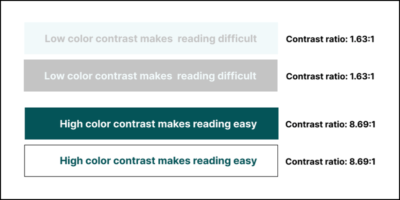
Color contrast describes the differences between the darkest and lightest color brightness. If the color contrast between the background and text is low, users with visual impairments like color blindness will have trouble reading content
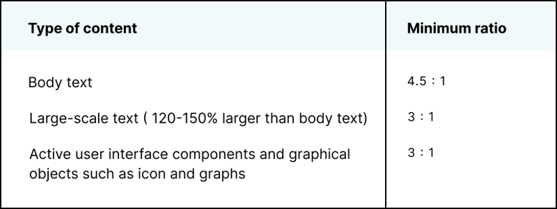
on your page. As a standard, WCAG advises that for body text and background (text with font sizes of 18px and below), the color contrast should be at least 4.5:1.
The WCAG guidelines recommend the following contrast ratios for designing readable interfaces:
Web Developers should ensure they validate their color contrast according to accessibility standards
before building web pages. With a good color contrast, you make it easy for every user to read text elements on your site easily.
Example of poor and good color contrast
7. Underline links within a block of text
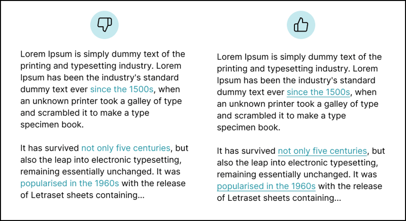
Link accessibility, although easily ignored is an essential aspect of accessibility. On many sites, links are only differentiated from text by color which makes it hard for users with color blindness to identify.
When it comes to making a link accessible, don't use only colors to communicate or differentiate links within a block of tex. By standard, WCAG2.1 recommends that links should also be underlined.
Comparison between links
8. Use ARIA landmarks
The previous versions of HTML lacked some tags that semantically described some UI widgets like menus. To bridge this gap, developers had to use <div> tags to create these widgets.
Although these widgets looked as they should visually, assistive technologies couldn't adequately interpret them to users because the code didn't provide enough information. This is because the <div> tag is a non-semantic HTML. ARIA was introduced to cover up accessibility issues HTML couldn't handle. ARIA, also known as WAI-ARIA, stands for Web Accessibility Initiative — Accessible Rich Internet Applications.
By definition, ARIA is a W3C specification that helps enhance accessibility for plain HTML by providing further information to assistive technologies using HTML attributes. It is important to note that ARIA solely provides an extra descriptive layer for screen readers and has no impact on how these elements are presented.
There are two major categories of ARIA attributes: Roles and State & properties:
Roles describe what an element does and doesn't change once set. For example, you describe the role of a search form as:
<form role=" search">.States and Properties ARIA states and properties support ARIA roles that already exist on a page. While ARIA Properties describe the relationships with other elements and don't change once set, ARIA States are more dynamic and usually update when users interact with a page.
3 popular ARIA States and properties are: aria-label, aria-labelledby and aria-describedby.
Note that ARIA doesn't replace HTML; instead, it complements it.
9. Add caption to tables
The same reason you would label a table for sighted users to get a quick idea of its content is why you'd need to add a caption to your table for visually impaired users. A caption describes the content of the table to screen readers.
To add caption to a table, use the <caption> tag and place it immediately after opening the <table> tag.
Example:
<table>
  <caption>Computer Science students</caption>
  ...
</table>
With the caption, a screen reader can now understand the information in a table and convey it to users.
10. Add <label> tags to forms
Without a <label> tag, assistive technologies won't be able to understand and differentiate the input fields on your form. When a screen reader gets to a form, it immediately reads out the label so that non-sighted users know the type of input form.
There are two ways to attach <label> to <input> fields:
1. Match the for attribute from the label with the id attribute from the input.
  <label for="first-name">First Name</label>
  <input type="text" name="name" id="first-name">
2.Place <input> within the <label> tags.
 <label>
   First Name
   <input type="text" name="first-name">
 </label>
Build a web that's inclusive of everyone
While there are many aspects to consider when weaving accessibility into your site, the above information are a good foundation for building an accessible web.
Building an accessible web isn't a "nice to have" and should be a priority for everyone.

Posted on March 24, 2022
Join Our Newsletter. No Spam, Only the good stuff.
Sign up to receive the latest update from our blog.
