Whats in an image?

Jeff V
Posted on August 18, 2019

For PrayerSurfer my goal is to be inviting to everyone. I've basically decided on the following rules:
- No religion
- No gender
- No words
It can't be strictly Christian, as other religions pray. It can't be religious as there are also non-religious people that pray. I'd like to keep gender out of it, if I can. Also, I'd prefer not to have the logo a word/words. This could be international, so iconography would be best.
So now the trick is to figure out what conveys prayer with non-religious and non-gender images.
With the rules in place, I began to think about what conveys prayer?
- Praying hands
- Flowers
- Candles
I can't draw worth a damn, but I can use paint.net. I'm sure if I hired an artist they would blow me away.
UPDATE:
I wrote the above a week ago, although I agree with most of the rules above, I decided that iconography is good, but after playing with some images I decided to use some words as using strictly images got cartoonish looking. Which is also an assumed rule that I don't want the logo to be.
Finishing strong!
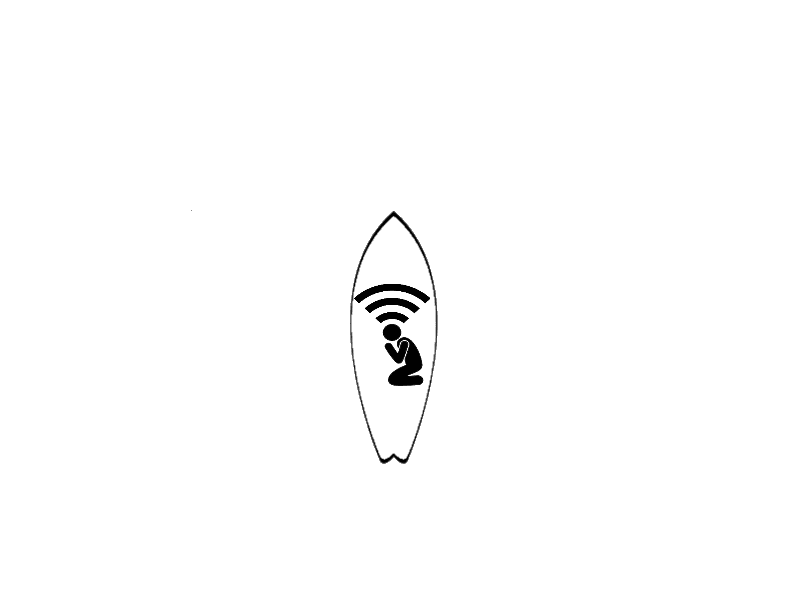
After a week of not really thinking about the image for a week. Today I decided to look at images of prayer. I found a cool clip art of a person in a prayer position. Then I found one with a person in prayer with the wifi signal above the head. I loved this one! However, I couldn't find a stock image of that one. I used the praying person and the wife symbol to create my own image.
I then started to look at surfboards for the "surfer" part. What I decided was to just use a surfboard outline, then just combine the 2 images to convey the
"prayer" & the "surfer" aspect.
I think I found my logo font. When I was looking for images of "Prayer", I found an image of a shirt that had the words Prayer Warrior in a Stencil. I found a Stencil font, downloaded it to my machine created the text PRAYER SURFER.
I started to go down a path with creating a simple sand dune, then I had 2 surfboards next to each other. Then I was playing around with the orientation of the boards. Then I added text to one of the surfboards... Then I added a palm tree... And... It just didn't look right. To me it looked cheesy.
I decided that wasn't going to work, but I did like certain aspects of the original image. I liked the prayingwifi image, and I thought the surfboard was simple but interesting. However, this is where I decided to break one of my original rules. I liked the text, but I didn't want it on another surfboard. So I decided to make the text stand alone in the stencil font. What I came up with, was this:
The thing with logos, is that they can be tweaked. This is version 1. I'm sure when I show this to my friends and family there will be good suggestions. I look forward to that.
Let me know what you think. I'd also love to know how you create your logos.

Posted on August 18, 2019
Join Our Newsletter. No Spam, Only the good stuff.
Sign up to receive the latest update from our blog.
Related

November 5, 2024


