virensuthar
Posted on March 14, 2021

CSS Grid
=> CSS Grid is a layout based system used for placing elements in a grid format without using float and position properties. It's easy to use also used for making webpage responsive. Flexbox and Grid are the most important things to learn in modern CSS.
You can check my article on CSS Flexbox here.
=> Grid is structured on rows and column, by using the grid you can place elements on rows and column in particular number and size and even place in a particular order. here is a basic guide so you can start implementing it in your CSS.
Using Grid
Give property of display: grid; to element for using flexbox.
- #### grid-template-columns
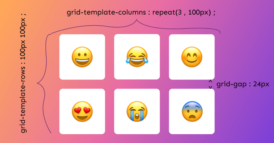
=> grid-template-columns is used for placing grid elements across the column,
like if you give 3 sizes it will divide your page into 3 columns.
example : grid-template-columns : 100px 100px 100px ; this will make 3 columns
with the each column size of 100px, here you can play with numbers you can even pass 100px 200px 100px. You have to pass parameter as number of columns you want you have to pass 5 parameters for 5 columns.
=> But if you want 10 columns this is not a good idea so the grid has a function repeat() so this become easy to use, in repeat you pass the number of columns and the size of each element. Ex: grid-template-column : repeat(5, 100px) it create 5 column size of 100px or grid-template-column : repeat(5, 1fr) fr is fractional units it means it takes all amount of free space.
- #### grid-template-rows
=> grid-template-rows is used for placing grid elements across the rows. All the properties are the same as grid-template-columns but it all works in rows.
=> Now giving space between grid elements you use grid-gap also you can use ( gap only)
Ex: grid-gap : 24px ; it place items with 24px of distance.
Look at the image below all the above properties are summed up. 👇
grid-auto-columns : auto for implicitly created columns positioning (implicit: not created by you).
grid-auto-rows : auto for implicitly created rows positioning.
Placing grid items
grid-column-start : 2 will place items in position 2 as possible.
grid-column-end : 2 it takes to position 5 and expanding.
both can be written shortly like this grid-column : 2/3
he same applies to rows also.
span in a grid used for expanding element at its position with other elements size
, like grid-column: span 2/ 4 means the first element will take the amount of space as equal to 2 elements.
- ####
minmax()
Ex : minmax(150px, 1fr) this means element's minmun width will be 150px and maximum will be 1fr, this used in grid-template-columns.
Tip: whenever you want to make the grid responsive do it this way it makes it responsive without using media query
grid-template-columns: repeat(auto-fit, minmax(300px, 1fr));( replace 300px size according to you.)
- #### grid alignment
unlike flexbox, you can centre things on a grid also.
align-items: center and justify-items: center both can be written in shortly place-items: center.
Best resource to learn CSS Grid is cssgrid.io course by wesbos
Thanks for reading 😊, please give your feedback I am trying to improve my blog by writing in a more structured way. 🙏

Posted on March 14, 2021
Join Our Newsletter. No Spam, Only the good stuff.
Sign up to receive the latest update from our blog.
