Yuval
Posted on March 13, 2021
Intro
We have given a task to build a screen, for mobile devices, which is a single column, with a header, text, image and an action button. The "catch" is that all elements must fit into the screen with NO scrolling, where the image is the "responsive" element that should shrink/expand according to available space.
Here is a schema of the design on 2 different screens:

What we should note here:
- The image shrinks on the small device so the "GO" button is not "pushed" out of the screen
- On larger screens the "GO" button is adjacent to the image, and the image takes the entire width available.
- IMPORTANT: We are guaranteed that the text won't be too long (so there will always be some space left for the image) and we should support "portrait only".
Initial Layout
The first implementation direction that comes to mind is using a "flex" column design, this is the html structure:
<div class="box">
    <div class="title">
        This is some long header?
    </div>
    <div class="text">
        Lorem ipsum dolor sit amet...
    </div>
    <img src="https://via.placeholder.com/600x400.png">
    <button>Open</button>
</div>
our container class, box, is a flex column:
<style>
    .box {
        display: flex;
        flex-direction: column;
        width: 100%;
        height: 100%;
        padding: 10px;
        box-sizing: border-box;
    }
</style>
Inside our "column" we have 4 items: title, text, image and button. The title, text and button just render "as-is" taking as much space as needed, where the <img> will have to adjust to the remaining space.
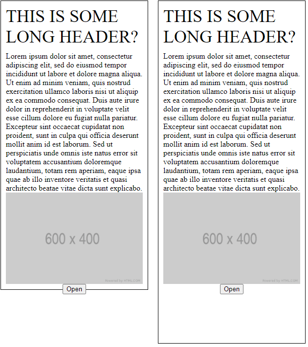
Currently the result looks as follow, "small" device on the left, "large" device on the right:

Sizing inside flex
The first issue that we see is the <button>, which stretches to fill the entire width, this is the default behavior of elements inside a flex container, to fix this we can just apply align-self: center to the <button>, we'll apply this also to the <img>, and voila:

OK, while the <button> is now centered and not stretched anymore, the <img> has lost its bounds... well this can easily be fixed by specifying max-width: 100% on the <img>:

Now we are really close to achieving our goal, we just need to tell the image: "don't push", and the/one way to do it inside a flex container is by setting overflow: auto on the misbehaving element, at this point we'll also set some margin-top to the <button> and <img>:
<style>
    .box img {
        align-self: center;
        max-width: 100%;
        overflow: auto; /* do NOT push others*/
        margin-top: 10px;
    }

    .box button {
        align-self: center;
        margin-top: 30px;
    }
</style>
The END
The key takeaways, inside flex container:
- Use
align-selfto prevent from an element to stretch. - Use
overflow: autoto prevent from an element to "push" other elements (assuming of course the element is "allowed" to shrink).

Posted on March 13, 2021
Join Our Newsletter. No Spam, Only the good stuff.
Sign up to receive the latest update from our blog.

