Valerie Woolard
Posted on August 5, 2019
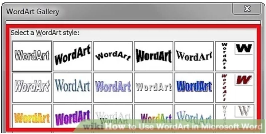
A few weeks ago, after being thoroughly inspired by the wonder that is pure CSS Gritty, I got the idea to attempt to recreate WordArt from old school Microsoft Word in pure CSS.
WordArt was a staple of my early-00s Word experience, and to my middle & high school brain was just the thing to make any piece of printed material look ✨polished✨.
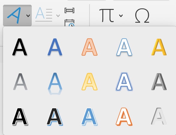
It has been toned down in more recent versions of Word, but I wanted to go for the nostalgia factor and recreate the classics.
I was not the first to have this idea. Several sites exist to generate modern WordArt on the web, but I noticed that these didn't seem to have all the options of the original WordArt function, and so I took this as an opportunity to get a bit better at CSS and try to implement them myself.
As it turns out, this is easier said than done, and it is with good reason that those online WordArt generators lacked some of the classics.
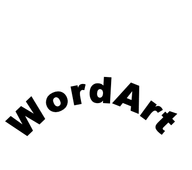
One of the first things I found is that CSS doesn't have a great way to "warp" text. You can have the text follow the path of an SVG, but you can't distort the shape of the text as in the third example on the first image. There may be legitimate accessibility reasons for this, as it can make text much less legible. It would also probably be difficult to implement in a robust way in CSS (and it's probably not a terribly useful or requested feature). I tried to approximate it using varying font sizes and it did not turn out too great. Image above.
It's also more difficult than you'd imagine to set an image as the fill for text. And even so, it's only supported in WebKit. There's a tutorial here. Setting a gradient as a text fill requires a similar process.
As I mentioned earlier, it is possible to wrap text along an SVG path but I think it would be hard to accommodate for text of arbitrary length (e.g. have a squiggly line that just got longer based on the text that was used). The example WordArt generators that I liked got around this issue on slanted text by using the CSS transform properties instead of SVGs.
Beyond these few challenges, I was impressed with how well most of the WordArt could be done with CSS. All the more reason to avoid embedding text in images (besides the existing accessibility wins). All of my CSS WordArt creations can be found on this Codepen.

Posted on August 5, 2019
Join Our Newsletter. No Spam, Only the good stuff.
Sign up to receive the latest update from our blog.


