Onion design systems, accessible type, dark patterns on TikTok — and more UX this week

Fabricio Teixeira
Posted on August 22, 2020
Your weekly list of curated design resources, brought to you by your friends at the UX Collective.
View this email in your browser
Abby Covert: articulating your value as an individual contributor →
“Management is an entirely different skill-set. Really good managers don’t have to be good at the thing they are managing others doing, they need to know how to support, fight for and unblock people. So while I am quite good at IA, I struggled to set aside that skillset to instead focus solely on managing others.”
The UX Collective is an ad-free platform that elevates unheard design voices all over the world, reaching over 380,000 designers every week. Curated by Fabricio Teixeira and Caio Braga.
Stories from the community
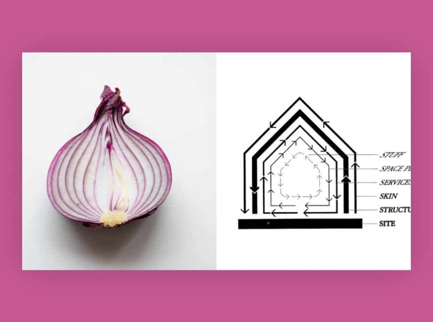
The onion for Design Systems →
All design projects should start in a Google Doc →
Type, type, type
- A guide to understanding what makes a typeface accessible →
- Just my type: tracing the evolution of letters →
- A full-stack designer’s take on a daily lettering challenge →
News & ideas
- Sync to furthest → How structural inconsistencies frustrate users.
- Why we interface → An essay on the past and future of interfaces.
- Dark politics → Tiktoker points dark patterns in candidates sites.
- Footnote usability → A skeuomorph hangover from printed text days.

Tools & resources
- Just in CSS → The just-in-case mindset in CSS.
- #CriticalAxis → Analyzing disability representation in media.
- Omatsuri → Open source browser tools for everyday use.
- Kinopio club → This mindmap tool helps you with hard problems.
We believe designers are thinkers as much as they are makers. So we created the design newsletter we have always wanted to receive.

Posted on August 22, 2020
Join Our Newsletter. No Spam, Only the good stuff.
Sign up to receive the latest update from our blog.
Related
August 22, 2020


