List View Patterns in Flutter: Alignment, Spacing, and Handling Long Texts

Kenji Tomita
Posted on September 10, 2023
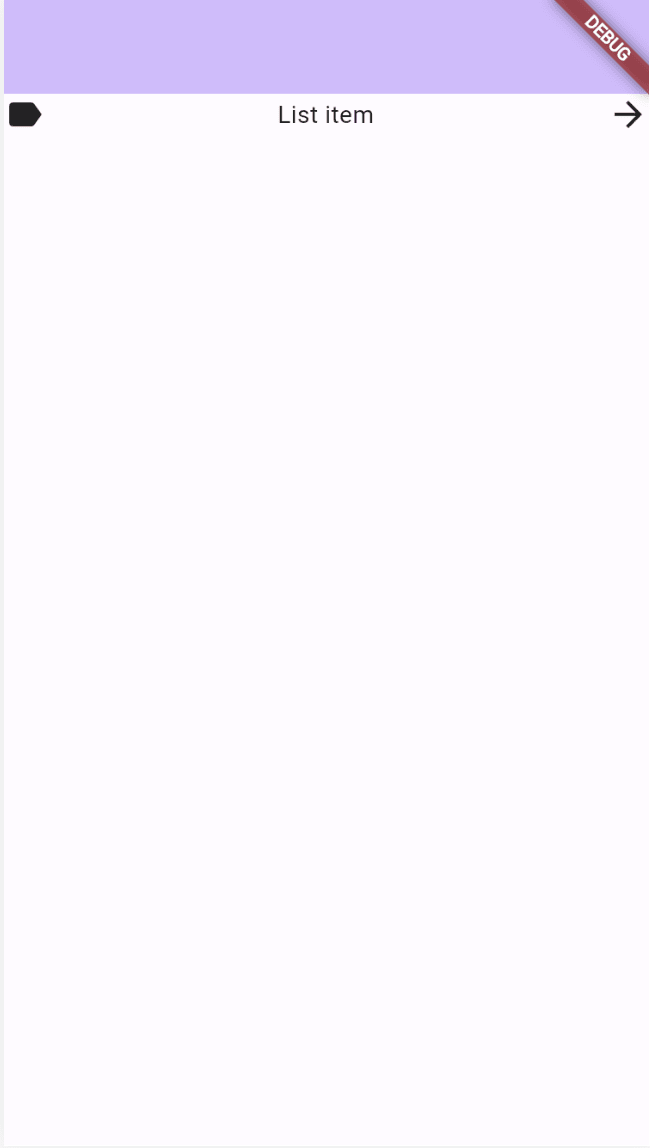
List views are a common UI pattern in many mobile applications. In this article, we'll explore several approaches to creating a list item in Flutter with an icon on the left, text in the center, and an action icon on the right.
Basic List View Patterns
① Using MainAxisAlignment.spaceBetween:
Row(
  mainAxisAlignment: MainAxisAlignment.spaceBetween,
  children: [
    Icon(Icons.label, size: 24.0),
    Text('List item'),
    Icon(Icons.arrow_forward, size: 24.0),
  ],
)
② Using the Expanded widget:
Row(
  children: [
    Icon(Icons.label, size: 24.0),
    Expanded(child: Text('List item')),
    Icon(Icons.arrow_forward, size: 24.0),
  ],
)
③ Using the Spacer widget:
Row(
  children: [
    Icon(Icons.label, size: 24.0),
    Text('List item'),
    Spacer(),
    Icon(Icons.arrow_forward, size: 24.0),
  ],
)
Handling Long Texts
When working with potentially long texts in Flutter's Row widget, it's essential to manage them correctly. Here are various approaches and their outcomes.
① Using MainAxisAlignment.spaceBetween:
This method is often used for evenly spacing items. but if the central text is too long, an overflow issue occurs.
Row(
  mainAxisAlignment: MainAxisAlignment.spaceBetween,
  children: [
    Icon(Icons.label, size: 24.0),
    Text(
      'This is an extremely long list item text that is designed to demonstrate how text overflow can be properly handled in Flutter using the Expanded widget and TextOverflow property set to ellipsis.',
      overflow: TextOverflow.ellipsis,
    ),
    Icon(Icons.arrow_forward, size: 24.0),
  ],
)
② Using the Expanded widget:
By employing the Expanded widget, the text is appropriately truncated according to the available space.
Row(
  children: [
    Icon(Icons.label, size: 24.0),
    Expanded(
      child: Text(
        'This is an extremely long list item text that is designed to demonstrate how text overflow can be properly handled in Flutter using the Expanded widget and TextOverflow property set to ellipsis.',
        overflow: TextOverflow.ellipsis,
      ),
    ),
    Icon(Icons.arrow_forward, size: 24.0),
  ],
)
③ Using the Spacer widget:
This approach also faces overflow issues when the text is too lengthy.
Row(
  children: [
    Icon(Icons.label, size: 24.0),
    Text(
      'This is an extremely long list item text that is designed to demonstrate how text overflow can be properly handled in Flutter using the Expanded widget and TextOverflow property set to ellipsis.',
      overflow: TextOverflow.ellipsis,
    ),
    Spacer(),
    Icon(Icons.arrow_forward, size: 24.0),
  ],
)
When handling long texts within Flutter's Row widget, it's better to use the Expanded widget to properly manage text overflow.
Difference and Inner Workings of Expanded and Spacer
Lastly, let's touch upon the main differences between Expanded and Spacer
-
Expanded: A widget that occupies available space within its parent widget. It allows its child widget to utilize that space fully. -
Spacer: A widget that fills available space. It's handy for adding space between specific widgets.
Interestingly, the Spacer internally uses Expanded. Here's snippet of Spacer's implementation:
class Spacer extends StatelessWidget {
  const Spacer({super.key, this.flex = 1})
    : assert(flex > 0);

  final int flex;

  @override
  Widget build(BuildContext context) {
    return Expanded(
      flex: flex,
      child: const SizedBox.shrink(),
    );
  }
}
For more details, see the official Spacer implementation here
From this implementation, we can see that Spacer utilizes the Expanded widget to create an empty space based on the provided flex value. Specifically, it uses SizedBox.shrink()(a SizedBox with zero size)as a child of Expanded, resulting in an empty space that doesn't render anything.
Conclusion
Through this article, we hope you've deepened your understanding of list view patterns, design, and implementation in Flutter.

Posted on September 10, 2023
Join Our Newsletter. No Spam, Only the good stuff.
Sign up to receive the latest update from our blog.


