(de)composing action bars continued

Thomas Künneth
Posted on February 21, 2021

Welcome to the second installment of (de)composing action bars. In the first part we took a look at how to set titles and subtitles. And we briefly revisited back navigation. Todays' post is based upon a small example called ScaffoldDemo. The corresponding GitHub repo is linked at the bottom of this article.
Back in the very old days Android devices featured hardware keys that navigated back or brought you to the home screen. There was also a dedicated menu buttn that opened the so-called options menu. You can spot it, for example, in the Wikipedia article HTC Dream. Later, those hardware keys became virtual. And the options menu moved to action bar, or appbar. To our (the developers) relief, the underlying machanics remained the same. These included:
- creating an xml file that defines the menu
- implement
onCreateOptionsMenu()(usually your code will inflate the xml file - react to item clicks in
onOptionsItemSelected()
Now, how does this translate to the declarative world? Actually, quite straight forward:
@Composable
fun Content() {
  ScaffoldDemoTheme {
    Scaffold(topBar = {
      TopAppBar(title = {
        Column {
          Text("Title")
          Text("Subtitle", style = MaterialTheme.typography.subtitle1)
        }
      },
        actions = {
          IconButton(onClick = {
            println("Icons.Default.Add")
          }) {
            Icon(Default.Add, null)
          }
          IconButton(onClick = {
            println("Icons.Default.Delete")
          }) {
            Icon(Default.Delete, null)
          }
        })
    }) {
      MyContent()
    }
  }
}
The docs say:
The actions displayed at the end of the
TopAppBar.
This should typically beIconButtons. The default
layout here is aRow, so icons inside will be placed
horizontally.
While this is convenient and easy to implement it offers less flexibility than the old approach. The following file represents a part of the options menu of one of my apps:
<?xml version="1.0" encoding="utf-8"?>
<menu xmlns:android="http://schemas.android.com/apk/res/android"
  xmlns:app="http://schemas.android.com/apk/res-auto">
  <item
    android:id="@+id/new_entry"
    android:icon="@drawable/ic_baseline_create_24"
    app:showAsAction="ifRoom"
    android:title="@string/menu_new_entry" />
  <item
    android:id="@+id/set_date"
    android:title="@string/menu_set_date" />
  …
</menu>
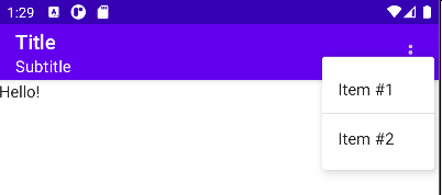
Did you notice ifRoom? That means: put it on the appbar as a visible icon if there is, well, enough room, otherwise put it in a menu, which, by the way, looks like this:
To do something similar in Compose we will use the DropdownMenu.
A
DropdownMenubehaves similarly to aPopup, and will use
the position of the parent layout to position itself on screen.
Commonly aDropdownMenuwill be placed in aBoxwith a
sibling that will be used as the 'anchor'. Note that a
DropdownMenuby itself will not take up any space in a layout,
as the menu is displayed in a separate window, on top of other
content.
How does this translate to code?
@Composable
fun Content() {
  var menuOpened by remember { mutableStateOf(false) }
  ScaffoldDemoTheme {
    Scaffold(topBar = {
      TopAppBar(title = {
        Column {
          Text("Title")
          Text("Subtitle", style = MaterialTheme.typography.subtitle1)
        }
      },
        actions = {
          Box {
            IconButton(onClick = {
              menuOpened = true
            }) {
              Icon(Default.MoreVert, null)
              DropdownMenu(expanded = menuOpened,
                onDismissRequest = {
                  menuOpened = false
                }) {
                DropdownMenuItem(onClick = {
                  menuOpened = false
                }) {
                  Text("Item #1")
                }
                Divider()
                DropdownMenuItem(onClick = {
                  menuOpened = false
                }) {
                  Text("Item #2")
                }
              }
            }
          }
        })
    }) {
      MyContent()
    }
  }
}
Now, while this looks nice it is not the same layout as in the old world. We could tweak the vertical position like this:
offset = DpOffset(0.dp, (-20).dp),
but this leaves at middle of the road:
There is a modifier called onGloballyPositioned which we might utilize like this:
var height: Int
Box(modifier = Modifier.onGloballyPositioned {
  height = it.size.height
}) {
  IconButton(onClick = {
But we still need to convert this Int value to dp, because offset is a DpOffset.
offset = DpOffset(
  0.dp,
  -(LocalDensity.current.density * height).dp
),
Now, this looks good. What do you think about menu support in Compose? Please share your thoughts in the comments.

Posted on February 21, 2021
Join Our Newsletter. No Spam, Only the good stuff.
Sign up to receive the latest update from our blog.


