Thomas George | 1st Phorm
Posted on June 19, 2020

Take a walk through your local town and you will see people with a variety of different shapes, sizes, personalities, and perspectives. Each with their own goals, dreams, thoughts, and expressions of the world. What if I told you that websites should have and need a particular personality of their own? For example, when you visit Facebook, why is the layout structured in that specific way? Why are the icons THAT type of icon? Why are there certain tools or items integrated into it? It has to deal with how the user of the site thinks and perceives the world around them.
When you use an Android Phone, what type of person do you believe it is centered around? What about an iPhone? The Android setup has more effort put into the utilitarian side of the market. So you would usually picture someone who loves to know what’s all running, and the nitty-gritty of the whole phones’ ecosystem. Whereas the iPhone focuses majorly keeping items neat and visually appealing. When you picture the type of person that would enjoy using iPhones, you picture someone who enjoys simplicity and organization without having to worry about all the settings and extra options.
Today I will be discussing a few ways that add a personality to your projects and really make the user feel connected to your application.
Brand Colors
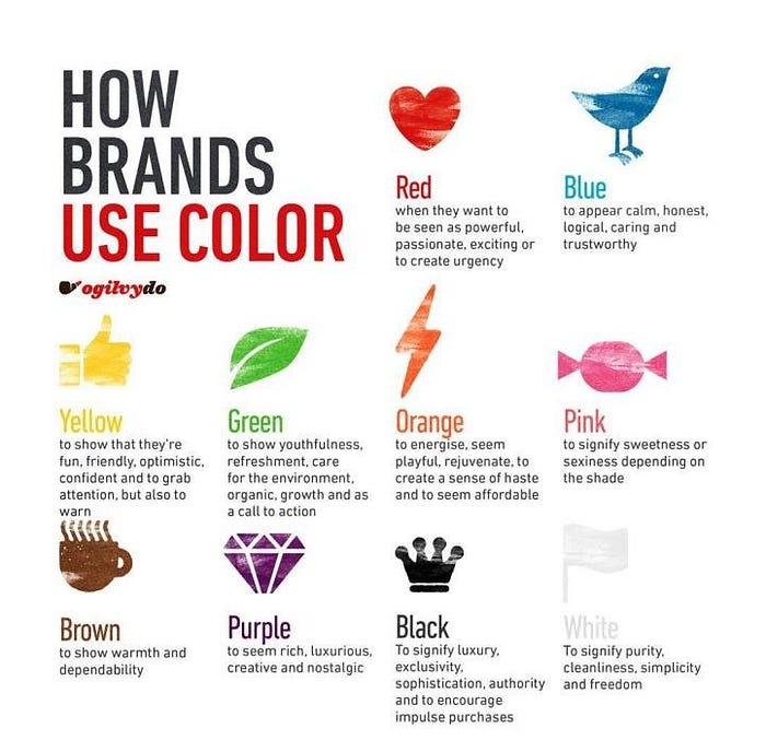
When it comes to choosing which colors you will use for your application, first you must think about how you would like your user to feel when they traverse it. For example, what do you think that Facebook wants the users who visit their site to feel when they visit it? If you recall, Facebook’s colors are dark blue, light blue, and white. Using the figure below, we can see that the color blue gives a calming sense to the person. If we look at another widely used software like Evernote, we see that they focused their main color around shades of green. Green expresses refreshments and signifies growth.

Images
Whether a site is meant to be formal or informal can all come down to one thing, and that’s what type of imagery the developer or company has displayed throughout their site. Let me give an example, look at the next couple images below and before going to the next paragraph write down what type of website comes to mind or the
When you viewed the two images above did your mind picture a large company with hundreds of employees that are very formal and dedicated with what they work on? Or what about a law firm that handles many of the cities biggest clients and gets them out of trouble (to be honest, I might just be watching too much of Suits…).
Let us take a look at another example. Again, before going on to the next paragraph, think about what comes to mind when viewing these images.
When viewing these images did you picture a very personal vlog of a person traveling around the world exploring new places and seeing what the world has to offer? Do you see what I mean? Based on what type of imagery you use, determines what type of emotions the visitors of your site get.
Personal Touches
When users visit your website and see that you added items that — although they are not required for the site to run — are added to help them as a user, they have a higher chance of becoming brand loyal. One way you can add a personal touch to your companies website or application is by adding Easter Eggs. What are Easter Eggs you may ask? They’re hidden references, clues to other games, movies, or software that are scattered throughout a website where only a number of people usually find them or know about them. If you would like to read more about Easter Eggs, view my article “🎉 Everybody Loves Easter Eggs”.
Click Here to View This Easter Egg
References:
DIGITAL MARKETING AND GUERRILLA MARKETING: HUGE OPPORTUNITIES FOR START-UP COMPANIES — Scientific Figure on ResearchGate. Available from: https://www.researchgate.net/figure/Colors-and-their-meanings_fig1_320489998 [accessed 22 May, 2020]

Posted on June 19, 2020
Join Our Newsletter. No Spam, Only the good stuff.
Sign up to receive the latest update from our blog.


