Celebrating my website launch

Thalita G.
Posted on March 22, 2021

After a long time, I have finally updated my website and decided to start my blog with it. Here's my first post, explaining the progress that I went through.
I started helping people on the Scrimba Discord server shortly after it was launched. I realised that perhaps my knowledge and explanations could be valuable. I'd also discovered places where you could share your posts, like dev.to. It made me start thinking about starting a blog, a place where I can share my experience with others.
And now, I'm finally writing my first post ever. On a brand-new website.
Goals and constraints
I've just started looking for a new job, so I had to make sure I got a newly updated website as soon as possible, while still making this a comfortable space for myself.
So, the site must:
- Be finished within 2 weeks
- Show off my personality and what I enjoy
- Showcase my skills right off the bat
- Use my favourite stack, the JAMstack
- Be usable on devices and browsers that block JavaScript
The design
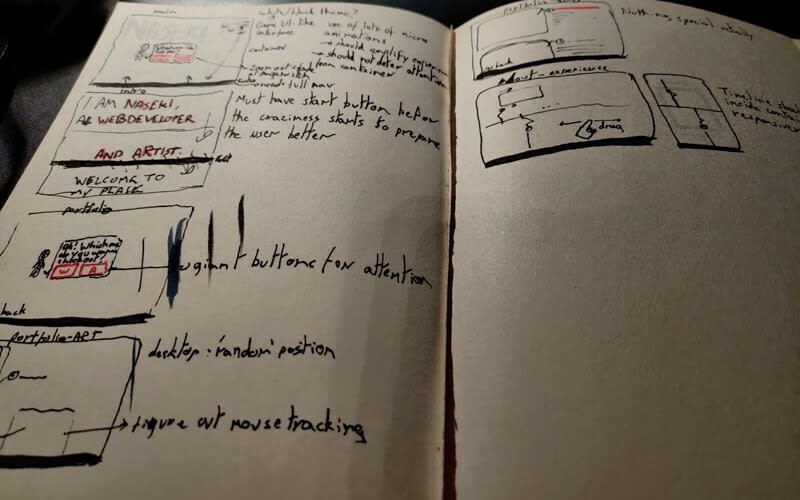
I already had a general idea of the design last year. The website would be made of windows. The homepage including my little bot tracking your mouse position. It'd have the navigation at the bottom since it's a much more logical location on mobile. It'd have theme options that'd always use any shade of red as its main colour. It'd show your current location on the website for easy navigation.
The terminal-like introduction on my homepage came later. So did the little header on top of the window containing your current location. The idea of the latter was already there at the time. I just didn't know where to place it.
Initially, I was planning to add a lot of different particles and motion in the background to add to the tech-like feeling. However, I decided to leave it as it is now as I started to take a liking its current look while developing. My website should be a place for people to read my articles, so a lot of white space and lack of distracting elements would help a lot with that.
The tools
I've been a huge fan of Eleventy for over a year now, so it was a given that I'd use that to make my website. It's a very lightweight and flexible static site generator that doesn't depend on any JavaScript. It's closer to Jekyll than Gatsby, as you create your pages using markdown files while using nunjucks for templating.
So I'd at least already decided on that. Since I didn't have a lot of time to make this, I had to make a few shortcuts along the way.
I wanted to give the website the feeling that it is a single-page web application by making page transitions. The history API was the answer to this. However, after doing some research, I've found that the history API doesn't come without its caveats and edge-case problems. Instead of taking the time to further research and write code for all of that, I decided to use an already existing plugin, Swup. Not only does Swup deal with page transitions, but it also captures pages in advance when you hover over the links using its "preload plugin". Excellent!
The other plugin I've used is SimpleBar. It's a lightweight plugin that adds cross-browser scrollbars. I simply wanted to make sure the scrollbar looked great on any browser, as the default scrollbar would break the look of these little windows.
These two already saved me enough time that I could code everything else on my own. The themes are saved in LocalStorage. The site also checks in SessionStorage whether you've already visited the homepage in your current session. That way you wouldn't have to go through the entire terminal-like experience again.
The blog
This blog is my space for anything I'd like to share. This means that not only will I talk about dev itself, I may also talk about productivity and career life. Since I'm also into illustration, I'd like to add little drawings to my articles whenever they help convey the message.
The content on dev.to and on this website will be slightly different. Dev.to gets only dev and career-related articles and this website gets the full package. Makes sense huh?
What's next?
There's still a lot that needs to be done on this website. I couldn't do most of these just yet out of time constraints.
Here are some things I plan to do:
- Making the interactive timeline page
- Tackling accessibility
- Adding some extra pages such as my work progress
- Ability to filter the blog by tag
- Adding RSS (it's still relevant, folks!)
- Get a newsletter where I share not only my own posts but anything else dev or design-related I've found on the internet
My next posts will mainly consist of tutorials related to things I've made for this website. It's still a bit of a mystery of what I'll be doing after that, but I can say for sure I've got a lot of exciting stuff to talk about.
So, until next time!
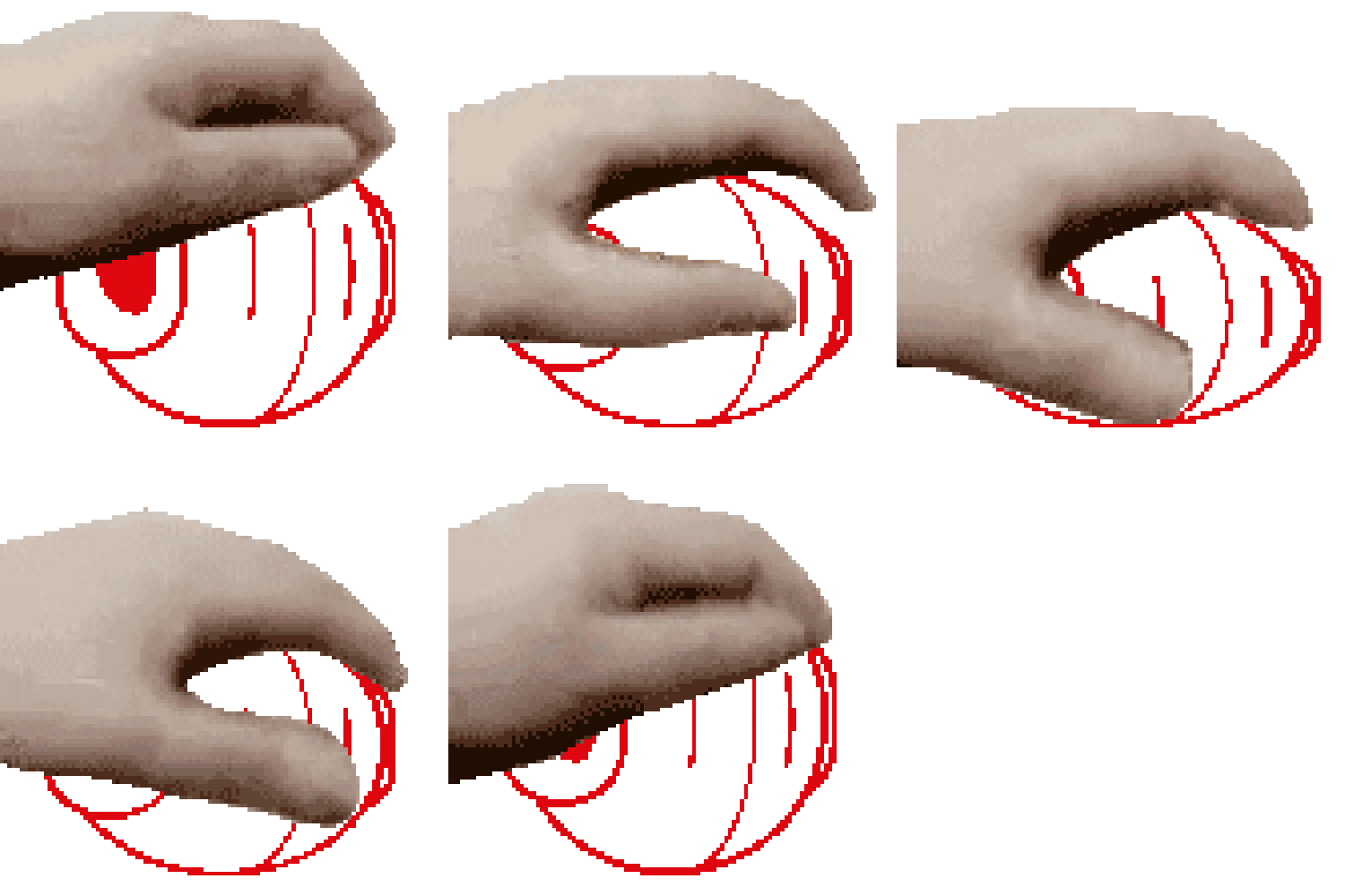
Oh, and have a pat pat gif of my bot.

Posted on March 22, 2021
Join Our Newsletter. No Spam, Only the good stuff.
Sign up to receive the latest update from our blog.


