Luka 03 - See. Assess.

Thomas Eckert
Posted on September 11, 2019

This post is part of a series on the development of a reverse polish notation calculator web-app using Rust/Wasm, Vue, and TypeScript. You can read more and follow along with development at the GitHub Repo.
Button++
One button is good, but does not a calculator make. It's time to add components for ButtonPush and ButtonNumber.
Before starting that, I am just going to change the page title in the base HTML to Luka. I want to make a cool favicon too, but that can wait until I have the design and color scheme nailed down.
I moved the three button components into a directory called buttons.
buttons
|- ButtonNumber.vue
|- ButtonOperation.vue
|- ButtonPush.vue
There are likely to be more of them and I want anyone coming to this project to be able to find any part of the code they need to change. The button components are all similar, that will change as I give them behavior. I made some changes to the layout and added colors that I have stolen from TailwindCSS:
The colors here are:
| Default | Hover | |
|---|---|---|
| Operation | #38B2AC | #319795 |
| Number | #4A5568 | #2D3748 |
| Push | #4C51BF | #434190 |
I am going to set the color scheme for Number to be the default and add styling to make Operation and Push buttons distinct.
The additional styling is set on the component itself. This can be seen in the ButtonPush component here:
<template>
  <button>Push</button>
</template>

<script lang="ts">
import { Component, Prop, Vue } from "vue-property-decorator";

@Component
export default class ButtonPush extends Vue {}
</script>

<style scoped>
:root {
  --button-default: #4c51bf;
  --button-hover: #434190;
}

button {
  background-color: var(--button-default);
}

button:hover {
  background-color: var(--button-hover);
}

button:active {
  background-color: var(--button-default);
}
</style>
The ButtonOperation component is similar.
Separation of Concerns
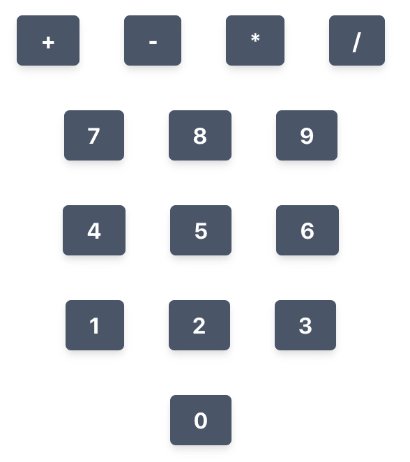
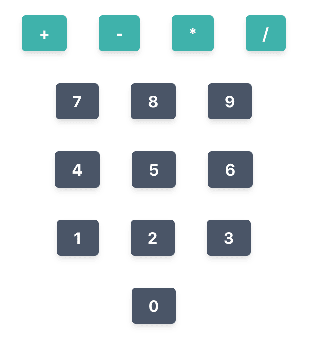
I iterated on the design from Luka 02, adding the coloring and adjusting the layout a bit. This new design can be separated into several components. First we see the intent of the design without the separation highlighted:
The component separations can be seen here:
The next step is to build these Base components and populate them with buttons.
Now the component structure is
|-App.vue                   implements Calculator
|-components/
| |-Calculator.vue          implements BaseActions, BaseNumbers, BaseOperations, BaseState
| |-bases/
| | |-BaseActions.vue       implements ButtonPush
| | |-BaseNumbers.vue       implements ButtonNumber
| | |-BaseOperations.vue    implements ButtonOperation
| | |-BaseState.vue
| |-buttons/
| | |-ButtonNumber.vue
| | |-ButtonOperation.vue
| | |-ButtonPush.vue
I'm going to start with the BaseNumbers which is going to have a 3x4 grid.
Ok, not a bad start:
There is definitely a slicker way to iterate through the numbers to draw them all to the screen, but what I have works for now.
A Colorful CSS Mistake
Here is something worth investigating. I added ButtonOperation components to the BaseOperations component and that component to the Calculator. It drew the buttons in the app, but they still have the base button color!
This kind of investigating comes up in writing software all the time. Let's dig in.
The problem could come about because I am defining the new colors in a root: on the component. One good way of finding the source of problems is shortening the path between two points in the system. Here, instead of defining the color as a variable, then setting it from that variable, I'll just directly set it.
That fixed it:
This CSS did not work:
:root {
  --button-default: #38b2ac;
  --button-hover: #319795;
}

button {
  background-color: var(--button-default);
}

button:hover {
  background-color: var(--button-hover);
}

button:active {
  background-color: var(--button-default);
}
This CSS did work:
button {
  background-color: #38b2ac;
}

button:hover {
  background-color: #319795;
}

button:active {
  background-color: #38b2ac;
}
The problem being that I was setting the root: within a scoped CSS Vue styling component. I might do more research on it later, but from an understanding of what it would mean to be scoped, it makes sense that I cannot put root: within something that is scoped, it would never reach the "top" of the CSS hierarchy. Maybe that's not the right way to say it. Hopefully my point comes across.
I have two ways I could still do this using a variable-type syntax. One is to use SCSS in the scoped CSS component and set the variables as SCSS variables. The other is to set all color variables in a root: in main.css.
I like the latter option because it gives future maintainers a single file to change the color of every button in the UI.
The main.css now contains the definition for every button color. When I add more buttons/functionality, I'll put the colors here too:
:root {
    --button-default: #4A5568;
    --button-default-hover: #2D3748;
    --button-operation: #38b2ac;
    --button-operation-hover: #319795;
    --button-push: #4c51bf;
    --button-push-hover: #434190;
    --shadow: 0 4px 6px -1px rgba(0, 0, 0, .1), 0 2px 4px -1px rgba(0, 0, 0, .06);
}

button {
    text-align: center;
    font-weight: 700;
    border-color: transparent;
    border-radius: 0.25rem;
    flex-shrink: 0;
    justify-content: center;
    cursor: pointer;
    color: #fff;
    background-color: var(--button-default);
    padding: 0.5rem 1rem;
    margin: 1rem;
    box-shadow: var(--shadow);
    transition: background-color 80ms linear;
}

button:hover {
    background-color: var(--button-default-hover);
}

button:active {
    background-color: var(--button-default);
}
Then the components call to these variables from their styles, for instance, the ButtonOperation style is
button {
  background-color: var(--button-operation);
}

button:hover {
  background-color: var(--button-operation-hover);
}

button:active {
  background-color: var(--button-operation);
}
And that works! (I almost took another screenshot to show below, but it just looks the same as it does above -- which was what I was going for -- so success!)
One Last Button and Some Fake State to go with it
Adding the BaseActions and ButtonPush components is much the same process. The buttons are not on the grid yet, I will fix that later.
The BaseState component is different from the other Base* components, because I am going to pass data to it. This might be a good time to talk about how I plan to structure the state handling in the Calculator component and how I'm thinking about component interaction as a whole.
Each Button* component will affect the state in some way. Rather than that component changing state directly or communicating to Wasm to do calculations, I'm going to route all state-changing operations through the Calculator component. Here is an example of how I want this to work:
- The initial state stack is
[2.0, 4.0]. - The
+button is clicked. - The
ButtonOperationcomponent passes "+" toBaseOperations. -
BaseOperationspassesoperate("+")toCalculator -
Calculatorparses the instruction and passes it to Wasmcalculatorwhich passes back the state[6.0]. -
Calculatorpasses the state toBaseStatewhich handles rendering it properly.
While the state doesn't have to be handled this way. I think it's just going to be safer to minimized the number of components that can directly change the state (in this case minimized to 1). When I talk about safer, I'm not talking about how the code is necessarily set up if the code were some static, unchanging document. If that were the case, either method would be "safe". But code changes, it is meant to change. Making those changes easier is part of what you learn as a software engineer.
I talked to a mentee recently about how growing as a software engineer is more about growth in wisdom rather than knowledge (though of course they are intertwined). Much of the hard knowledge of programming can easily be Googled. Modern compilers will guide you in the right direction too. Knowing what patterns to use and which to avoid is part of growing as an engineer.
With that said, let's pass some fake state to the BaseState component. Setting an array of numbers called state in Calculator will cause BaseState to update with the last 4 values in that array. As things progress and I give more control to the user, I will need to be thoughtful about this mutable state. If someone were to continually push values onto the stack, they could eventually fill up the memory of the service worker rendering that tab in the browser.
At least with Wasm and Vue, I don't have to worry about an insecure backend. If I were running the Rust portion of this code, holding the state, as a web server there could be potential for compromise by pushing unhandled values into the backend. If I didn't plan for that possibility, I could be in trouble -- more susceptible to DDOS attacks (You will always be susceptible to DDOS attacks. It's just a matter of making the attack hard enough to pull off.).
Here is the app as it now renders. I am going to merge back into master. I'm also going to delete the add-function-buttons branch that I've been working on. I no longer feel that is a good description of what I'm doing and I need a new name for this "feature".
Wrap Up
I'm not sure what I want to do next. I'll have to sleep on it. Either I'll wire up the Wasm so I can get state from Rust or I'll work on passing the function of the buttons up the stack of Vue components.
Starting Commit: 7a7251ace3a5ed0b4c67f024130fdda5fb5580e7
Ending Commit: 049a205f3a9e4c6cda6f9171a5b071d005b7152c

Posted on September 11, 2019
Join Our Newsletter. No Spam, Only the good stuff.
Sign up to receive the latest update from our blog.


