7 Best React Chart / Graph Libraries & How to Use Them (With Demo)

Syakir
Posted on August 27, 2020

This post was originally published at https://www.devaradise.com/best-react-chart-graph-libraries
Chart or Graph is a common component in a web application used for data visualization. It turns raw data into information that can be used for decision making.
Creating chart components in the web-app from scratch is difficult and very time-consuming. Because of that, web developers usually create chart components using an external library.
In React, We can also use an external library to create chart components. There are many React chart libraries we can choose.
Here, We are going to discuss and review 7 top react chart/graph libraries so you can choose and decide what's best for project.
Related Tutorials
We will see what each of these libraries can do, how easy to use & customize it, and how popular it is among developers.
For usage details, I include a code snippet and a working demo example for each library. Each demo example has the same data and case so to make it fair when we compare them.
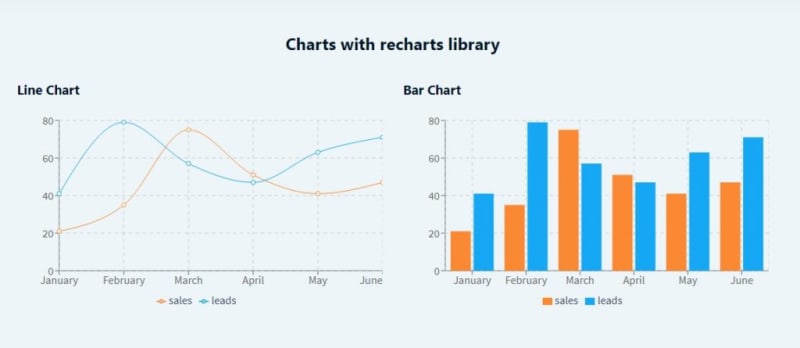
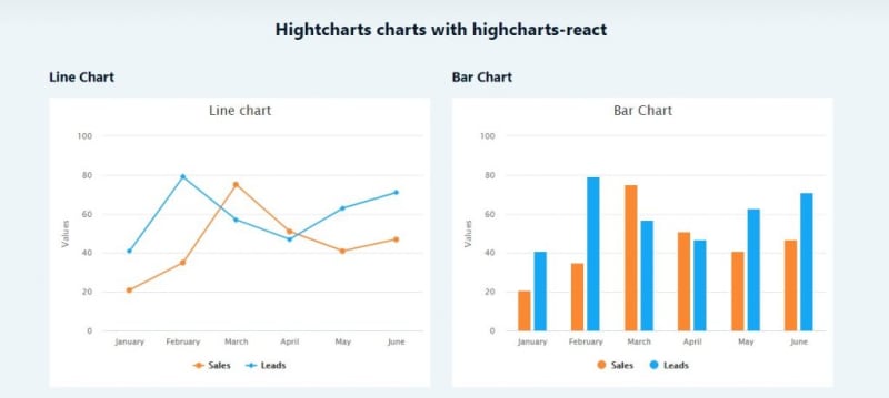
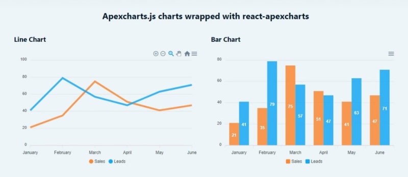
We will visualize sales and leads data from January to June with Line and Bar Chart.
You can see the all demo examples in the link below.
For the complete codes, you can see here on github. You can also clone the repository that contains demo for other tutorials as well. Don't forget to star it if you find it useful :D.
Now, let's see and review the 7 react chart libraries below.
1. Recharts
Rechart is a simple, easy and highly-customizable open-source chart library for React.js. It supports line chart, bar chart, doughnut, pie chart, etc.
With more than 14k stars on github, Rechart is the most popular chart library built on top of React and D3.
Recharts is well documented and easy to implement. It also has minimal pre-designed charts that suit any design style.
How to use recharts
To use recharts, first you have to install it on your React project.
npm install recharts
After it installed, you can create charts by using recharts components easily as follows.
import React from 'react'
import { ResponsiveContainer, LineChart, Line, BarChart, Bar, CartesianGrid, XAxis, YAxis, Tooltip, Legend } from 'recharts';

const data = [
  { label: 'January', sales: 21, leads: 41 },
  { label: 'February', sales: 35, leads: 79 },
  { label: 'March', sales: 75, leads: 57 },
  { label: 'April', sales: 51, leads: 47 },
  { label: 'May', sales: 41, leads: 63 },
  { label: 'June', sales: 47, leads: 71 }
];

export default function Recharts() {
  return (
    <div className="row">
      <div className="col-md-12">
        <h2>Charts with recharts library</h2>
      </div>

      <div className="section col-md-6">
        <h3 className="section-title">Line Chart</h3>
        <div className="section-content">
          <ResponsiveContainer width="100%" height={300}>
            <LineChart data={data} margin={{ top: 15, right: 0, bottom: 15, left: 0 }}>
              <Tooltip />
              <XAxis dataKey="label" />
              <YAxis />
              <CartesianGrid stroke="#ccc" strokeDasharray="5 5" />
              <Legend/>
              <Line type="monotone" dataKey="sales" stroke="#FB8833" />
              <Line type="monotone" dataKey="leads" stroke="#17A8F5" />
            </LineChart>
          </ResponsiveContainer>
        </div>
      </div>

      <div className="section col-md-6">
        <h3 className="section-title">Bar Chart</h3>
        <div className="section-content">
          <ResponsiveContainer width="100%" height={300}>
            <BarChart data={data} margin={{ top: 15, right: 0, bottom: 15, left: 0 }}>
              <XAxis dataKey="label" />
              <YAxis />
              <CartesianGrid stroke="#ccc" strokeDasharray="5 5" />
              <Tooltip />
              <Legend/>
              <Bar dataKey="sales" fill="#FB8833" />
              <Bar dataKey="leads" fill="#17A8F5" />
            </BarChart>
          </ResponsiveContainer>
        </div>
      </div>

    </div>
  )
}
As you see, the data object supplied for the charts is simple (line 5 - 12). It doesn't mix with options object like the other chart libraries. This makes recharts is easier and simple to implement.
In recharts, most of the chart elements like legends, grid, and tooltip also have their own component. So, we can just call include the in JSX markup if we want to show them.
If you want to see more recharts examples, you can see go to the official recharts examples page.
2. React-chartjs-2 (Chart.js wrapper for React)

 reactchartjs
/
react-chartjs-2
React components for Chart.js, the most popular charting library
react-chartjs-2 is just a wrapper for Chart.js, the most popular javascript library for chart and graph with 50k+ stars on Github.
Chart.js is a great library to create highly customizable charts. It has many kinds of charts and a lot of options to customize it. It supports line chart, bar chart, doughnut & pie, scatter, radar, etc.
With react-chartjs-2, Implementing Chart.js in React becomes easier. React-chartjs-2 creates ready-to-use React chart components that can be used in JSX.
How to use chart.js in React
To use chart.js, you have to install chart.js and react-chartjs-2 as follows.
npm install --save react-chartjs-2 chart.js
After that, you can import the chart components you want to implement, and use them. You can see the codes below.
import React from 'react'
import { Line, Bar } from 'react-chartjs-2';

const data = {
  labels: ['January', 'February', 'March', 'April', 'May', 'June'],
  datasets: [
    {
      label: 'Sales',
      data: [21, 35, 75, 51, 41, 47],
      fill: false, // for Line chart
      backgroundColor: '#FB8833',
      borderColor: '#FB8833' // for Line chart
    },
    {
      label: 'Leads',
      data: [41, 79, 57, 47, 63, 71],
      fill: false, // for Line chart
      backgroundColor: '#17A8F5',
      borderColor: '#17A8F5' // for Line chart
    }
  ]
};

const options = {
  scales: {
      yAxes: [{
          ticks: {
              beginAtZero: true
          }
      }]
  }
}

export default function ReactChartjs2() {
  return (
    <div className="row">
      <div className="col-md-12">
        <h2>Chart.js charts wrapped with react-chartjs-2</h2>
      </div>

      <div className="section col-md-6">
        <h3 className="section-title">Line Chart</h3>
        <div className="section-content">
          <Line data={data} options={options}/>
        </div>
      </div>

      <div className="section col-md-6">
        <h3 className="section-title">Bar Chart</h3>
        <div className="section-content">
          <Bar data={data} options={options}/>
        </div>
      </div>

    </div>
  )
}
With chart.js, the data object supplied for the chart has some properties to customize it, like fill, backgroundColor and borderColor.
The options object is used to set any configuration that not related to the data like chart layout, legend, animations, etc.
There are a lot of options to customize your chart with Chart.js. You can see the Chart.js official docs for that.
3. Nivo
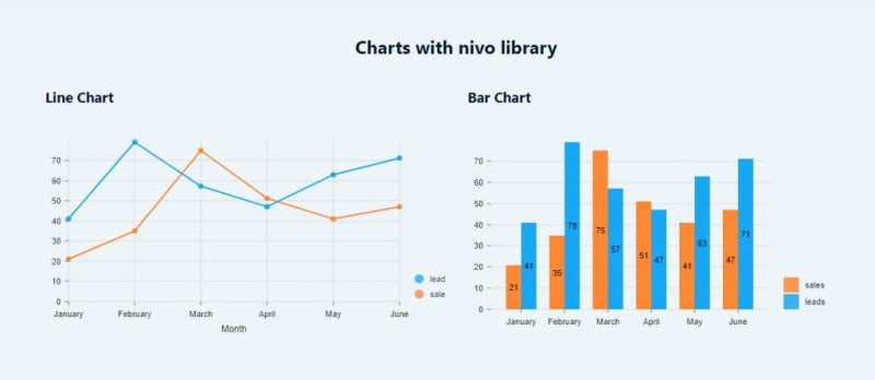
Nivo is another best data visualization library for React, built on top of D3. It is highly customizable and has a lot of data visualization components with very good documentation.
It supports line chart, bar chart, bubble, heatmap, pie, radar and many more with the options to create them using SVG, Canvas and HTTP API.
Nivo also provides server side rendering ability and fully declarative charts.
How to use nivo
Nivo is modular. So, you don't have to install all packages on your project. Just install the components you want to add using yarn. You can find all the component list here.
yarn add @nivo/bar @nivo/line
After that, you can create nivo charts as follows.
import React from 'react'
import { ResponsiveLine } from '@nivo/line'
import { ResponsiveBar } from '@nivo/bar'

const data = [
  {
    id: 'sales',
    color: '#FB8833',
    data: [
      { x: "January", y: 21 },
      { x: "February", y: 35 },
      { x: "March", y: 75 },
      { x: "April", y: 51 },
      { x: "May", y: 41 },
      { x: "June", y: 47 }
    ]
  },
  {
    id: 'leads',
    color: '#17A8F5',
    data: [
      { x: "January", y: 41 },
      { x: "February", y: 79 },
      { x: "March", y: 57 },
      { x: "April", y: 47 },
      { x: "May", y: 63 },
      { x: "June", y: 71 }
    ]
  }
];

const databar = [
  { label: 'January', sales: 21, leads: 41 },
  { label: 'February', sales: 35, leads: 79 },
  { label: 'March', sales: 75, leads: 57 },
  { label: 'April', sales: 51, leads: 47 },
  { label: 'May', sales: 41, leads: 63 },
  { label: 'June', sales: 47, leads: 71 }
]

export default function Nivo() {
  return (
    <div className="row">
      <div className="col-md-12">
        <h2>Charts with nivo library</h2>
      </div>

      <div className="section col-md-6">
        <h3 className="section-title">Line Chart</h3>
        <div className="section-content" style={{height:'300px'}}>
          {/*
          // make sure parent container have a defined height when using
          // responsive component, otherwise height will be 0 and
          // no chart will be rendered. */}
          <ResponsiveLine
            data={data}
            margin={{ top: 30, right: 60, bottom: 60, left: 30 }}
            axisBottom={{
              orient: 'bottom',
              tickSize: 5,
              tickPadding: 5,
              tickRotation: 0,
              legend: 'Month',
              legendOffset: 36,
              legendPosition: 'middle'
            }}
            colors={d => d.color}
            pointSize={7}
            pointBorderWidth={2}
            pointLabelYOffset={-12}
            useMesh={true}
            legends={[
              {
                anchor: 'bottom-right',
                direction: 'column',
                justify: false,
                translateX: 100,
                translateY: 0,
                itemsSpacing: 0,
                itemDirection: 'left-to-right',
                itemWidth: 80,
                itemHeight: 20,
                itemOpacity: 0.75,
                symbolSize: 12,
                symbolShape: 'circle',
                symbolBorderColor: 'rgba(0, 0, 0, .5)',
              }
            ]}
          />
        </div>
      </div>

      <div className="section col-md-6">
        <h3 className="section-title">Bar Chart</h3>
        <div className="section-content" style={{height:'300px'}}>
          {/*
          // make sure parent container have a defined height when using
          // responsive component, otherwise height will be 0 and
          // no chart will be rendered. */}
          <ResponsiveBar
            data={databar}
            keys={[ 'sales', 'leads' ]}
            indexBy="label"
            groupMode="grouped"
            margin={{ top: 30, right: 130, bottom: 50, left: 30 }}
            padding={0.3}
            colors={['#FB8833', '#17A8F5']}
            legends={[
              {
                dataFrom: 'keys',
                anchor: 'bottom-right',
                direction: 'column',
                justify: false,
                translateX: 120,
                translateY: 0,
                itemsSpacing: 2,
                itemWidth: 100,
                itemHeight: 20,
                itemDirection: 'left-to-right',
                itemOpacity: 0.85,
                symbolSize: 20,
              }
            ]}
            animate={true}
          />
        </div>
      </div>

    </div>
  )
}
The data object and options for each chart type are different. Nivo components has also many props for customization.
In the first look, that may seem intimidating. But, with Nivo modularity and very good documentation, you don't have to worry about all of those options.
4. Hightcharts-react (Highcharts wrapper for React)
 highcharts
/
highcharts-react
highcharts
/
highcharts-react
The official Highcharts supported wrapper for React
Highchart is a popular javascript library for charts with 9k+ stars on Github. To make it easily implemented in React, the developer create highcharts-react as a react wrapper for highcharts.
Highcharts supports various line charts, time series, area chart, column/bar chart, pie chart, scatter, bubble, and many more. You can see the complete demo here.
How to use highcharts
To use highcharts, first, you have to install highcharts and highcharts-react-official as wrapper on your React project using npm.
npm install highcharts highcharts-react-official
After that, you can create the charts as follows.
import React from 'react'
import Highcharts from 'highcharts'
import HighchartsReact from 'highcharts-react-official'

const LineChartOptions = {
  title: {
    text: 'Line chart'
  },
  xAxis: {
    categories: ['January', 'February', 'March', 'April', 'May', 'June']
  },
  colors: ['#FB8833', '#17A8F5'],
  series: [
    {
      name: 'Sales',
      data: [21, 35, 75, 51, 41, 47]
    },
    {
      name: 'Leads',
      data: [41, 79, 57, 47, 63, 71]
    }
  ],
  credits: {
    enabled: false
  }
}

const BarChartOptions = {
  chart: {
    type: 'column'
  },
  title: {
    text: 'Bar Chart'
  },
  xAxis: {
    categories: ['January', 'February', 'March', 'April', 'May', 'June']
  },
  colors: ['#FB8833', '#17A8F5'],
  series: [
    {
      name: 'Sales',
      data: [21, 35, 75, 51, 41, 47]
    },
    {
      name: 'Leads',
      data: [41, 79, 57, 47, 63, 71]
    }
  ],
  credits: {
    enabled: false
  }
}

export default function HighchartsReactWrapper() {
  return (
    <div className="row">
      <div className="col-md-12">
        <h2>Hightcharts charts with highcharts-react</h2>
      </div>

      <div className="section col-md-6">
        <h3 className="section-title">Line Chart</h3>
        <div className="section-content">
          <HighchartsReact
            highcharts={Highcharts}
            options={LineChartOptions}
          />
        </div>
      </div>

      <div className="section col-md-6">
        <h3 className="section-title">Bar Chart</h3>
        <div className="section-content">
          <HighchartsReact
            highcharts={Highcharts}
            options={BarChartOptions}
          />
        </div>
      </div>

    </div>
  )
}
As you see, you should create a mixed data and option object for each chart component. The data object structure are quite readable.
To customize it further, you can see the official documentation to add more options.
5. React-apexcharts (ApexCharts wrapper for React)
 apexcharts
/
react-apexcharts
📊 React Component for ApexCharts
Like Chart.js and Highchart, Apexcharts is also a popular javascript chart library that can be implemented to React with a wrapper. Apexcharts supports line, bar/column, area, timeline, mixed, candlestick, etc.
Among the other 6 chart libraries, Apexcharts is the most feature-rich and beautifully designed chart library. With minimum options, you can have a chart with zoom in/out feature, area selection, and import options to SVG, PNG, and CSV format.
But, it comes with a cost. Apexcharts has slower rendering charts compared to other chart libraries here.
How to use apexcharts
To use Apexcharts, first, you have to install it on your React project, as well as its wrapper.
npm install react-apexcharts apexcharts
Then, you can create chart components as follows.
import React from 'react'
import Chart from 'react-apexcharts'

const options = {
  chart: {
    id: 'apexchart-example'
  },
  xaxis: {
    categories: ['January', 'February', 'March', 'April', 'May', 'June']
  },
  colors: ['#FB8833', '#17A8F5']
}

const series = [
  {
    name: 'Sales',
    data: [21, 35, 75, 51, 41, 47]
  },
  {
    name: 'Leads',
    data: [41, 79, 57, 47, 63, 71]
  }
]

export default function ReactApexcharts() {
  return (
    <div className="row">
      <div className="col-md-12">
        <h2>Apexcharts.js charts wrapped with react-apexcharts</h2>
      </div>

      <div className="section col-md-6">
        <h3 className="section-title">Line Chart</h3>
        <div className="section-content">
          <Chart options={options} series={series} type="line"/>
        </div>
      </div>

      <div className="section col-md-6">
        <h3 className="section-title">Bar Chart</h3>
        <div className="section-content">
          <Chart options={options} series={series} type="bar" />
        </div>
      </div>

    </div>
  )
}
You only need to import a Chart component and call it in JSX with some props.
The data and options object are similar with highcharts. For more details of the customization, you can go to the official documentation.
6. React-vis
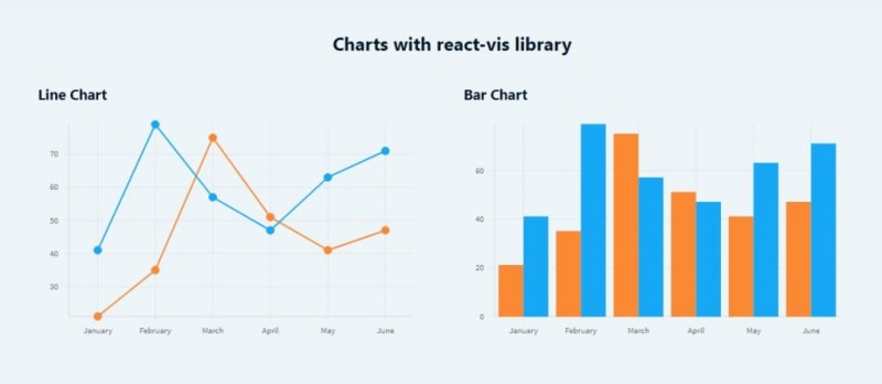
React-vis is a collection of react components to render common data visualization charts.
It supports line/area/bar charts, heat maps, scatterplots, contour plots, hexagon heatmaps, pie and donut charts, sunbursts, radar charts, parallel coordinates, and treemaps.
React-vis is great if you want to create your own designed chart.
How to use React-vis
To use react-vis, first you have to install it on your React project.
npm install react-vis --save
After it installed, you can create charts as follows.
import React from 'react'
import '../../../../node_modules/react-vis/dist/style.css';
import { XYPlot, XAxis, YAxis, HorizontalGridLines, VerticalGridLines, LineMarkSeries, VerticalBarSeries } from 'react-vis';

const data = {
  sales : [
    { x: "January", y: 21 },
    { x: "February", y: 35 },
    { x: "March", y: 75 },
    { x: "April", y: 51 },
    { x: "May", y: 41 },
    { x: "June", y: 47 }
  ],
  leads : [
    { x: "January", y: 41 },
    { x: "February", y: 79 },
    { x: "March", y: 57 },
    { x: "April", y: 47 },
    { x: "May", y: 63 },
    { x: "June", y: 71 }
  ]
}

export default function ReactVis() {
  return (
    <div className="row">
      <div className="col-md-12">
        <h2>Charts with react-vis library</h2>
      </div>

      <div className="section col-md-6">
        <h3 className="section-title">Line Chart</h3>
        <div className="section-content">
          <XYPlot
            xType="ordinal"
            width={500}
            height={300}>
            <XAxis />
            <YAxis />
            <VerticalGridLines />
            <HorizontalGridLines />
            <LineMarkSeries
              data={data.sales}
              color="#FB8833"
              />
            <LineMarkSeries
              data={data.leads}
              color="#17A8F5"
              />
          </XYPlot>
        </div>
      </div>

      <div className="section col-md-6">
        <h3 className="section-title">Bar Chart</h3>
        <div className="section-content">
          <XYPlot
            xType="ordinal"
            width={500}
            height={300}>
            <XAxis />
            <YAxis />
            <VerticalGridLines />
            <HorizontalGridLines />
            <VerticalBarSeries
              data={data.sales}
              color="#FB8833"
              />
            <VerticalBarSeries
              data={data.leads}
              color="#17A8F5"
              />
          </XYPlot>
        </div>
      </div>

    </div>
  )
}
As you can see, it's quite simple to create charts with react-vis. The data supplied for the chart is also simple.
Similar to rechart, react-vis also has smaller collection of components for chart element like Grid, Line, XAxis, YAxis, etc that can be used in JSX markup.
As for the chart style/design, you should manually import the react-vis css file first. You can also add your own style to customize your chart components.
7. Victory
 FormidableLabs
/
victory
A collection of composable React components for building interactive data visualizations
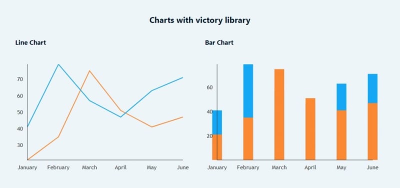
Victory is a set of modular charting components for React and React Native. It makes it easy to get started without sacrificing flexibility.
Victory supports various chart components like line, bar, area, pie, candlestick, scatter, and many more.
How to use victory
To use victory, first you have to install it on your React project.
npm i --save victory
After it installed, you can create the victory charts as follows.
import React from 'react'
import { VictoryChart, VictoryLine, VictoryBar } from 'victory';

const sales = {
  style: {
    data: {
      stroke: "#FB8833", // for Line chart
    },
    parent: { border: "1px solid #ccc"}
  },
  style2: {
    data: {
      fill: "#FB8833" // for Bar chart
    },
    parent: { border: "1px solid #ccc"}
  },
  data: [
    { x: "January", y: 21 },
    { x: "February", y: 35 },
    { x: "March", y: 75 },
    { x: "April", y: 51 },
    { x: "May", y: 41 },
    { x: "June", y: 47 }
  ]
};

const leads = {
  style: {
    data: {
      stroke: "#17A8F5", // for Line chart
    },
    parent: { border: "1px solid #ccc"}
  },
  style2: {
    data: {
      fill: "#17A8F5" // for Bar chart
    },
    parent: { border: "1px solid #ccc"}
  },
  data: [
    { x: "January", y: 41 },
    { x: "February", y: 79 },
    { x: "March", y: 57 },
    { x: "April", y: 47 },
    { x: "May", y: 63 },
    { x: "June", y: 71 }
  ]
};


export default function Victory() {
  return (
    <div className="row">
      <div className="col-md-12">
        <h2>Charts with victory library</h2>
      </div>

      <div className="section col-md-6">
        <h3 className="section-title">Line Chart</h3>
        <div className="section-content">
          <VictoryChart padding={30}>
            <VictoryLine
              style={sales.style}
              data={sales.data}
            />
            <VictoryLine
              style={leads.style}
              data={leads.data}
            />
          </VictoryChart>
        </div>
      </div>

      <div className="section col-md-6">
        <h3 className="section-title">Bar Chart</h3>
        <div className="section-content">
          <VictoryChart padding={30}>
            <VictoryBar
              style={leads.style2}
              data={leads.data}
            />
            <VictoryBar
              style={sales.style2}
              data={sales.data}
            />
          </VictoryChart>
        </div>
      </div>

    </div>
  )
}
Initializing a chart component with victory is simple. But, it doesn't come with a predefined chart element like legend, tooltip, etc.
So, if you want to add those elements to your chart, you should add and design it manually. You can see the official documentation for that.
Conclusions
Among the 7 libraries above, I recommend the first 5 libraries if you want complete features and easy-to-use charts. But, if you want to create a very customized chart, and design it on your own, you can try the last 2 libraries.
After reading this post, i hope you can now choose and decide what chart library is best for your React project.
If you find this post useful, feel free to share it with your developer friends. If you have any questions, or maybe a suggestion, let me know in the comment section below!
Happy coding!

Posted on August 27, 2020
Join Our Newsletter. No Spam, Only the good stuff.
Sign up to receive the latest update from our blog.
Related
October 15, 2023
