Tailwind CSS: The future of styling or just another CSS framework?

Sławek Kołodziej
Posted on January 15, 2021
My first encounter with Tailwind CSS was through Twitter. The creators of Tailwind are the same people who published a very popular ebook Refactoring UI. I also recognized Steve (one of the creators) from his Youtube series Refactoring UI where he redesigns views of real application while explaining all of his choices.
With this in mind I knew Tailwind isn't just a random CSS framework but something bigger.
I didn't had to wait too long. Creators of Tailwind CSS quickly released Tailwind UI - a paid set of UI components built on top of Tailwind CSS making $2 million in revenue in 2020.
Why I decided to use Tailwind CSS for my blog redesign
I never really liked CSS frameworks. Back in the days, when Bootstrap was as its peak, the only feature I found useful was its grid system. Yes, I used the one based on float: left. Then flex and grid became widely supported by browsers and using ready-made grid system didn't make sense to me anymore.
Also what I didn't like was how ugly and outdated default styles of Bootstrap are.
The other thing was it became nearly impossible to use any CSS Framework while creating UIs based on a custom design.
Tailwind CSS looked like the first framework I would enjoy using. I already saw how easily you can create beautiful UIs with it (thanks to Tailwind UI project). It also offers easy customization options allowing to work with custom designs, although right now I'm still not 100% convinced on this one.
Pros of using Tailwind CSS
Tailwind CSS just looks good
Although it's primarily an utility CSS framework it offers very modern and pleasing styling options. Authors already made design decisions when it comes to colors, shadows, borders, typography and also spacing options. It's a way easier to come up with a slick UI when you have limited options that work well together than writing CSS from scratch. Trust me, I tried both.
Tailwind CSS has a great IDE support
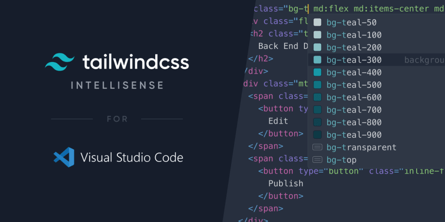
I'm using VS Code and thanks to Tailwind CSS Intellisense extension I was able to see all available Tailwind CSS classes as suggestions.
But the real power of this extension comes from its integration with the Tailwind configuration for given project. Let's say you added your custom color and modified some spacing option. You will see your changes as suggestions when writing CSS classes.
https://tailwindcss.com/docs/intellisense
It allows for very quick prototyping
Developing a new feature often comes with trying different solutions to see what's working and what's not.
My standard workflow for creating a new piece of UI is coming up with a good name, going to a separate place to create a styled components (I use CSS-in-JS a lot) and then using this component. For the plain CSS the steps are quite similar.
When working with Tailwind CSS I don't not have to switch between my HTML and the place where I define styles. I can use few classes to define the final look of HTML element. I don't have to come up with weird names like container, content-container or page-header-wrapper just to add a display: flex to some element.
Cons of using Tailwind CSS
Although on paper Tailwind looks like a perfect tool, after using it in real project you will start to notice some downsides.
You still have to style the UI by yourself
Tailwind doesn't style any elements by default. More than that, it removes default styles from elements like lists and inputs. While developing your own site you still have to choose typography, colors, sizing and position of elements.
Tailwind doesn't offer any ready-made components by default. Thankfully there are already two plugins that introduce default styling for elements: tailwindcss-typography and tailwindcss-typography. If you are struggling with coming up with good design watch Designing with TailwindCSS on Youtube from Adam Wathan - creator of Tailwind.
Looong list of CSS classes
This is the argument you will hear a lot as a downside of Tailwind. While for simple layout elements it isn't that much overwhelming, you will start notice the issue when styling UI components. Other than that it will be harder to recognize parts of the website when reading the code.
In the usual approach CSS classes usually contain name of the element and describe its function. With utility-first approach this part is missing.
Pagination link component from my blog
The first solution to this issue is creating regular css files and using @apply to include Tailwind utilities to CSS classes. You can read more about it in the documentation. It sounds right but then we might as well not use Tailwind at all and write regular CSS.
The second solution is to use the power of JavaScript frameworks and separate UI elements as components. You might still have a button with 13 different CSS classes but now it will be a proper component. Usually after creating such component once, you might not look into it for a while. You will be able to ignore the styling part when the component is done and do not bother reading all of the CSS classes.
Limited options when working with designers
This is my main problem with all of the CSS frameworks. Custom designs usually do not respect the boundaries of CSS framework. Thankfully Tailwind is very flexible and you can recreate almost any design.
The main limitations are with sizing and spacing values. I would recommend talking with your designer about it before you start working together on something. I would also want to see some official style guide of Tailwind so designers could base their work on it. Also remember that Tailwind is highly customizable and you can add your own sizes, colors etc. if you need to.
My conclusions after using Tailwind CSS
I need more experience with it
Tailwind at its own isn't too hard to learn. What I would want to explore is the tooling around it ex. twin.macro which aims to solve issue with long CSS class names and avoid creating separate CSS files at the same time. I also want discover more good practices.
I won't use it for commercial projects yet
I usually avoid using any CSS frameworks for more complex commercial projects due to its limitations. For now, Tailwind is no exception for me. I don't want to experiment in a commercial project when not everyone in a team is familiar with Tailwind and knows about its good and bad practices. Creating components and using SCSS or CSS-in-JS is usually enough for this type of work.
The only place where I would consider using it are marketing pages with a short time to deliver.
This opinion might change if we will have more experience with Tailwind as a community.
I will still use it for my own projects
Styling with Tailwind is very fast and fun. I think is the only tool since I learned React that I truly enjoy using.
The redesign of my blog took overall few hours to complete. I know I would struggle longer with plain CSS to come up with good looking UI.
As for my own projects I don't care that much about great code quality since the scale and the need of maintenance is usually very low. It's a good place to make mistakes and experiment with new tools.
I'm regularly publishing my insights on web development.
Consider subscribing to my newsletter.
Visit my blog at slawkolodziej.com to find out more interesting content.
Follow me on Twitter.

Posted on January 15, 2021
Join Our Newsletter. No Spam, Only the good stuff.
Sign up to receive the latest update from our blog.
Related
September 4, 2024


