Sinan
Posted on August 23, 2022

Imagine you're an experienced web developer 👨💻 and someone asks you to center a text inside a box. "Not like I didn't do that a 1 Mio times in my life" you say and continue. Rule after rule is being added by you to the css file, and finally you look at the result. Something is off, the text isn't just a little bit too low. In fact, the text in the button is also too low, it was never really centered. You apply, just like a pro would do, EVERY css rule that has "align" in the name and set it to "center" aaaand doesn't work,
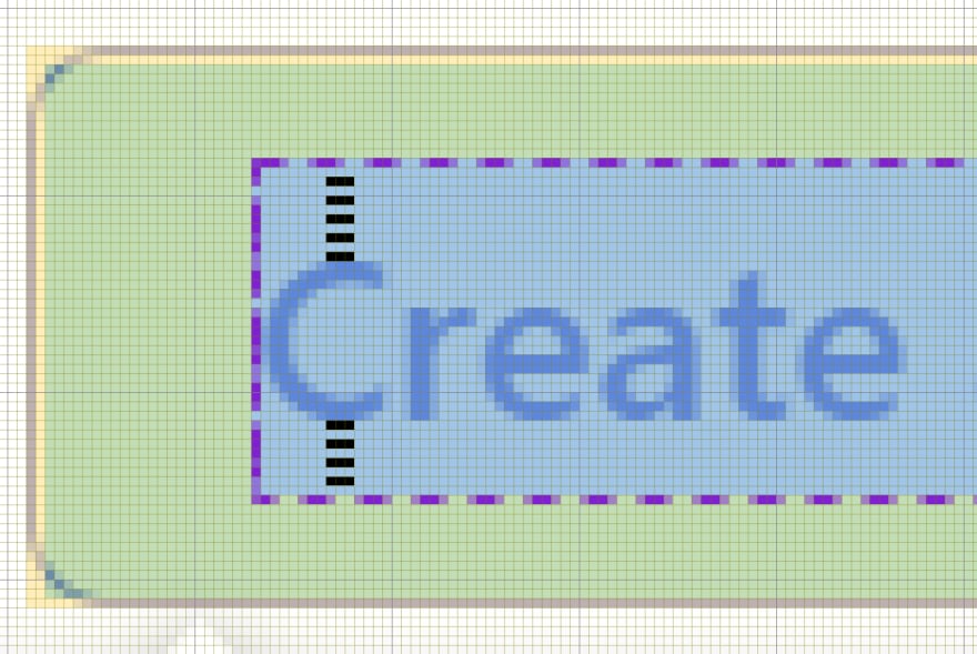
That wouldn't happen to you? Well, go ahead, logout and check the Log in and Create account button from dev.to. Did you notice that the space above is larger than the one below? It is off by a pixel.
Now I don't dare to say that it was by accident in the case of dev.to, and I will go ahead, saying it is by design like that. But why could that be the case on other websites?
Well, the cause of the issue is vertical metric (or rather its poor values), which as the name implies, is there to vertically align the font. If that metric is off, your alignment will be trash. "Only unknown, cheap fonts are affected" I hear you say, to which I can only answer: No!
Just to give you an example: One of them is Open Sans, which according to Google Fonts is used by 130,000,000 websites and the second most used font from Google Fonts... which means 130,000,000 Websites have wrong text alignment 😅
Cheers
Edit #1:
The vertical offset is most likely intentionally by the creator(s) for most fonts. However, I think it would be better if all of them would be centered by default and manually offset by software, e.g. using css-rules.
Edit #2:
Above I said that all 130,000,000 websites are affected by it, but that would only be the case if all of them actually tried to vertically center at least one piece of text using that font.

Posted on August 23, 2022
Join Our Newsletter. No Spam, Only the good stuff.
Sign up to receive the latest update from our blog.

