Creating Stunning Charts for Your ASP.NET Applications - Part 2

S. Olusegun Ojo
Posted on March 12, 2024
Introduction
In my last post, I showed how to use ChartsJS to render data from an ASP.NET application. I also mentioned Highcharts as another possible option.
In this post, I will use Highcharts to display the same data as in my previous post: a bar chart and a pie chart.
About Highcharts
Developed by Highsoft, Highcharts has been around since 2009. Unlike ChartsJS, which uses HTML5 canvas, Highcharts uses SVG rendering.
Highcharts is very versatile and offers more functionality than ChartsJS. It also allows charts for stocks, maps, gantt and a dashboard feature. One In addition, it allows, using GPT, the creation of data visualisations with natural language prompts. By default, Highcharts' charts are interactive and it has helpful defaults, such as colour, which ChartsJS doesn't by default. Highcharts also has integrations for languages such as Python, C#, etc.
Unlike ChartsJS, Highcharts is not free software. It can be used for free, however, with a URL to the Highcharts website displayed on the rendered chart.
Using Highcharts
On the frontend, Highcharts uses svg rendering to display charts. Like ChartsJS, it allows data to be added in a regular JS array. It can also be richly customised.
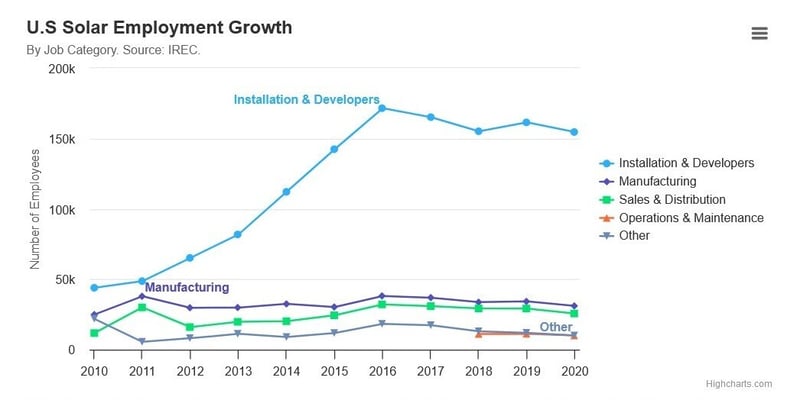
Here is a sample use from the official documentation:
Highcharts.chart('container', {

    title: {
        text: 'U.S Solar Employment Growth',
        align: 'left'
    },

    subtitle: {
        text: 'By Job Category. Source: <a href="https://irecusa.org/programs/solar-jobs-census/" target="_blank">IREC</a>.',
        align: 'left'
    },

    yAxis: {
        title: {
            text: 'Number of Employees'
        }
    },

    xAxis: {
        accessibility: {
            rangeDescription: 'Range: 2010 to 2020'
        }
    },

    legend: {
        layout: 'vertical',
        align: 'right',
        verticalAlign: 'middle'
    },

    plotOptions: {
        series: {
            label: {
                connectorAllowed: false
            },
            pointStart: 2010
        }
    },

    series: [{
        name: 'Installation & Developers',
        data: [43934, 48656, 65165, 81827, 112143, 142383,
            171533, 165174, 155157, 161454, 154610]
    }, {
        name: 'Manufacturing',
        data: [24916, 37941, 29742, 29851, 32490, 30282,
            38121, 36885, 33726, 34243, 31050]
    }, {
        name: 'Sales & Distribution',
        data: [11744, 30000, 16005, 19771, 20185, 24377,
            32147, 30912, 29243, 29213, 25663]
    }, {
        name: 'Operations & Maintenance',
        data: [null, null, null, null, null, null, null,
            null, 11164, 11218, 10077]
    }, {
        name: 'Other',
        data: [21908, 5548, 8105, 11248, 8989, 11816, 18274,
            17300, 13053, 11906, 10073]
    }],

    responsive: {
        rules: [{
            condition: {
                maxWidth: 500
            },
            chartOptions: {
                legend: {
                    layout: 'horizontal',
                    align: 'center',
                    verticalAlign: 'bottom'
                }
            }
        }]
    }

});
To use it with our dotnet application, we will simply supply our data from the backend as an array of values to the library.
Demo
This demo is in the same repository as that for the last post, https://github.com/shegzee/dotnet-charts. I am rendering the same sample data in another Razor page, ChartArrayBasic-Highcharts.
Models/BankData.cs
Just like before, the data I will be charting includes the bank name, colour for the bar or pie slice and transactions count (the actual data value to be charted).
namespace TransChartDemo.Models
{
    public class BankData
    {
        public int Id { get; set; }
        public string Name { get; set; }
        public string Colour { get; set; }
        public int Year { get; set; }
        public int TransactionsCount { get; set; }
    }
}
Repositories/IBankDataRepository.cs
using TransChartDemo.Models;

namespace TransChartDemo.Repositories
{
    public interface IBankDataRepository
    {
        BankData GetBankData(int id);
        void AddBankData(BankData bankData);
        void UpdateBankData(BankData bankData);
        void DeleteBankData(int id);
        List<BankData> GetAllBankData();

    }
}
Repositories/BankDataRepository.cs
using TransChartDemo.Models;

namespace TransChartDemo.Repositories
{
    public class BankDataRepository : IBankDataRepository
    {
        List<BankData> sampleBankData = new List<BankData>
        {
            new BankData { Id = 1, Name = "GTB", Colour = "Orange", TransactionsCount = 1923 },
            new BankData { Id = 2, Name = "UBA", Colour = "Red", TransactionsCount = 2011 },
            new BankData { Id = 3, Name = "FBN", Colour = "LightBlue", TransactionsCount = 1820 },
            new BankData { Id = 4, Name = "ZIB", Colour = "Black", TransactionsCount = 1500 },
            new BankData { Id = 4, Name = "ACC", Colour = "LightGreen", TransactionsCount = 1947 }
        };
        public void AddBankData(BankData bankData)
        {
            sampleBankData.Add(bankData);
        }

        public void DeleteBankData(int id)
        {
            sampleBankData.Remove(sampleBankData.FirstOrDefault(b => b.Id == id));
        }

        public List<BankData> GetAllBankData()
        {
            return sampleBankData;
        }

        public BankData GetBankData(int id)
        {
            return sampleBankData.FirstOrDefault(b => b.Id == id);
        }

        public void UpdateBankData(BankData bankData)
        {
            var oldBankData = sampleBankData.FirstOrDefault();
            if (oldBankData != null)
            {
                sampleBankData.Remove(oldBankData);
                sampleBankData.Add(bankData);
            }
        }
    }
}
Program.cs
using TransChartDemo.Repositories;

var builder = WebApplication.CreateBuilder(args);

// Add services to the container.
builder.Services.AddRazorPages();

builder.Services.AddScoped<IBankDataRepository, BankDataRepository>();

var app = builder.Build();

// Configure the HTTP request pipeline.
if (!app.Environment.IsDevelopment())
{
    app.UseExceptionHandler("/Error");
    // The default HSTS value is 30 days. You may want to change this for production scenarios, see https://aka.ms/aspnetcore-hsts.
    app.UseHsts();
}

app.UseHttpsRedirection();
app.UseStaticFiles();

app.UseRouting();

app.UseAuthorization();

app.MapRazorPages();

app.Run();
Pages/ChartArrayBasic-ChartsJS.cshtml.cs
Here, I'm adding the data (the list of BankData objects I manually created in BankDataRepository.cs) to the ViewData dictionary so it is accessible from ChartArrayBasic-Highcharts.cshtml.
using Microsoft.AspNetCore.Mvc;
using Microsoft.AspNetCore.Mvc.RazorPages;
using System.Text.Json;
using TransChartDemo.Repositories;

namespace TransChartDemo.Pages
{
    public class ChartArrayBasicHighchartsModel : PageModel
    {
        private readonly IBankDataRepository bankDataRepository;

        public ChartArrayBasicHighchartsModel(IBankDataRepository _bankDataRepository)
        {
            bankDataRepository = _bankDataRepository;
        }

        public void OnGet()
        {
            var bankData = bankDataRepository.GetAllBankData();
            ViewData["allBankData"] = JsonSerializer.Serialize(bankData);
        }
    }
}
Pages/ChartArrayBasic-ChartsJS.cshtml
In this Razor page, I use Highcharts to render the data in ViewData["allBankData"].
@page
@model TransChartDemo.Pages.ChartArrayBasicHighchartsModel
@{

}
<div class="text-center">
    <h1 class="display-4">Charts.js Demo</h1>
    <p>Integrating Charts.js in ASP.NET Core - Highcharts</a>.</p>

    <div class="row">
        <div class="col-sm-6">
            <div class="card">
                <div class="card-header">
                    Bar Chart
                </div>
                <div class="card-body">
                    <div id="bar" class="my-4 h-25"></div>
                </div>
                <div class="card-footer">
                    Transactions across top-tier banks
                </div>
            </div>
        </div>

        <div class="col-sm-6">
            <div class="card">
                <div class="card-header">
                    Pie Chart
                </div>
                <div class="card-body">
                    <div id="pie" class="my-4 h-25"></div>
                </div>
                <div class="card-footer">
                    Transactions among top-tier banks ;-)
                </div>
            </div>
        </div>
    </div>
</div>

@section Scripts {
    <script src="https://code.highcharts.com/highcharts.js"></script>
    <script src="https://cdnjs.cloudflare.com/ajax/libs/Chart.js/2.9.4/Chart.min.js"></script>
    <script type="text/javascript">
        var jsonData = '@Html.Raw(ViewData["allBankData"])';
        var values = JSON.parse(jsonData);
        //var arr = [];
        // $.each(values, function (i, val) {
        //     var bankData = {};
        //     bankData.color = val.color;
        //     bankData.value = val.value;
        //     bankData.label = val.label;
        //     arr.push(bankData);
        // });

        var colours = {
            'GTB': 'rgba(200, 100, 0, 0.5)',
            'UBA': 'rgba(200, 50, 50, 0.5)',
            'ZIB': 'rgba(100, 50, 50, 0.5)',
            'FBN': 'rgba(50, 50, 200, 0.5)',
            'ACC': 'rgba(50, 200, 100, 0.5)',
        }

        document.addEventListener('DOMContentLoaded', function () {
            const chart = Highcharts.chart('bar', {
                chart: {
                    type: 'column'
                },
                plotOptions: {
                    column: {
                        colorByPoint: true,
                        colors: values.map(x =>
                            x.Colour
                        )
                    }
                },
                title: {
                    text: ''
                },
                xAxis: {
                    categories: values.map(x => x.Name)
                },
                yAxis: {
                    title: {
                        text: 'Bank Transactions'
                    }
                },
                series: [{
                    name: 'Bank Transactions',
                    data: values.map(x =>
                        x.TransactionsCount
                    ),
                    colors: values.map(x =>
                        x.Colour
                    )
                }]
            });
        });


        document.addEventListener('DOMContentLoaded', function () {
            Highcharts.chart('pie', {
                chart: {
                    type: 'pie'
                },
                title: {
                    text: 'Bank Transactions'
                },
                tooltip: {
                    valueSuffix: ''
                },
                subtitle: {
                    text:
                        'Bank Transactions for 2023'
                },
                plotOptions: {
                    pie: {
                        allowPointSelect: true,
                        cursor: 'pointer',
                        dataLabels: {
                            enabled: true,
                            format: '{point.name}: {point.percentage:.1f}%'
                        },
                        showInLegend: true
                    }
                },
                series: [
                    {
                        name: 'Transactions',
                        colorByPoint: true,
                        data: values.map(x => ({ name: x.Name, y: x.TransactionsCount, color: x.Colour }))
                    }
                ]
            });
        })

    </script>
}
Here are the critical parts.
Bar Chart
For the bar chart, this div is created:
<div id="bar" class="my-4 h-25"></div>
The id is required by Highcharts:
//...
document.addEventListener('DOMContentLoaded', function () {
    const chart = Highcharts.chart('bar', {
//...
To have distinct colours for each column, the colorByPoint field must be set to true. The colours may then be specified in the plotOptions field. Alternatively, they can be set in the colors field for each series as will be shown below.
//...
plotOptions: {
    column: {
        colorByPoint: true,
        colors: values.map(x =>
            x.Colour
        )
    }
},
//...
The categories field under xAxis contain the names of each bar.
//...
xAxis: {
    categories: values.map(x => x.Name)
},
//...
Then the data is specified under the series field.
The colours can also be supplied in an array. This will affect only this series as opposed to using the option under plotOptions which applies to all the series when not otherwise specified.
//...
series: [{
    name: 'Bank Transactions',
    data: values.map(x =>
        x.TransactionsCount
    ),
    colors: values.map(x =>
        x.Colour
    )
}]
//...
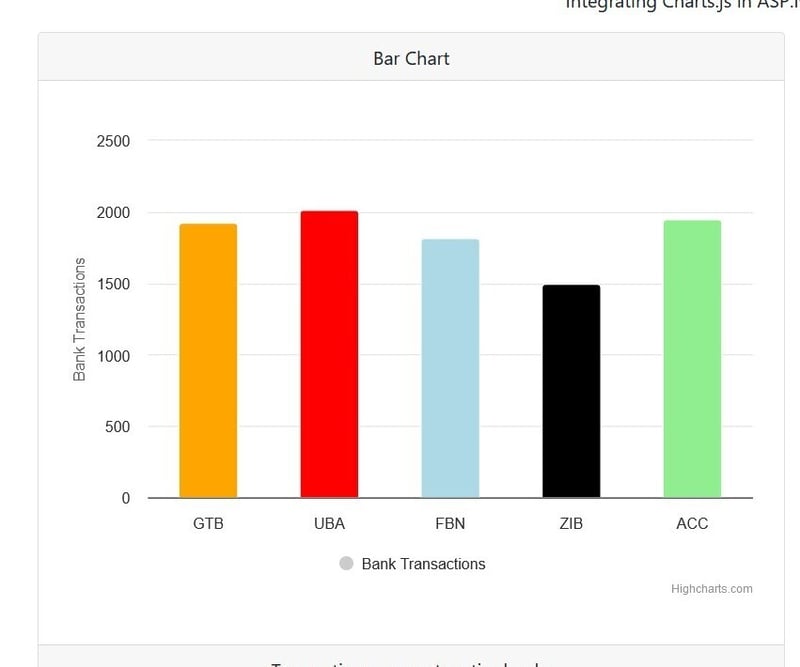
Here is what the output looks like:
Pie Chart
For the pie chart, this div is used:
<div id="pie" class="my-4 h-25"></div>
This id is supplied to Highcharts.
//...
document.addEventListener('DOMContentLoaded', function () {
    Highcharts.chart('pie', {
        chart: {
            type: 'pie'
        },
//...
The data option in the series allows you to supply the plot data as an array of objects.
//...
series: [
    {
        name: 'Transactions',
        colorByPoint: true,
        data: values.map(x => ({ name: x.Name, y: x.TransactionsCount, color: x.Colour }))
    }
]
//...
plotOptions allows customisation.
//...
plotOptions: {
    pie: {
        allowPointSelect: true,
        cursor: 'pointer',
        dataLabels: {
            enabled: true,
            format: '{point.name}: {point.percentage:.1f}%'
        },
        showInLegend: true
    }
},
//...
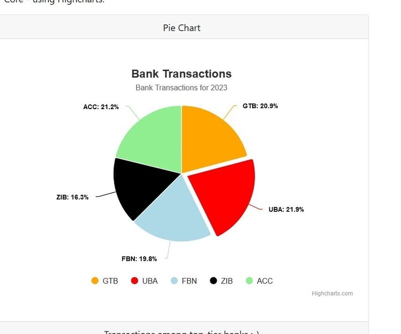
The final output looks like this:
Conclusion
So far, we have used ChartsJS and Highcharts to render data fetched in C#, in a bar chart and a pie chart. This should show some of the differences between these two leading charting libraries.
The code for this demo is available at https://github.com/shegzee/dotnet-charts.
Thank you for reading, and I hope you learnt something new! I would love to know if you have used Highcharts or ChartsJS before, and which you prefer.
originally posted here

Posted on March 12, 2024
Join Our Newsletter. No Spam, Only the good stuff.
Sign up to receive the latest update from our blog.


