Satvik
Posted on March 28, 2022

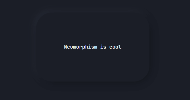
Neumorphism was a design trend where elements of the design appear to extrude out of the background while they still seem to be attached to it (They do not appear to float).
Like Glassmorphism neumorphism is easily achievable using CSS.
- Create a div in your .html file
<div class="box neumorphic-shadows">Neumorphism is cool</div>
- In your CSS Set a background color for your page , neumorphism usually works best with dark backgrounds but it is upto preference
body {
    background-color: #1b1e27;
  }
Now for the element
The only important thing to remember here is that color of your foreground element should be the same as your background otherwise it is just not neumorphism anymore
.box{
    background: #1b1e27;

    // shaping the card
    height: 5em;
    width: 20em;
    align-items: center;
    border-radius: 50px;
    display: flex;
    height: 200px;
    justify-content: center;
    margin-left: 35%;
    margin-top: 15%;
    padding: 10px 20px;

    // font
    font-family: 'JetBrains Mono', monospace;
    font-size: 16px;
    color: rgb(255, 255, 255); // color of the font

  }
Now to achieve the real effect we need to add box shadows
.neumorphic-shadows{
    box-shadow:  5px 5px 31px #111319,
    -5px -5px 21px #373d5081;
  }
- the shadow value with positive pixel distance (5px) controls the shadows
- the shadow value with negative pixel distance (-5px) controls the highlights
You can change the signs and values to change the direction and distance of the shadows/highlights respectively
Footnotes:
To make your job a lot easier you can use neumorphism.io, it's a great website that generates CSS code for the neumorphic effect . You can tweak the effect according to your liking and get the CSS code generated for it.

Posted on March 28, 2022
Join Our Newsletter. No Spam, Only the good stuff.
Sign up to receive the latest update from our blog.


