Glam Up My Markup - Cozy Camp

Rodrigo Antunes
Posted on March 22, 2024

This is a submission for DEV Challenge v24.03.20, Glam Up My Markup: Camp Activities
What I Built
This was a very fun challenge.
I explain the details of this journey after the demo.
Demo
Journey
I started by choosing the colors. I wanted to deliver a cozy and warm vibe, so I used CSS Variables to help me remember them.
:root {
  --color-camp-01: #738d5e; // muted green
  --color-camp-02: #293d31; // rich green
  --color-camp-03: #ffc78a; // warm golden
}
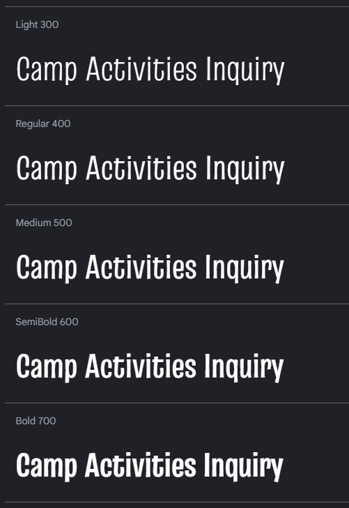
Looking at camp inspiration designs, I found strong typography, colorful contrasts and nature-inspired illustrations. Fonts are always hard to choose, so I made up my mind on Truculenta and kept moving forward.
Ok, time to build the thing.
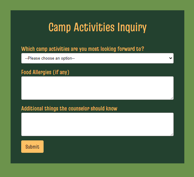
Since we cannot edit the HTML, with flexbox I manage to achieve something like this.
Looks fine, but there is still some work to be done.
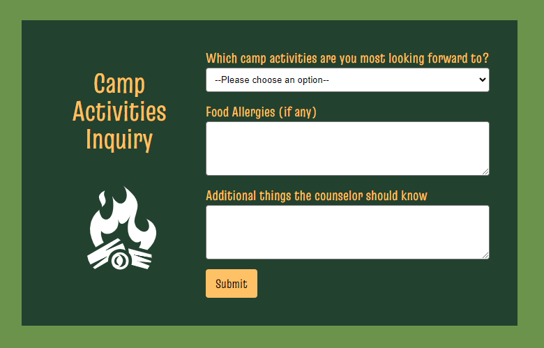
This is more of a mobile-first approach, since on desktop we have more room to work with, I thought about changing the direction of the flex elements. And using the :after pseudo element so I could place something inside the <h1> tag.
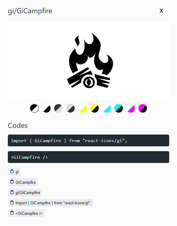
I used an SVG from game-icons library.
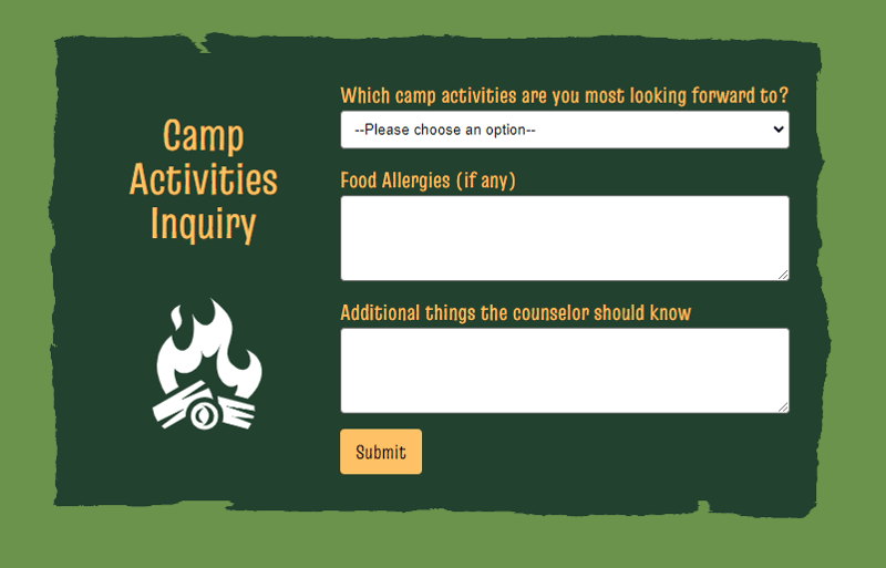
Putting it all together, we have this:
Good, we are getting somewhere.
Although, there is something missing 🤔
Getting back at the camp designs inspiration, I found some rough edges designs, and things that give some organic look. So I decide to try some border-image css to see how it looks.
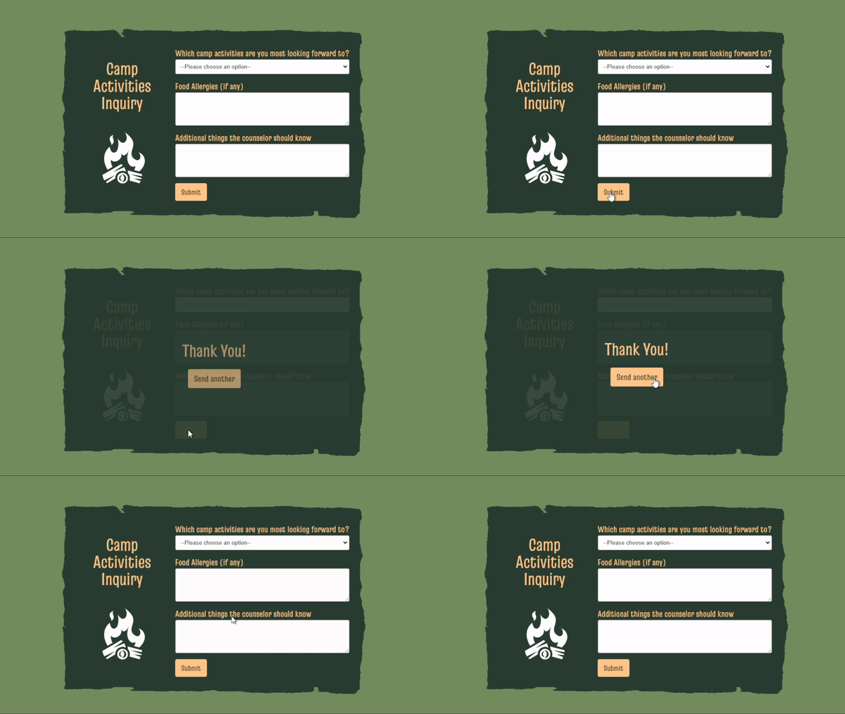
Now, about the feedback when the form is sent?
Since I started this thinking about cozyness, we need some smooth animations:
At the last minute I decide to increased spacing between elements for improved readability 😊
Thank you Dev.to team for creating this challange.

Posted on March 22, 2024
Join Our Newsletter. No Spam, Only the good stuff.
Sign up to receive the latest update from our blog.
