Richik SC
Posted on October 14, 2019
Currently, the state of styling <input type="range"> across browsers is a nightmare. Chrome, IE, Safari, and Edge each have their own way of styling range inputs with differently named pseudo-elements. With this proposal, I want to bring some unity and standardization to this similar to the CSS scrollbars spec. Currently, Chrome has no support for styling the "progress" part of a range input (the area corresponding to "below" the current value, in LTR languages, the track to the left. @danielstern has written an article about it on CSS-Tricks, and although it was last updated in 2017, most of it still applies.
Definitions
Thumb: the UI element that the user interacts with and is dragged by the user - it shows the current state of the range.
Track: The "groove" or bar that the thumb runs along - shows the "range" (min and max values) of the range.
Current state of range styling
WebKit/Blink (Chrome/Opera/Safari):
::-webkit-slider-thumb { /* Styles the thumb of the input*/ }
::-webkit-slider-runnable-track { /* Styles the track of the input*/ }
Firefox
::-moz-range-thumb { /* Styles the thumb of the input*/ }
::-moz-range-track { /* Styles the track of the input*/ }
::-moz-range-progress { /* Styles the progress/fill below the thumb of the input*/ }
IE/Edge
::-ms-thumb { /* Styles the thumb of the input*/ }
::-ms-track { /* Styles the track of the input*/ }
::-ms-fill-lower { /* Styles the progress/fill below the thumb */ }
::-ms-fill-upper { /* Styles the fill above the thumb */ }
Proposal
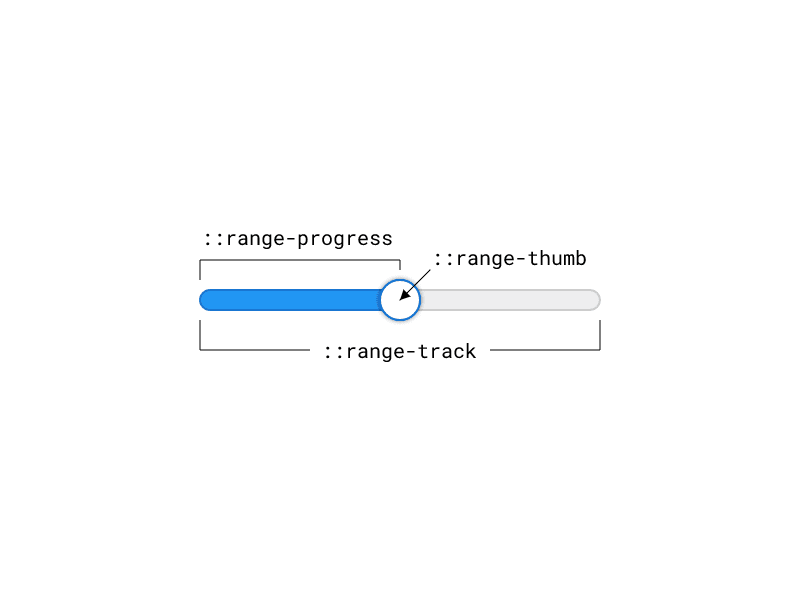
As you can see, attempting to style a consistent range input across browsers is a daunting task and requires a lot of CSS and repetition of styles. I'd like to propose three new standard pseudo-elements for styling the range:
::range-thumb { /* Styles the thumb of the input*/ }
::range-track { /* Styles the track of the input*/ }
::range-progress { /* Styles the progress/fill below the thumb of the input*/ }
Sample CSS for the above mockup would be something like this:
input[type=range]::range-track {
  width: 100%;
  height: 20px;
  border-radius: 10px;
  background-color: #eee;
  border: 2px solid #ccc;
}

input[type=range]::range-thumb {
  width: 40px;
  height: 40px;
  border-radius: 100%;
  background-color: white;
  border: 2px solid #1976D2;
  box-shadow: 0 0 5px rgba(0, 0, 0, 0.25);
}

input[type=range]::range-progress {
  height: 20px;
  border-radius: 10px 0 0 10px;
  background-color: #2196F3;
  border: 2px solid #1976D2;
}
If you think this is important, feel free to give a 👍 on the GitHub issue.
 [css-pseudo-4] Standardizing input[type="range"] styling
#4410
Currently, the state of styling <input type="range"> across browsers is a nightmare. Chrome, IE, Safari, and Edge each have their own way of styling range inputs with differently named pseudo-elements. With this proposal, I want to bring some unity and standardization to this similar to the CSS scrollbars spec. Currently, Chrome has no support for styling the "progress" part of a range input (the area corresponding to "below" the current value, in LTR languages, the track to the left. @danielstern has written an article about it on CSS-Tricks, and although it was last updated in 2017, most of it still applies.
Definitions
Thumb: the UI element that the user interacts with and is dragged by the user - it shows the current state of the range. Track: The "groove" or bar that the thumb runs along - shows the "range" (min and max values) of the range.
Current state of range styling
WebKit/Blink (Chrome/Opera/Safari):
::-webkit-slider-thumb { /* Styles the thumb of the input*/ }
::-webkit-slider-runnable-track { /* Styles the track of the input*/ }
Firefox
::-moz-range-thumb { /* Styles the thumb of the input*/ }
::-moz-range-track { /* Styles the track of the input*/ }
::-moz-range-progress { /* Styles the progress/fill below the thumb of the input*/ }
IE/Edge
::-ms-thumb { /* Styles the thumb of the input*/ }
::-ms-track { /* Styles the track of the input*/ }
::-ms-fill-lower { /* Styles the progress/fill below the thumb */ }
::-ms-fill-upper { /* Styles the fill above the thumb */ }
Proposal
As you can see, attempting to style a consistent range input across browsers is a daunting task and requires a lot of CSS and repetition of styles. I'd like to propose three new standard pseudo-elements for styling the range:
::range-thumb { /* Styles the thumb of the input*/ }
::range-track { /* Styles the track of the input*/ }
::range-progress { /* Styles the progress/fill below the thumb of the input*/ }
Sample CSS for the above mockup would be something like this:
input[type=range]::range-track {
  width: 100%;
  height: 20px;
  border-radius: 10px;
  background-color: #eee;
  border: 2px solid #ccc;
}

input[type=range]::range-thumb {
  width: 40px;
  height: 40px;
  border-radius: 100%;
  background-color: white;
  border: 2px solid #1976D2;
  box-shadow: 0 0 5px rgba(0, 0, 0, 0.25);
}

input[type=range]::range-progress {
  height: 20px;
  border-radius: 10px 0 0 10px;
  background-color: #2196F3;
  border: 2px solid #1976D2;
}
Posted on October 14, 2019
Join Our Newsletter. No Spam, Only the good stuff.
Sign up to receive the latest update from our blog.
Related

November 29, 2024


