Rabe Datta
Posted on October 15, 2022
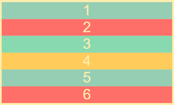
We have six divs that display numbers from 1 to 6:
   <body>
        <div class="container">
            <div>1</div>
            <div>2</div>
            <div>3</div>
            <div>4</div>
            <div>5</div>
            <div>6</div>
        </div>
    </body>
Preview of the code:
To turn the container into a grid, we first apply the display: grid property to the container class:
 .container {
    display: grid;
  }
grid-template-columns
In order to specify the columns, we give the container grid-template-columns. grid-template-columns property allow us to define how many columns we will have in our grid and how wide each column will be.
.container {
   display: grid;
   grid-template-columns: 100px auto 100px;
 }
The auto keyword in this case means that the columns will take up whatever remaining space there is in the width.
Preview of the code:

grid-template-rows
The grid-template-rows property allows us to define the height of each row:
 .container {
     display: grid;
     grid-template-columns: 100px auto 100px;
     grid-template-rows: 50px 200px;
   }
Preview of the code:

grid-gap or gap
To set the gap between rows and columns, we can use the grid-gap or gap property:
 .container {
    display: grid;
    grid-template-columns: 100px auto 100px;
    grid-template-rows: 50px 50px;
    grid-gap: 3px;
  }
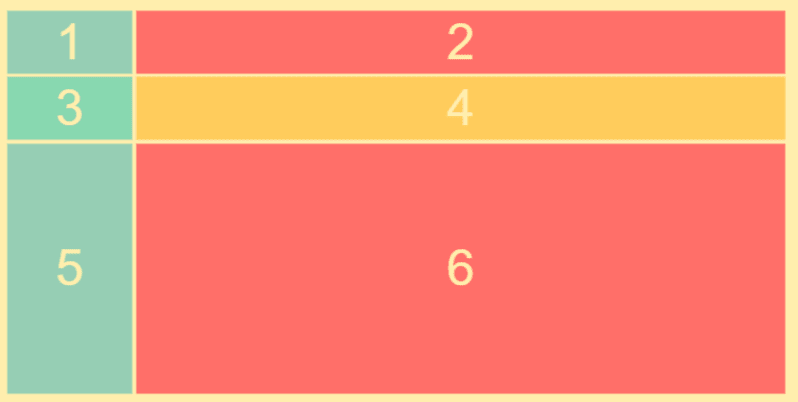
If we want our grid to be two columns wide and three rows long, we can remove the third column and add an additional row:
.container {
   display: grid;
   grid-template-columns: 100px auto;
   grid-template-rows: 50px 50px 200px;
   grid-gap: 3px;
 }
Preview of the code:

Posted on October 15, 2022
Join Our Newsletter. No Spam, Only the good stuff.
Sign up to receive the latest update from our blog.
Related

November 27, 2024


