Francesco Pigozzi
Posted on May 26, 2021

Photo by Ralph (Ravi) Kayden on Unsplash
TL;DR
I created this landing page and wanted to make it cool so I used SVG's animateMotion, docs here
The story
If you find stories boring stuff, skip this section
It was a day like many others in Cubbit and suddenly a message was sent to the whole company saying that we have started an internal referral program 🎉
What a perfect opportunity to finally build something I had in mind for quite a long time: a landing page with animated bees, Cubbit's symbol, and strong empathic messages with the goal to spread our mission as much as possible.
Also, the best opportunity for everyone to get access to a nice discount code
Creative process
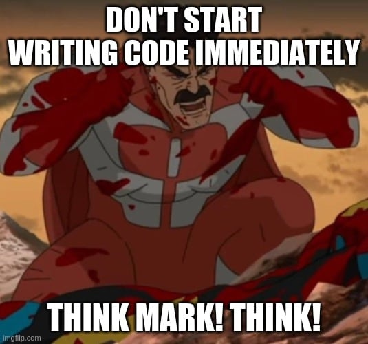
A wise friend once said: programmers, when they have an idea, start coding immediately and this is the worst error you could do!
So, a huge step back and we are ready to start designing something and this is the result of the first draft of a sketched minimal bee.
Not very interesting, uh? Asking for feedback is the best way for you to come to better solutions. So I asked to my girlfriend.
This is the final result
Way better, Lovely
So, now it’s time to start coding, right? Wrong
First of all, you wouldn't go far with just a bunch of bees flying around and..
Wait, HOW THE HECK DO I MAKE THEM FLY? Ok, I will think about this later.
Now it's time to design some interfaces, maybe a story line and, why not, a prototype!
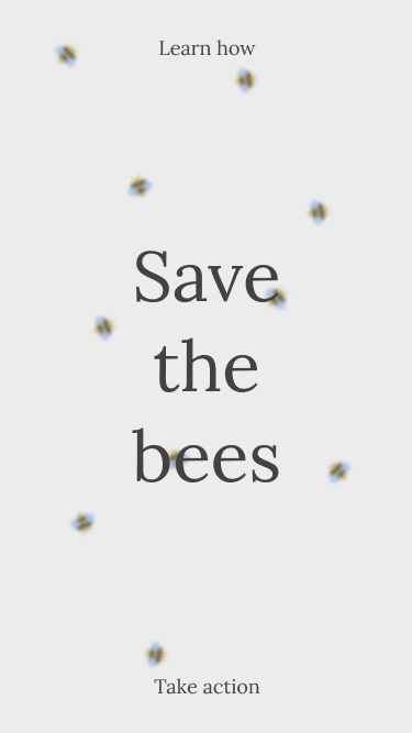
The very first frame looked something like this, a little bit boring, though.
I've tried several ways to improve it and, at the end, I decided to apply some blur to it
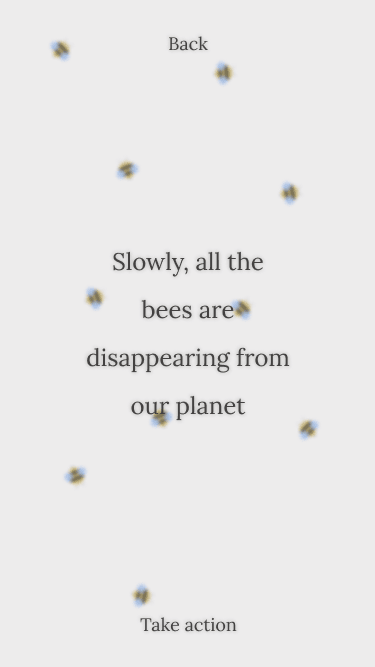
Way better, now the user won't pay much attention to the bees' details and will focus on what I have to say: time for some text!
This is good already but looks a little too flat, without any depth and some bees might interfere with the focus on the text, even if they are blurred.
The same wise friend I was talking about before gave me a cool trick that designers adopt when it comes to typography and readability
Again, some feedback to the rescue!
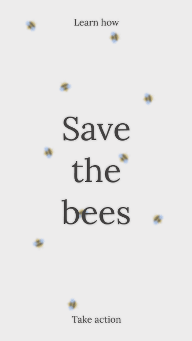
Shadows are magical
These screens are already the final result that you can enjoy on the live page
Coding, finally!
Just to give you some small details, this site is built with React, TypeScript, styled-components, React Transition Group and a lot of sense of humor. It's hosted on Vercel, of course.
Ok, building the interfaces, preparing all the styles and scaffolding the codebase was the simple part and now come the troubles
Quoting myself
HOW THE HECK DO I MAKE THEM FLY?
And this has been the longest and toughest challenge of this project
CSS transform
Ok, the very first thing I tried was to wrap everything into multiple transformed containers with some properties like translate3d and rotate3d ; the 3d part is necessary to access the hardware acceleration
And it started to work fine until I decided to animate the bees automatically, with some sort of algorithm and random numbers: a complete failure
When you deal with CSS and Javascript at the same time, you can't benefit from both with a solution that involves both of them: my problem was the huge load of computations that the main thread had to handle in order to find the next possible point for a bee to move to
You can already understand that this solutions doesn't scale up very well
Thank you, next!
SVG to the rescue!
So, after the previous failure I started wondering: isn't there a way to smoothly animate an SVG without using any JS and/or CSS?
After googling a bit (ok I admit it, after googling a lot), I stumbled across this documentation on our beloved MDN: https://developer.mozilla.org/en-US/docs/Web/SVG/Attribute/rotate#examples
And everything started to be magical and possible again 🌈
This article represents the exact solution I was looking for!
The problem is not to move the bees in a random set of points generated at runtime; instead, you should focus on a set of already defined paths and let the SVG magic do the rest 🧙♂️
This is the export of the SVG of the bee with the path
The final code of the Bee
I won't make it any longer, here you can find the resulting code of a React component, with CSS transforms, SVG elements and animations
import React from 'react';
import styled, { keyframes } from 'styled-components';

const vibration = keyframes`
    from,
    to {
    transform: translate3d(0, 0, 0);
    }
    10%,
    30%,
    50%,
    70%,
    90% {
        transform: translate3d(-3px, 0, 0);
    }
    20%,
    40%,
    60%,
    80% {
        transform: translate3d(1px, 0, 0);
    }
`;

const VibratingWings = styled.g`
    animation: 1s ${vibration} infinite;
`;

type TransformProps = {
    x?: number;
    y?: number;
    rotation?: number;
}

const BeeSVG = styled.svg<TransformProps>(({x = 0, y = 0, rotation = 0}) => ({
    position: 'absolute',
    transform: `translate3d(${x}px, ${y}px, 0px) rotate3d(0, 0, 1, ${rotation}deg)`,
}))

type Props = {
    debug?: boolean;
    duration: number;
} & TransformProps

function Bee({debug, duration, ...transformProps}: Props) {
    return (
        <BeeSVG
            {...transformProps}
            width="422"
            height="552"
            viewBox="0 0 422 552"
            fill="none"
            xmlns="http://www.w3.org/2000/svg"
        >
            <g clipPath="url(#clip0)">
                <path
                    id="motionPath"
                    d="M80.4017 146.011C80.4018 1.26631 376.903 53.5395 339.785 146.011C302.666 238.483 69.0275 297.382 80.4017 402.125C91.776 506.868 339.784 543.688 339.785 402.125C339.785 260.562 80.4017 290.757 80.4017 146.011Z"
                    stroke="black"
                    strokeOpacity={debug ? '1' : '0'}
                />
                <g clipPath="url(#clip1)">
                    <path d="M0 13L3 11.268L3 14.7321L0 13Z" fill="#434141"/>
                    <mask id="mask0" mask-type="alpha" maskUnits="userSpaceOnUse" x="2" y="5" width="16" height="16">
                        <circle cx="10" cy="13" r="8" fill="#E6CC74"/>
                    </mask>
                    <g mask="url(#mask0)">
                        <path d="M10 21C5.58172 21 2 17.4183 2 13C2 8.58172 5.58172 5 10 5C14.4183 5 18 8.58172 18 13C18 17.4183 14.4183 21 10 21Z" fill="#E6CC74"/>
                        <path d="M8 -3L8 29H5L5 -3L8 -3Z" fill="#434141"/>
                        <path d="M14 -3L14 29H11L11 -3L14 -3Z" fill="#434141"/>
                    </g>
                    <VibratingWings>
                        <path d="M10.4645 3.53551C12.0266 5.09761 12.0266 7.63027 10.4645 9.19236C8.90238 10.7545 6.36972 10.7545 4.80762 9.19236C3.24552 7.63027 3.24552 5.09761 4.80762 3.53551C6.36972 1.97341 8.90238 1.97341 10.4645 3.53551Z" fill="#B5D2FF" fillOpacity="0.6"/>
                        <path d="M11.1716 2.8284C12.7337 4.3905 12.7337 6.92316 11.1716 8.48526C9.60953 10.0474 7.07687 10.0474 5.51477 8.48526C3.95268 6.92316 3.95268 4.3905 5.51477 2.8284C7.07687 1.26631 9.60953 1.26631 11.1716 2.8284Z" fill="#B5D2FF" fillOpacity="0.8"/>
                        <path d="M10.4645 22.4853C8.90238 24.0474 6.36972 24.0474 4.80762 22.4853C3.24552 20.9232 3.24552 18.3906 4.80762 16.8285C6.36972 15.2664 8.90238 15.2664 10.4645 16.8285C12.0266 18.3906 12.0266 20.9232 10.4645 22.4853Z" fill="#B5D2FF" fillOpacity="0.6"/>
                        <path d="M11.1716 23.1924C9.60947 24.7545 7.07681 24.7545 5.51471 23.1924C3.95262 21.6303 3.95262 19.0976 5.51471 17.5355C7.07681 15.9734 9.60947 15.9734 11.1716 17.5355C12.7337 19.0976 12.7337 21.6303 11.1716 23.1924Z" fill="#B5D2FF" fillOpacity="0.8"/>
                    </VibratingWings>

                    <path d="M16.5 11C16.5 11 19.25 10.5 20 10C20.75 9.50002 21 8.00002 21 8.00002" stroke="#434141" strokeWidth="0.2"/>
                    <path d="M16.5 15C16.5 15 19.25 15.5 20 16C20.75 16.5 21 18 21 18" stroke="#434141" strokeWidth="0.2"/>

                    {/* https://developer.mozilla.org/en-US/docs/Web/SVG/Attribute/rotate */}
                    <animateMotion dur={`${duration}s`} repeatCount="indefinite" rotate="auto">
                        <mpath href="#motionPath"/>
                    </animateMotion>
                </g>
            </g>
            <defs>
                <clipPath id="clip0">
                    <rect width="422" height="552" fill="white"/>
                </clipPath>
                <clipPath id="clip1">
                    <rect width="26.0208" height="22" fill="white" transform="translate(22) rotate(90)"/>
                </clipPath>
            </defs>
        </BeeSVG>
    );
}

export default Bee;
BeeSVG is the wrapper around the SVG and it accepts some props in order to make the entire SVG transformable; in order to place the bees in a random position and rotation inside the page
VibratingWings is a styled g element that lets the wings simulate a vibration
animateMotion with rotate="auto" is my best friend for this project
Considerations
Ok, I have to admit that I like a lot this final solution but unfortunately it's not performing very well neither; even though it runs at 60fps on average devices
I think that in the next releases I'll think about moving to WebGL in order to benefit from real hardware acceleration
Now it's your turn!
Let me know what you think about this article and, of course, don't forget to visit my, and Cubbit's, pages about the real problem: our world is suffering and the bees are dying 🐝🌎
Don't let this happen, take action! Whatever you can do is enough, you don't need to make anything big!
Start with the simple things, like me!
I'll bee around
Hope that you enjoyed this little story and have learned something new!
Leave a 🦄, if so, and a 🐝 in the comments!

Posted on May 26, 2021
Join Our Newsletter. No Spam, Only the good stuff.
Sign up to receive the latest update from our blog.


