Web Performance: Images

Yuwang Cai
Posted on January 22, 2023
High-quality images can significantly boost your website's appeal. They make an excellent first impression on users and effectively communicate your insights.
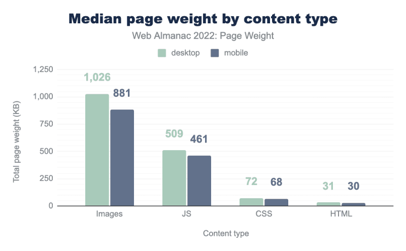
However, according to Web Almanac 2022 statistics, images are also the leading cause of website performance issues, with a staggering page weight of 1000+ KB, which is twice that of JavaScript.
We want to deliver high-quality images while minimizing performance loss, which necessitates extensive and in-depth image optimization.
🔽 Reduce Image Quality
Among all possible solutions, brute force always seems to be the most intuitive one. The less information in an image, the easier it is to compress, the better the performance.
- Blur: If we only want to emphasize the foreground of image, we can blur the background, which reduces the amount of information while keeping all of the important parts.
- Zoom: Zoom out to 87% of the original image, and then zoom in to 115% of the current one. In the end, the size did not change, but many pixels vanished during the zooming process.
- Tool: Use tools like Squoosh to further compress the image.
After the above processing, the size of an image can be reduced to ~3%, with humans barely noticing the difference.
🎞️ Choose Correct Format
| Scenario | Format |
|---|---|
| Ordinary Pictures | WebP, Jpeg |
| Complex graphics | PNG, Jpeg |
| With transparency | PNG, WebP |
| Icons | SVG |
| Dynamic | Video |
🤔 Other
- Adjust the width to somewhere between 320px and 1920px.
- Opaque is preferred to transparent.
- Remove all unnecessary shapes in SVG.
- Integrate tools like Sharp and Imagemin into the build scripts.
🖼️ Responsive Images
If we provide a 1920px wide image for laptops, mobile devices will also receive the same 1920px wide image, which is completely unnecessary.
srcset is a native attribute of <img> that allows us to provide images of different sizes for devices of different widths. The size attribute can then be used to run media query based on these images.
<img
  srcset="image-small.jpg 320w   👈 for devices under 320px
          image-medium.jpg 600w  👈 for devices under 600px
          image-large.jpg 1200w  👈 for devices under 1200px
          image-full.jpg 1920w   👈 for devices under 1920px
         "
  size="(min-width:1200px) 1200px, 100vw  👈 1200px for devices above 1200px, or 100vw otherwise"
  src="image.jpg"
  alt="A nice image."
/>
Typically, 4-5 options would suffice. Going too far is as bad as not going far enough.
🛏️ Lazy Loading
The image is not loaded until the user scrolls to it.
<img src="image.png" alt="A nice image." loading="lazy" />
Simple as the attribute is, it can boost the performance a lot. loading="lazy" should be the default for every image.
Exception: It is not recommended to apply lazy loading to LCP. It would only have negative impacts on the performance.

Posted on January 22, 2023
Join Our Newsletter. No Spam, Only the good stuff.
Sign up to receive the latest update from our blog.
Related

November 27, 2024


