Micah Lindley
Posted on April 12, 2022

For the last six years or so, my personal site (micahlindley.com) has been built with pure HTML, CSS, and JavaScript with no compilation or build steps. It's super nice just to push a commit and have it live on GitHub Pages in a matter of seconds. However, after spending a lot of time learning Vue 3 this last year I decided to finally rebuild the site. There are some major changes between versions 1 and 2, so I'll go over them and why I made the decisions.
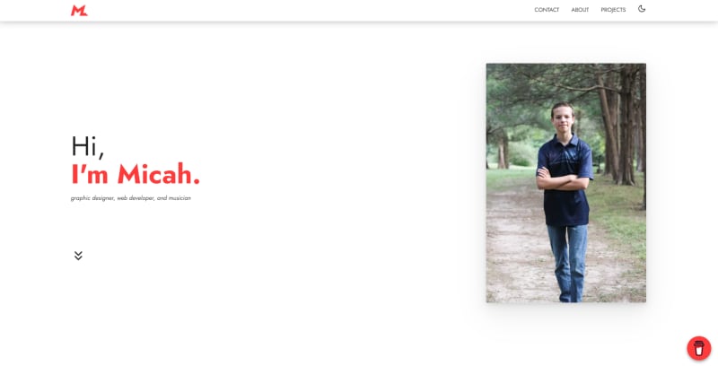
| Original Site | New Site |
|---|---|
 |
 |
Design
My original site was very minimal and the layout was cookie-cutter for a portfolio site. It worked well and was responsive on multiple devices, but it didn't speak much to my identity as a graphic designer. I realized that I needed to make a stronger impression with my site. I started by using my accent color significantly more and even splitting the homepage in half with one side being white and the other being red. I was able to retain my minimal style while also bringing more character to the site. The most noticeable design change, however, is the cursor. On non-touch devices (see the pointer media query, the default cursor is hidden and replaced by a circle that uses the difference blend mode, creating some super neat effects.
Animation
There were some minor touches of motion on my original site - notably a large preloader that zoomed and disappeared after the page loaded. However, the new site is filled with several touches of motion that give it an almost organic feel. A circle of text rotates around my logo on the homepage. When links are hovered, the cursor is enlarged. Navigation transitions between pages are smooth. There's a fine line between too much animation and not enough, but I hope I've reached the happy medium.
Pages and performance
Version 1 used a single-page layout that's very common among developer portfolios. However, I was struggling to fit more content on the site while retaining fast load times. I gave in and switched to lazy-loaded routes that Vue Router supports. I was originally concerned about the weight that some frameworks and bundlers can cause, but Vite's intelligent bundling enables my site to load so fast that I don't even use a preloader anymore!
Automatic builds
The main feature of the old site that I didn't want to give up was the ease of pushing and having the site automatically deployed. For some of my projects, I use dedicated hosting tools like Vercel or Netlify, but I wanted to keep my site hosted on GitHub Pages so that other projects already on GitHub could continue to be on the micahlindley.com domain. Thankfully, GitHub Actions provided a great option for me to build the site with Vite in the cloud and host it automagically with Pages. I wrote my own Action to deploy the site and it's worked wonderfully so far.
The results
My analytics show that user retention (aka session length) on the v2 site has gone up by 12% , and the number of visits per month has not been affected. I'm very impressed with how fast it runs, and working with Vite has been a joy - I don't think I'll ever start a project with Webpack again! Vue 3 is a rapidly maturing ecosystem that I'm glad to be a part of. If you have any feedback, feel free to let me know! And of course, the site is open-source: https://github.com/micahlt/micahlt.github.io

Posted on April 12, 2022
Join Our Newsletter. No Spam, Only the good stuff.
Sign up to receive the latest update from our blog.