Putting Your Best Foot Forward: Updating Projects

Melissa Guachun
Posted on April 11, 2022
The topic of updating past projects is stressful. After pouring hours of work into a project, the last thing you might wanna do is dive back into it after months of inactivity to see what bugs await you. But when the opportunity comes to present the skills you have to an employer, the situation changes.
I had to do this exact thing recently. During the interview process, I was asked to have 3-4 projects present and to the interviewer as a way to display my frontend skills.
When I think back to the lengthier projects that I have so far, they all stem from my coding bootcamp. At that time, the curriculum was more focused on ensuring we knew how to incorporate concepts of object oriented programming, RESTful routes, AJAX, Bcrypt, omniauth, and other important concepts into our projects. Frontend design like using CSS, Bootstrap/ReactStrap, SCSS, JQuery, and other frontend libraries were the least of their concern. And rightfully so, when I was still in bootcamp, I really didn't know I wanted to focus on frontend engineering. So I don't blame them in any way. I'm just explaining that it wasn't the main concern of my bootcamp's material.
I'm lucky at my internship where I've have the opportunity to advance my knowledge of styling, layout, flexbox, UX/UI along with my frontend skills. Even though it's been a little over two months I've been working, it's pretty remarkable how much I've learned so far. I didn't come to this conclusion until I started revamping my projects from my bootcamp days.
A project that stuck out to me that I knew I wanted to update was my vanilla Javascript frontend and SQLite3 backend.
Immediately, I cringed opening up this project. It's funny how I have such a passion for aesthetics and design, but had no real approach in designing when I was building this site. It goes to show that we all start somewhere.
I was originally inspired by Record Store Day where record stores would have a huge sale on their inventory and sell exclusive bundles. The concept behind this app was to allow a user to compile a list of albums with the proper fields such as artist, album title, year released, and genre. I wanted to create an app for users to have on hand to remind them of the albums they'd wanna buy at a record shop.
There were obvious things I knew I wanted to change stylistically off the bat.
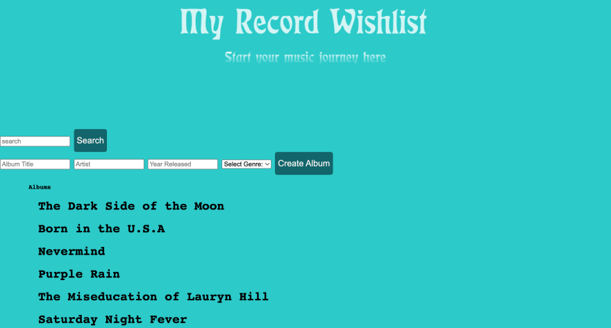
The color became overbearing with time. I knew how important it would be to choose a color less intense for the user. I also wanted to change the font style to incorporate consistency throughout the experience of usage.
The form was needing a lot of love for styling as well. It looks clunky and didn't make sense with the flow of the app.
The workflow consisted of a user filling out the form at the top but they would ultimately have to scroll all the way down to see the album they stored. This didn't make sense and would waste the user's time.
To my surprise, I realized the title and quote styling wasn't even using CSS. It was actually a downloaded image that I attached to the heading of the file. Insane.
The list of concerns grew with the more time I spent inspecting this project. It brought back memories of how lost I felt when building the app. It's hard to imagine feeling more lost than you are now. But it was comforting in hindsight, seeing how far I had come in the matter of months. The concerns I had for the usage of this app shows that I've grown as a frontend engineer.
Growing means changing and adapting. And as much shame as I felt looking back at the app, I couldn't be too hard on myself. I was just starting and that warranted enough slack. I saw this revision as a new challenge for myself.
If I wanted to put my best foot forward and authentically show my skills, I knew a complete overhaul of the frontend was needed. I took the whole weekend to work on this project along with three others to update their frontends.
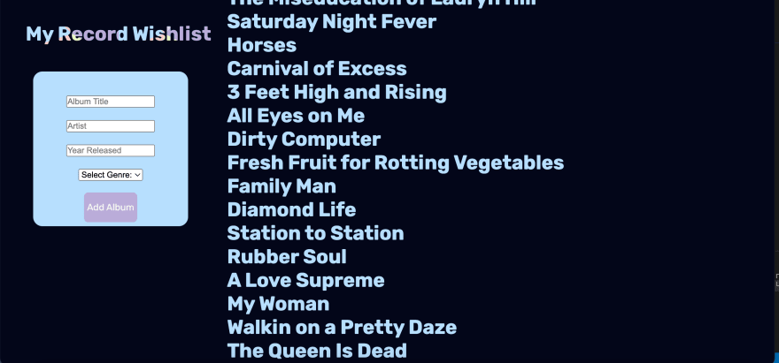
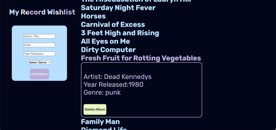
Here is the newest revision of My Record Wishlist App. As you can see, the color pallet has changed quite a bit. I created a color pallet from the title of the app. When hovering over the title, there is a responsive hover that makes the colors move in different directions. I wanted to add a playfulness to the app but not take away from it's functionality. I used a darker color for the background to not strain the eyes, and a lighter color to contrast in the text color.
Button responsiveness was added to display when a button was being hovered over through color change. I also made the font bigger, more legible, and enclosed in a border for easier reading.
An exciting piece of functionality that I built was creating a sticky header and form. As a user's list expands in length, the title of the app and form follows as they scroll through their list. In case a user doesn't have an album on their list, they can easily make an addition without scrolling all the way to the top of the file.
Revising this project gave me so much reassurance that I was learning and growing as an engineer. I amazed myself at how much better I understood my vanilla javascript code from practicing with mini projects. As well as how much more thoughtful I was about user experience from working at my internship. And even a better eye for design from practicing with styling libraries, doing frontend challenges, and pushing myself stylistically at my job. The revisioning of this project allowed all these outlets of practice to culminate in this result.
This experience makes me excited for the future. As daunting as the thought is, I hope my future self looks back at these revisions and cringe with the same first hand embarrassment. Because I'll know that my abilities have grown and I'll be eager to remind myself how far I've come.
Conclusion:
Don't let the shame or cringe overtake you when revisiting old projects. It can be hard putting aside your own ego as an engineer when revamping old projects. It's like looking at photos of yourself from middle school. You did what you thought was cool at the time. But most importantly, you showed what you knew at the time. The root of the embarrassment from looking back at the past is the inner realization that you've progressed. Without the embarrassed blush, you can't appreciate how far you've come.

Posted on April 11, 2022
Join Our Newsletter. No Spam, Only the good stuff.
Sign up to receive the latest update from our blog.
Related

February 8, 2023


