GitHub Pull Requests with Screenshots Tip

Matthew McGarvey
Posted on June 29, 2021
When you're making a pull request in GitHub and want to include screenshots in the description, you might be tempted to just throw the screenshots in with headings. I urge you, though, not to do that! Those screenshots take up a lot of room and there is a better way!
Dropdowns
Dropdowns are truly the better way to add images to pull requests. By default they can be ignored and can be expanded if you want to look at them.
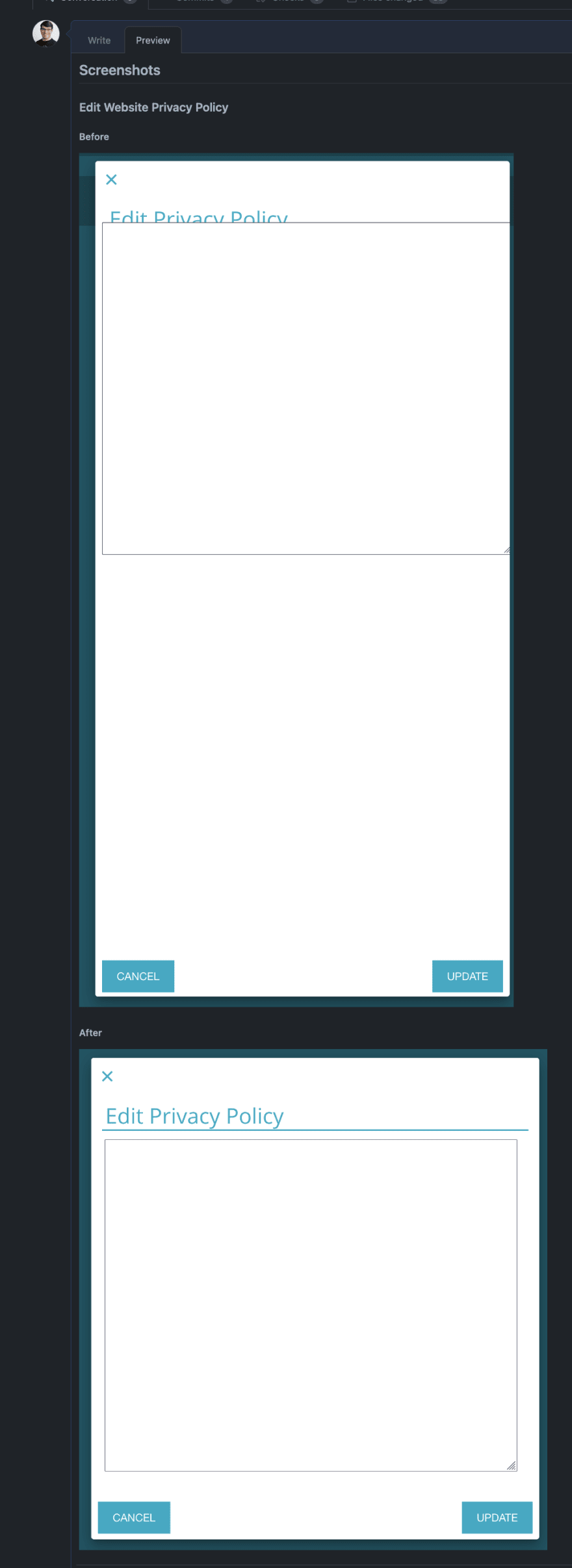
Here's a picture of a pull request description without using dropdowns. Notice how much room is taken up. I had to zoom out to 60% just to get it all on my screen!

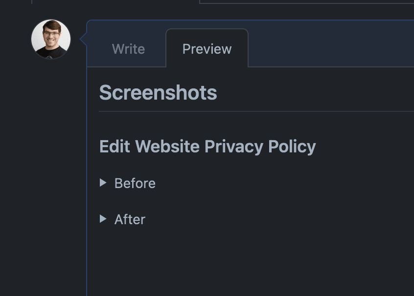
Now here's a picture using dropdowns. It's so much simpler.
Syntax
I used to always google "github markdown dropdown" and used this link.
They are created using markdown like this:
<details>
<summary>How do I dropdown?</summary>
<br>
This is how you dropdown.
</details>
Saved Replies
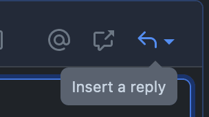
Just so that you and I don't have to remember this article or that GitHub gist in the future, you can make it easy by creating a saved reply. Those are accessed in the bar above the text area when creating a pull request description.
You can create a new saved reply through that button and make a dropdown saved reply. That's going to save me a bunch of time!

Posted on June 29, 2021
Join Our Newsletter. No Spam, Only the good stuff.
Sign up to receive the latest update from our blog.
Related
November 29, 2024


