Maame Afia Fordjour
Posted on September 8, 2022

CSS VARIABLES
📌 The var() function can be used to insert the value of a custom property.
📌 Variables in CSS should be declared within a CSS selector that defines its scope.
📌 For a global slope you can use the ':root' or the body selector.
📌 Variable name must begin with two dashes (--) and is case sensitive.
Syntax is;
var(custom-name, value)
NB: The var() function is basically a function that selects from a parent and gives whatever characteristics that parent has to the child. For example;
<!DOCTYPE html>
<html>
<head>
<style>
:root {
  --main-bg-color: blue;
}

#div1 {
  background-color: var(--main-bg-color);
  padding: 5px;
}

#div2 {
  background-color: var(--main-bg-color);
  padding: 5px;
}

#div3 {
  background-color: var(--main-bg-color);
  padding: 5px;
}
</style>
</head>
<body>

<h1>The var() Function</h1>

<div id="div1">Lorem ipsum dolor sit amet, consectetur adipiscing elit. Etiam semper diam at erat pulvinar, at pulvinar felis blandit.</div>
<br>

<div id="div2">Lorem ipsum dolor sit amet, consectetur adipiscing elit. Etiam semper diam at erat pulvinar, at pulvinar felis blandit.</div>
<br>

<div id="div3">Lorem ipsum dolor sit amet, consectetur adipiscing elit. Etiam semper diam at erat pulvinar, at pulvinar felis blandit.</div>

</body>

</html>
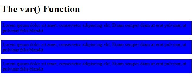
The code above would display as;
📌 It would be realized that, because the var() function for the ':root' had a background color of blue. Any element given that particular var function would also have the background color of BLUE.
📌 Always put in mind that, your var() 'custom-name' must always start with two dashes.
📌 You could also use the var() function for other styles like text-align, padding font-size etc. depending on your preference.
For example;
<!DOCTYPE html>
<html>
<head>
<style>
:root {
  --main-bg-color: coral;
  --main-txt-color: blue;
  --main-padding: 15px;
}

#div1 {
  background-color: var(--main-bg-color);
  color: var(--main-txt-color);
  padding: var(--main-padding);
}

#div2 {
  background-color: var(--main-bg-color);
  color: var(--main-txt-color);
  padding: var(--main-padding);
}

#div3 {
  background-color: var(--main-bg-color);
  color: var(--main-txt-color);
  padding: var(--main-padding);
}
</style>
</head>
<body>

<h1>The var() Function</h1>

<div id="div1">Lorem ipsum dolor sit amet, consectetur adipiscing elit. Etiam semper diam at erat pulvinar, at pulvinar felis blandit.</div>
<br>

<div id="div2">Lorem ipsum dolor sit amet, consectetur adipiscing elit. Etiam semper diam at erat pulvinar, at pulvinar felis blandit.</div>
<br>

<div id="div3">Lorem ipsum dolor sit amet, consectetur adipiscing elit. Etiam semper diam at erat pulvinar, at pulvinar felis blandit.</div>

</body>

</html>
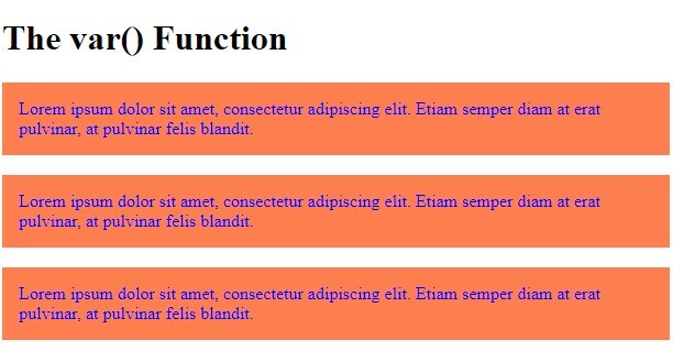
📌 The code above indicates that, the background color would be coral, text color blue and main padding will be 15px. This can be showed as;
CSS FLEXBOX
📌 Before there was a flexbox layout module, there were four different layout modes; These included:
📌Positioned (Position of an element)
📌Table (Two-dimensional table data)
📌Inline (Text)
📌Block (Sections in a webpage)
The flexbox module has made it easier to design a responsive layout structure without using float or positioning.
1. Defining a 'flex container'.
For example;
<!DOCTYPE html>
<html>
<head>
<style>
.flex-container {
  display: flex;
  background-color: DodgerBlue;
}

.flex-container > div {
  background-color: #f1f1f1;
  margin: 10px;
  padding: 20px;
  font-size: 30px;
}
</style>
</head>
<body>

<div class="flex-container">
  <div>1</div>
  <div>2</div>
  <div>3</div>
</div>

</body>

</html>
The code above would be displayed as;
There are flex container properties. These include;
📌 align-content
📌 align-items
📌 flex-direction
📌 flex-wrap
📌 flex-flow
📌 justify-content
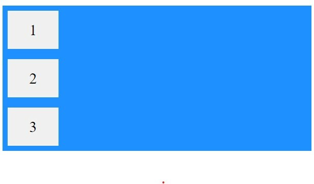
To determine the direction the container wants to stack the flex items. There are different directions to which you can stack these items.
1. Using the column value (stacks items vertically):
<!DOCTYPE html>
<html>
<head>
<style>
.flex-container {
  display: flex;
  flex-direction: column;
  background-color: DodgerBlue;
}

.flex-container > div {
  background-color: #f1f1f1;
  width: 100px;
  margin: 10px;
  text-align: center;
  line-height: 75px;
  font-size: 30px;
}
</style>
</head>
<body>


<div class="flex-container">
  <div>1</div>
  <div>2</div>
  <div>3</div>
</div>

</body>

</html>
The code above would be displayed as;
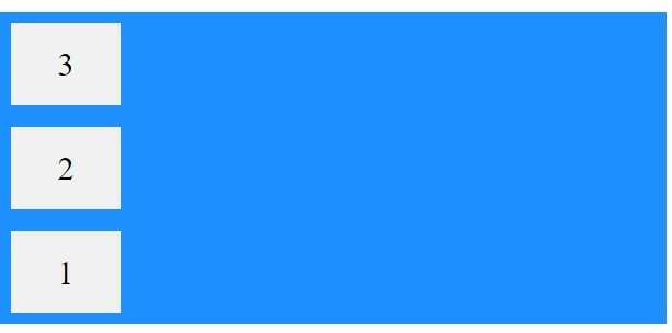
2.The column-reverse (vertically but from bottom to top):
<!DOCTYPE html>
<html>
<head>
<style>
.flex-container {
  display: flex;
  flex-direction: column-reverse;
  background-color: DodgerBlue;
}

.flex-container > div {
  background-color: #f1f1f1;
  width: 100px;
  margin: 10px;
  text-align: center;
  line-height: 75px;
  font-size: 30px;
}
</style>
</head>
<body>

<div class="flex-container">
  <div>1</div>
  <div>2</div>
  <div>3</div>
</div>

</body>

</html>
This would come out as;
3. The row value (horizontally):
<!DOCTYPE html>
<html>
<head>
<style>
.flex-container {
  display: flex;
  flex-direction: row;
  background-color: DodgerBlue;
}

.flex-container > div {
  background-color: #f1f1f1;
  width: 100px;
  margin: 10px;
  text-align: center;
  line-height: 75px;
  font-size: 30px;
}
</style>
</head>
<body>
<div class="flex-container">
  <div>1</div>
  <div>2</div>
  <div>3</div>
</div>

</body>

</html>
This code would be displayed as;
4. Row-reverse value (horizontally but from right to left):
<!DOCTYPE html>
<html>
<head>
<style>
.flex-container {
  display: flex;
  flex-direction: row-reverse;
  background-color: DodgerBlue;
}

.flex-container > div {
  background-color: #f1f1f1;
  width: 100px;
  margin: 10px;
  text-align: center;
  line-height: 75px;
  font-size: 30px;
}
</style>
</head>
<body>

<div class="flex-container">
  <div>1</div>
  <div>2</div>
  <div>3</div>
</div>

</body>

</html>
The code above would be displayed as;
THE FLEX WRAP PROPERTY
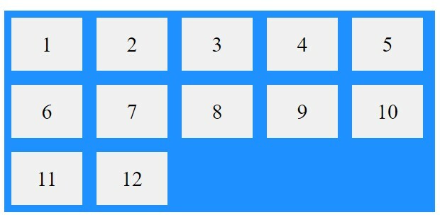
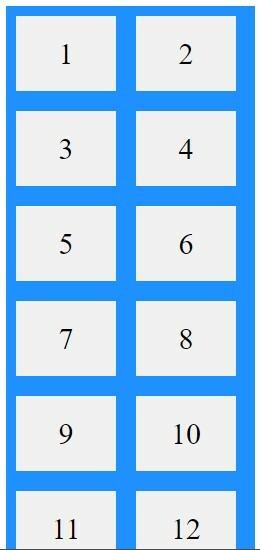
📌 It indicates whether the flex items should wrap or not. If you don't really understand what text wrapping is, just take it as when you resize a browser window to lets say the size of a mobile phone, the images on it normally adjusts itself to fit the screen. So if initially on desktop view, there were three or more rows
in a reduced browser window it would change to become less rows. Lets take an example below to help you understand better;
<!DOCTYPE html>
<html>
<head>
<style>
.flex-container {
  display: flex;
  flex-wrap: wrap;
  background-color: DodgerBlue;
}

.flex-container > div {
  background-color: #f1f1f1;
  width: 100px;
  margin: 10px;
  text-align: center;
  line-height: 75px;
  font-size: 30px;
}
</style>
</head>
<body>

<div class="flex-container">
  <div>1</div>
  <div>2</div>
  <div>3</div>
  <div>4</div>
  <div>5</div>
  <div>6</div>
  <div>7</div>
  <div>8</div>
  <div>9</div>
  <div>10</div>
  <div>11</div>
  <div>12</div>
</div>

</body>

</html>
The code above would be displayed as;
(When browser window is enlarged)
(when browser window is minimised)
NB: There is a default value for flex-wrap. This is the 'nowrap' which means flex items would not wrap.
📌 To combine both the flex-direction and flex-wrap properties, there is a shorthand property known as the 'flex-flow property' (i.e flex-flow:row wrap).
📌 To align items in a flexbox, we do not use the 'text-align' but the 'justify-content'. So instead of text-align (center, right, left..) the justify-content uses;
- Flex-start (at the beginning)
- Flex-end (at the end)
- Center
- Space-around (displays with space before, between and after lines)
- Space-between (displays items with space between lines)
ADDITIONAL POINTER: For perfect centering, set the justify-content and align-items properties to 'center'.
CHILD ELEMENTS (ITEMS)
📌 The direct child elements of a flex container automatically becomes a flex item.
There are six flex item properties;
📌align-self
📌flex
📌order
📌flex-grow
📌flex-basis
📌flex-shrink
THE ORDER PROPERTY
📌 It indicates the order of flex items.
📌 The order value must be a number, and the default value is zero.
📌 It can change the order the flex items. Lets look at an example;
<!DOCTYPE html>
<html>
<head>
<style>
.flex-container {
  display: flex;
  align-items: stretch;
  background-color: #f1f1f1;
}

.flex-container>div {
  background-color: DodgerBlue;
  color: white;
  width: 100px;
  margin: 10px;
  text-align: center;
  line-height: 75px;
  font-size: 30px;
}
</style>
</head>
<body>

<div class="flex-container">
  <div style="order: 3">1</div>
  <div style="order: 2">2</div>
  <div style="order: 4">3</div>
  <div style="order: 1">4</div>
</div>

</body>

</html>
We can see from the image above that even though we stated in our div container for the items to range from 1 to 4, the order property overrides that sequence making 1 the third on the flexbox, 4 the first on the flexbox and so on. This indicates that the first flex item in the code does not have to appear as the first item in the layout.
FLEX-GROW PROPERTY
📌 Indicates how much a flex item will grow relative to the rest of the flex items.
📌 The default value is zero, so you must indicate a number in order for it to work.
Lets take an example where we want the third item to grow 4 times faster than the other items;
<!DOCTYPE html>
<html>
<head>
<style>
.flex-container {
  display: flex;
  align-items: stretch;
  background-color: #f1f1f1;
}

.flex-container > div {
  background-color: DodgerBlue;
  color: white;
  width: 100px;
  margin: 10px;
  text-align: center;
  line-height: 75px;
  font-size: 30px;
}
</style>
</head>
<body>


<div class="flex-container">
  <div style="flex-grow: 1">1</div>
  <div style="flex-grow: 1">2</div>
  <div style="flex-grow: 4">3</div>
</div>

</body>

</html>
The code above would ne displayed as;
It would be realized that, the third item is longer than the other two. That is the main purpose of the flex-grow property.
FLEX-SHRINK PROPERTY
📌 There is always an opposite of something. The flex-shrink property does the opposite of what the flex-grow property does.
📌 In basic terms, it indicates how much an item would shrink relative to the rest of the flex items.
📌 Giving it a value of 0 makes it 'not shrinkable'.
NB: 'align-self' targets a particular item and 'align-items' affects the entire flex items.
CONCLUSION
The flexbox makes it easier to arrange items on your webpage and makes it less complicated as compared to using positioning and floats. Thanks for reading!

Posted on September 8, 2022
Join Our Newsletter. No Spam, Only the good stuff.
Sign up to receive the latest update from our blog.
