Four Types of Bar Charts in Python - Based on Array Data

Luca Liu
Posted on March 14, 2024

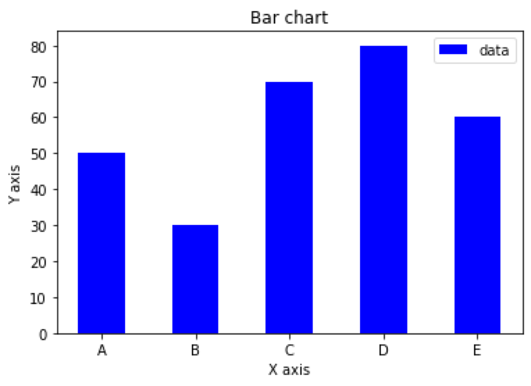
Simple bar chart based on an array in Python
import matplotlib.pyplot as plt
import numpy as np

x = np.array(['A', 'B', 'C', 'D', 'E'])
y = np.array([50, 30, 70, 80, 60])

plt.bar(x, y, align='center', width=0.5, color='b', label='data')
plt.xlabel('X axis')
plt.ylabel('Y axis')
plt.title('Bar chart')
plt.legend()
plt.show()
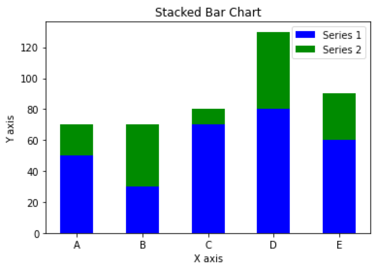
Stacked bar chart based on arrays in Python
import matplotlib.pyplot as plt
import numpy as np
x = np.array(['A', 'B', 'C', 'D', 'E'])
y1 = np.array([50, 30, 70, 80, 60])
y2 = np.array([20, 40, 10, 50, 30])

plt.bar(x, y1, align='center', width=0.5, color='b', label='Series 1')
plt.bar(x, y2, bottom=y1, align='center', width=0.5, color='g', label='Series 2')
plt.xlabel('X axis')
plt.ylabel('Y axis')
plt.title('Stacked Bar Chart')
plt.legend()
plt.show()
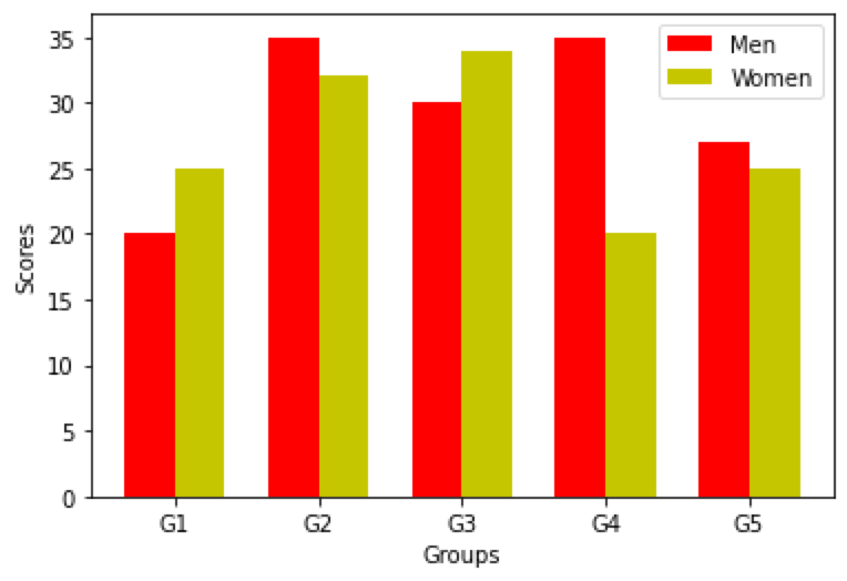
Grouped bar chart based on arrays in Python
import matplotlib.pyplot as plt
import numpy as np

# Prepare the data
N = 5
men_means = (20, 35, 30, 35, 27)
women_means = (25, 32, 34, 20, 25)
ind = np.arange(N)  # x-axis position
width = 0.35  # width of each bar

# Plot the bar chart
fig, ax = plt.subplots()
rects1 = ax.bar(ind, men_means, width, color='r')
rects2 = ax.bar(ind + width, women_means, width, color='y')

# Add labels, legend, and axis labels
ax.set_xticks(ind + width / 2)
ax.set_xticklabels(('G1', 'G2', 'G3', 'G4', 'G5'))
ax.legend((rects1[0], rects2[0]), ('Men', 'Women'))
ax.set_xlabel('Groups')
ax.set_ylabel('Scores')

# Display the plot
plt.show()
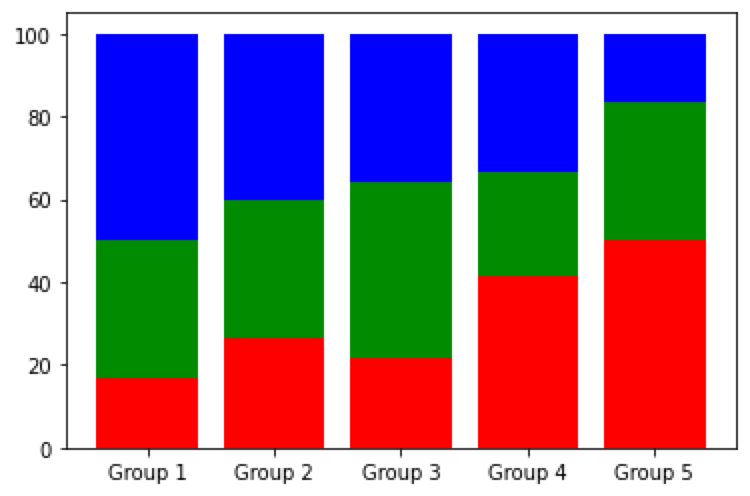
Percent stacked bar chart based on arrays in Python
import matplotlib.pyplot as plt
import numpy as np

# Prepare the data
x = ['Group 1', 'Group 2', 'Group 3', 'Group 4', 'Group 5']
y = np.array([[10, 20, 30],
              [20, 25, 30],
              [15, 30, 25],
              [25, 15, 20],
              [30, 20, 10]])

# calculate percentage
y_percent = y / np.sum(y, axis=1, keepdims=True) * 100

# Plot the chart
fig, ax = plt.subplots()
ax.bar(x, y_percent[:, 0], label='Series 1', color='r')
ax.bar(x, y_percent[:, 1], bottom=y_percent[:, 0], label='Series 2', color='g')
ax.bar(x, y_percent[:, 2], bottom=y_percent[:, 0] + y_percent[:, 1], label='Series 3', color='b')

# Display the plot
plt.show()
Explore more
Thank you for taking the time to explore data-related insights with me. I appreciate your engagement.
💖 💪 🙅 🚩

Luca Liu
Posted on March 14, 2024
Join Our Newsletter. No Spam, Only the good stuff.
Sign up to receive the latest update from our blog.
Related

programming How to Use the Concat Function in Pandas for Horizontal or Vertical Table Concatenation
March 13, 2024


